
reminds me of Gary Conway from Land of the Giants

Results 31 to 45 of 68
-
09-21-2017, 07:15 PM #31BANNED

- Join Date
- Apr 2016
- Posts
- 16,238

-
09-21-2017, 07:35 PM #32Incredible Member
- Join Date
- May 2014
- Posts
- 613
I think it might be. Sue resembles actress Deanna Lund from the same series. She was the redhead.
-
09-21-2017, 08:20 PM #33BANNED
- Join Date
- Apr 2016
- Posts
- 16,238
I was going to suggest it. but the hair is different enough that I dismissed it. Originally Posted by beetee

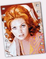
hmm. w/ the soft lighting, they do look a lot alike.
-
09-22-2017, 01:51 AM #34Ultimate Member
- Join Date
- May 2014
- Location
- Bedford UK
- Posts
- 10,323
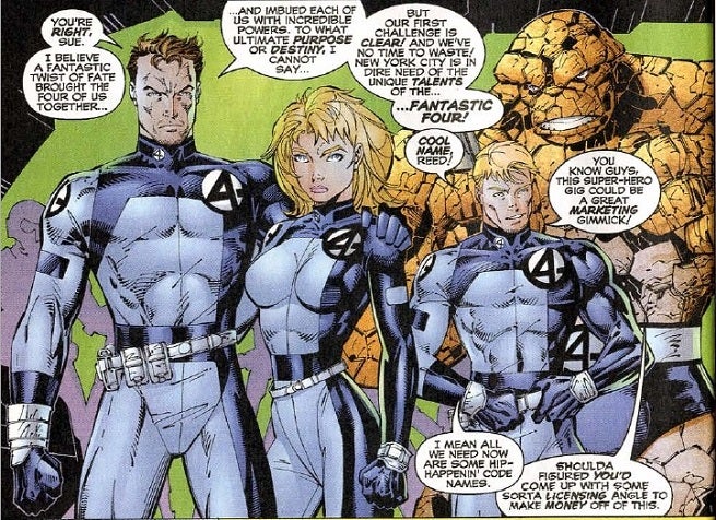
I wonder if the symbol has been designed to evoke the numbers 1 through 4. 1 and 4 are obvious, 3 is on its side, and 2 is evoked by the top curve and the diagonal, and would be completed with a line across the negative space below it.
Last edited by JKtheMac; 09-22-2017 at 01:54 AM.
-
09-22-2017, 03:47 AM #35Extraordinary Member
- Join Date
- May 2014
- Location
- Canada
- Posts
- 5,095
I do really like the stylized 4 emblem, even if nothing comes of this.
-
09-22-2017, 04:02 AM #36BANNED
- Join Date
- Apr 2014
- Posts
- 7,499
It's a cool redesign. Originally Posted by Raye
-
09-22-2017, 04:16 AM #37BANNED
- Join Date
- Jul 2014
- Location
- Four Freedoms Plaza
- Posts
- 1,090
Some of my favourite uniforms I'd love to see back

-
09-22-2017, 04:21 AM #38Ultimate Member
- Join Date
- May 2014
- Location
- Bedford UK
- Posts
- 10,323
This Ross logo shares a lot with the logo here. That one also to some extent has the 1-4 effect. You can see the 2 more clearly (see the logo on sue, which is at an angle to the viewer), and the 3 is perhaps more stylised and crowded out. I Imagine this one served as the model for Ross. Originally Posted by The BaRoN
Indeed in this picture I wonder if the intent was to try and show the 4 digits. The square-on Johnnny, and the slightly obscured logo on Ben add to the slant effect on Sue.Last edited by JKtheMac; 09-22-2017 at 04:28 AM.
-
09-22-2017, 06:11 AM #39Ultimate Member
- Join Date
- May 2014
- Location
- Bedford UK
- Posts
- 10,323
I see the suggested colour depicted more likely to be a white suit as mocked up here:
image.jpg
-
09-22-2017, 06:32 AM #40Extraordinary Member
- Join Date
- Apr 2014
- Posts
- 8,702
not bad. i think an inversion works nicely, although nothing beats the classic black on blue
-
09-22-2017, 07:28 AM #41Latverian ambassador
- Join Date
- Apr 2014
- Location
- Latverian Embassy
- Posts
- 20,663
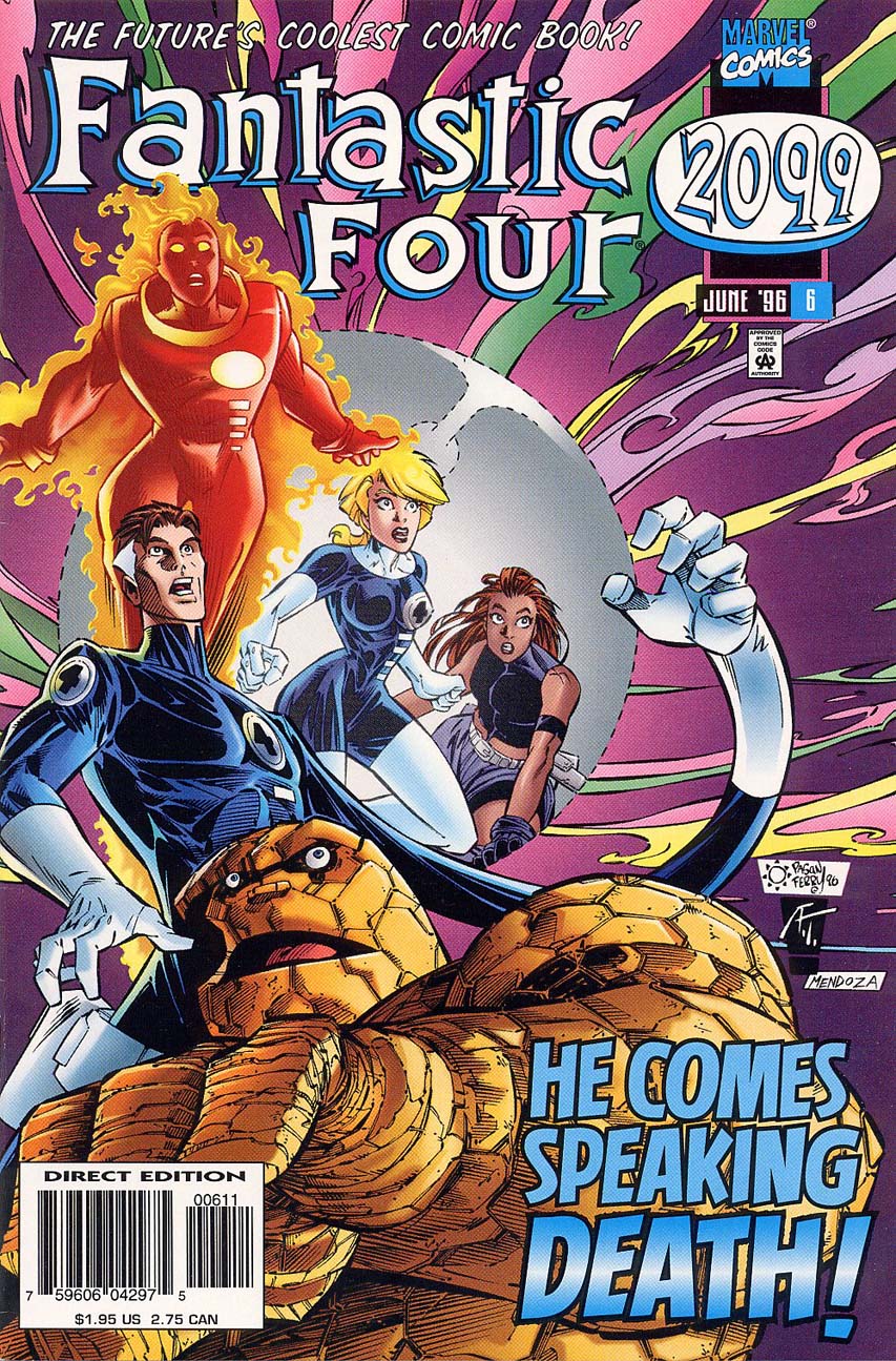
Wow....didn't think anyone besides me even read Fantastic Four 2099. I did like the ones from the Claremont/Larocca run too. Originally Posted by The BaRoN
-
09-22-2017, 07:29 AM #42Ultimate Member
- Join Date
- May 2014
- Location
- Bedford UK
- Posts
- 10,323
Maybe, but their colours are almost invariably blue, black and white, even in the early days the 4 was often on a white circle and the neckline was sometimes black. Originally Posted by AcesX1X
Plus I have a soft spot for Djurdjevic's black and white design, as this was my introduction to the characters, never having read an F4 book until then. Indeed on reflection I would perhaps use the black neckline even if I did use blue for the detailing on the rest of the flight suits.
-
09-22-2017, 08:49 AM #43Extraordinary Member
- Join Date
- Apr 2014
- Posts
- 8,702
i liked them too. personally, i've always thought of the FF suits as functional tools rather than superhero suits. Originally Posted by JKtheMac
-
09-22-2017, 09:51 AM #44Extraordinary Member
- Join Date
- Apr 2014
- Posts
- 7,741
I always liked the inverted dark blue/white suits from Byrnes run more than the traditional black/blue suits.

-
09-22-2017, 10:10 AM #45Astonishing Member
- Join Date
- May 2014
- Posts
- 3,881
Yep, that is who it really looks like.

 Reply With Quote


