

OK here's the second half.
View Poll Results: What is your favorite Detective Comics logo? The Later Years
- Voters
- 27. You may not vote on this poll
-
1989
3 11.11% -
1990
1 3.70% -
1991
3 11.11% -
1993
0 0% -
1996
3 11.11% -
2000
3 11.11% -
2003
9 33.33% -
2011
1 3.70% -
2014
4 14.81%
Results 1 to 12 of 12
-
10-22-2017, 07:04 AM #1Astonishing Member

- Join Date
- Jun 2014
- Location
- Brooklyn, NY
- Posts
- 4,341
 Favorite Detective Comics Logo -- Part 2
-
10-22-2017, 07:07 AM #2Astonishing Member
- Join Date
- Jun 2014
- Location
- Brooklyn, NY
- Posts
- 4,341
Less editorializing this time.
1989
Screen Shot 2017-10-21 at 1.35.41 PM.jpg
1990
Screen Shot 2017-10-21 at 1.36.41 PM.jpg
1991
Screen Shot 2017-10-21 at 1.37.38 PM.jpg
-
10-22-2017, 07:09 AM #3Astonishing Member
- Join Date
- Jun 2014
- Location
- Brooklyn, NY
- Posts
- 4,341
-
10-22-2017, 07:10 AM #4Astonishing Member
- Join Date
- Jun 2014
- Location
- Brooklyn, NY
- Posts
- 4,341
-
10-22-2017, 07:19 AM #5I am a diamond, Ms. Pryde
- Join Date
- Nov 2014
- Posts
- 12,796
Love this poll! The changes in Tec are really linked to a bunch of great stories!
"We're the same thing, you and I. We're both lies that eventually became the truth." Lara Notsil, Star Wars: X-Wing: Solo Command, Aaron Allston
"All that is not eternal is eternally out of date." C. S. Lewis, The Four Loves
"There's room in our line of work for hope, too." Stephanie Brown
Stephanie Brown Wiki, My Batman Universe Reviews, Stephanie Brown Discord
-
10-22-2017, 08:17 AM #6Retired
- Join Date
- Apr 2014
- Posts
- 18,747
I still haven't decided if I'm going to vote in this part, because I prefer the logos on the first part. But 'TEC sure has some great logo designs. The way 2011 leans to the left is really weird, though. Right leaning always seems to be better, but maybe that's a right-handed prejudice.
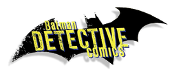
As a matter of principle, I don't like when "Batman" dominates the logo. I understand why they do it--because people are stupid and can't figure out that Batman is the star--although, to be fair, sometimes he isn't. But I like logos such as the 1989 and 1991 designs where "Detective" is the major element.
-
10-22-2017, 09:37 AM #7long time member
- Join Date
- May 2014
- Posts
- 2,625
Not a fan of the New 52, but I like that Detective Comics logo!
Still liking the slant.
 "History of the DC Universe" by Wolfman and Perez, when the DCU use to make sense.
-
10-22-2017, 04:10 PM #8Astonishing Member
- Join Date
- Jul 2014
- Posts
- 4,266
I love this whole game! What fun to vote on the logos! I never would have thought of that but I find I have strong opinions on each and every one of these polls. These sorts of threads make CBR community really fun. Thanks to OP! Originally Posted by millernumber1

-
10-23-2017, 07:10 AM #9Astonishing Member
- Join Date
- Jun 2014
- Location
- Brooklyn, NY
- Posts
- 4,341
I agree completely. And if they have to at least say "...featuring Batman" or "Batman starring in..." Just having "Batman" above "Detective" (or "Superman" above "Action," for that matter) makes no sense to me. My LCS actually alphabetizes them under B and S, which makes me crazy. Originally Posted by Jim Kelly
-
10-23-2017, 09:58 AM #10Ultimate Member
- Join Date
- May 2014
- Location
- Louisiana
- Posts
- 12,302
I don't usually like flat logos because they tend to be uninteresting and with very little to draw attention.
However... I do like 2014's logo, because of the clever use of the Bat-logo, or rather, half of. The absence of half the logo gives a feeling of 'deduction' and 'sleuthing' as does the grunge texturing done with the words.
I also liked the 2000 logo for the same pulp magazine aesthetics."There's magic in the sound of analog audio." - CNET.
-
10-23-2017, 10:27 AM #11Mighty Member

- Join Date
- Apr 2014
- Location
- Dallas, TX
- Posts
- 1,389
1990 for me.
-
11-03-2017, 07:29 AM #12Astonishing Member
- Join Date
- Jun 2014
- Location
- Brooklyn, NY
- Posts
- 4,341
I decided to revive these original polls to see if/how the results differed from the finals. I'm not sure if I should've done multiple rounds or not. Maybe some polling geeks could jump in and tell me what they think.
Again, Detective had to be split in half because there were too many for a single poll. Interestingly, 2003 is way out front here. 1991, the eventual winner, is tied in a pack way down the list. Honorable mention goes to 2014.

 Reply With Quote


