

That was the very first Siegel and Shuster costume and design for the S, featured in Action #1. Part of the inspiration being a police badge. By Action #7 we started the seeds of change with a more triangular look, with a slightly more styled S, and of course it would just continue to evolve from there.
Results 826 to 840 of 1084
-
03-20-2018, 01:04 AM #826Ultimate Member

- Join Date
- Apr 2014
- Posts
- 18,725
 "They can be a great people Kal-El, they wish to be. They only lack the light to show the way. For this reason above all, their capacity for good, I have sent them you. My only son." - Jor-El
-
03-20-2018, 01:29 AM #827Obsessed & Compelled
- Join Date
- Feb 2016
- Posts
- 8,636
That's the S from Action Comics #1 in 1938 Originally Posted by Osiris-Rex

Dammit! Sacred Knight beat me to it!
-
03-20-2018, 07:55 AM #828Ultimate Member
- Join Date
- Apr 2014
- Posts
- 19,547
It was impressive. And I think he's better now than he used to be. But he is one slllloooowwwww artist. Originally Posted by Kuwagaton
Of course, back in the day when I was still doing commercial work, so was I.
Reis made it look good during Throne of Atlantis. And Fabok did great things with it during Darkseid War. Kulder made it look decent in Action. Rocafort made it look okay, though I disliked how slim he drew Superman. Originally Posted by Bored at 3:00AM
Other than them.....I'm drawing a blank, but I'm sure there were others. Probably not many though."We all know the truth: more connects us than separates us. But in times of crisis the wise build bridges, while the foolish build barriers. We must find a way to look after one another, as if we were one single tribe."
~ Black Panther.
-
03-20-2018, 08:58 AM #829Death becomes you
- Join Date
- Dec 2015
- Location
- Memphis
- Posts
- 6,857
Oh, yeah. Now I see it on the cover of Action Comics #1. Originally Posted by Sacred Knight
-
03-20-2018, 03:32 PM #830Fantastic Member
- Join Date
- May 2014
- Posts
- 382
I thought Nicola Scott did a better job drawing the suit in the early issues of Superman in 2011. Part of it was the more traditional way in which she drew Superman's face/hair and the S symbol, and maybe also the placement of the seams, but also things that didn't entirely relate to her work, like the coloring being more vibrant. Originally Posted by Bored at 3:00AM
-
03-20-2018, 03:39 PM #831Ultimate Member
- Join Date
- Apr 2014
- Posts
- 18,725
In spite of creating it Lee probably drew it the worst, in fact, outside of maybe Ha, who made it WAY too bulky. I think most everyone drew it pretty good. Some had some difficulties at first but it didn't take long for them to get the hang of it. Then again I don't hate the base design nearly as much as most here do.
Last edited by Sacred Knight; 03-20-2018 at 03:41 PM.
"They can be a great people Kal-El, they wish to be. They only lack the light to show the way. For this reason above all, their capacity for good, I have sent them you. My only son." - Jor-El
-
03-20-2018, 05:59 PM #832Incredible Member
- Join Date
- May 2014
- Posts
- 773
I love how Fabok did everything he could to make the collar as non-existent as possible. Originally Posted by Ascended

-
03-20-2018, 07:27 PM #833Ultimate Member
- Join Date
- Apr 2014
- Posts
- 19,547
Grrr.....its not even the "its not the classic so therefore it is the devil!!!" thing, its the fact that its just not well done from a design perspective. Originally Posted by Sacred Knight
"We all know the truth: more connects us than separates us. But in times of crisis the wise build bridges, while the foolish build barriers. We must find a way to look after one another, as if we were one single tribe."
~ Black Panther.
-
03-20-2018, 07:30 PM #834Ultimate Member
- Join Date
- Apr 2014
- Posts
- 19,547
It was almost comical how small he played it. I think if he had stuck on the book another year, he would've eventually narrowed it down to nothing. lol Originally Posted by titansupes
Y'know, of all the things that annoyed me about that New52 design, the collar wasn't one of them. I would've changed the lines personally, but the collar in and of itself didn't bother me at all."We all know the truth: more connects us than separates us. But in times of crisis the wise build bridges, while the foolish build barriers. We must find a way to look after one another, as if we were one single tribe."
~ Black Panther.
-
03-21-2018, 04:22 AM #835Maintaining Status Q
- Join Date
- Dec 2016
- Posts
- 301
Jurgens has deliberately gone out of his way to make that Nu52 costume butt fugly.
I don't really rate the guy, but he's a far better artist than that.
-
03-21-2018, 09:39 AM #836Phantom Zone Escapee
- Join Date
- May 2014
- Location
- Planet Houston
- Posts
- 5,360
I don't think he intentionally set out to make it look bad. He's just rendering it to model. It's not his fault the original design model was crap.Generally Jurgens doesn't tend to reinterpret whatever design of which he's drawing. It's not his style to improvise. Same when George Perez and his interpretation. Originally Posted by _Feely_
To make it look good, the various artists that did the best renditions had to take out half the seams, slim and streamline the belt and boots, alter the shield, get rid of the metallic Sheen. ETC.
Yeah, the New 52 suit could look ok, but the original Jim Lee design itself was butt fugly. It took major tweaks to make it look decent.When it comes to comics,one person's "fan-service" is another persons personal cannon. So by definition it's ALL fan service. Aren't we ALL fans?
SUPERMAN is the greatest fictional character ever created.
-
03-21-2018, 10:28 AM #837Ultimate Member
- Join Date
- Apr 2014
- Posts
- 18,725
Looks like he put the same amount of effort into it as all the other looks. All those details were the original design. Other artists improved upon it and simplified it some over the 5 years, but he's drawing straight-up Lee there. The colorist forgot the red trim, though.
:sigh: or what manofsteel already said. Must read better.
"They can be a great people Kal-El, they wish to be. They only lack the light to show the way. For this reason above all, their capacity for good, I have sent them you. My only son." - Jor-El
-
03-21-2018, 01:19 PM #838Incredible Member
- Join Date
- May 2014
- Posts
- 955
His take on the Swan Superman is pretty awesome. The face isn't quite right for Swan, but I really like it anyway. That and his version of Boring are both great interpretations of the character. I prefer those to the most recent incarnations in the image. The "modern" Superman looks weirdly old. I know he's a dad, but still.
That cover is my favorite so far. It's what I expected for an issue this big.Last edited by Jadeb; 03-21-2018 at 01:24 PM.
-
03-21-2018, 03:55 PM #839Extraordinary Member
- Join Date
- Apr 2014
- Posts
- 6,819
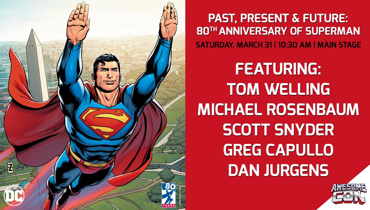
Ad for Awesomecon. Actually really love the trunks costume right here
-
03-21-2018, 04:11 PM #840BANNED
- Join Date
- Feb 2018
- Posts
- 116
Does it bother anyone else that there's no full representation of each era of Superman's history in the main variants? I love Steve Rude's work, but his cover doesn't portray the Superman of AC 1. Allred's manages to beautifully sum up the Silver/Bronze ages, but none of the others reflect anything in particular about their respective eras. I would have loved a recreation of Action Comics #1 for the 30s variant, followed by a 40s variant that sees Superman leaping into the sky with the damaged car beneath him, perhaps facing off against Luthor in one of his weird airplanes. The 50s variant would then be Superman in space going up against Brainiac, and then the 60s gives us Supergirl, the Super Pets, other villains of that era, etc. The 70s could have been Superman fighting himself/Sand Superman with Muhammad Ali waiting in the wings. The 80s gives us a cover with Superman fighting Luthor in his armored suit and then a dividing line of some sort with Byrne's Superman flying away from the Kent farm on the other side. The 90s is Doomsday, the Supermen, Conduit, and Blue/Red, and the 2000s is Superman versus Zod with Gary Frank Brainiac, Atlas, and other villains of that decade waiting their turn. Finally, the standard cover could have been that beautiful Fabok cover that shows Superman triumphant after 80 years of fighting for truth, justice, and the American Way.

 Reply With Quote


