

For those who don't know, Ira Schnapp is one of the most important letters in comics -- if not THE most important. DC never had a house style as far as art and story were concerned, but in terms of lettering, Ira Schapp was the go-to guy at DC Comics for decades until Carmine Infantino fired him around 1968.
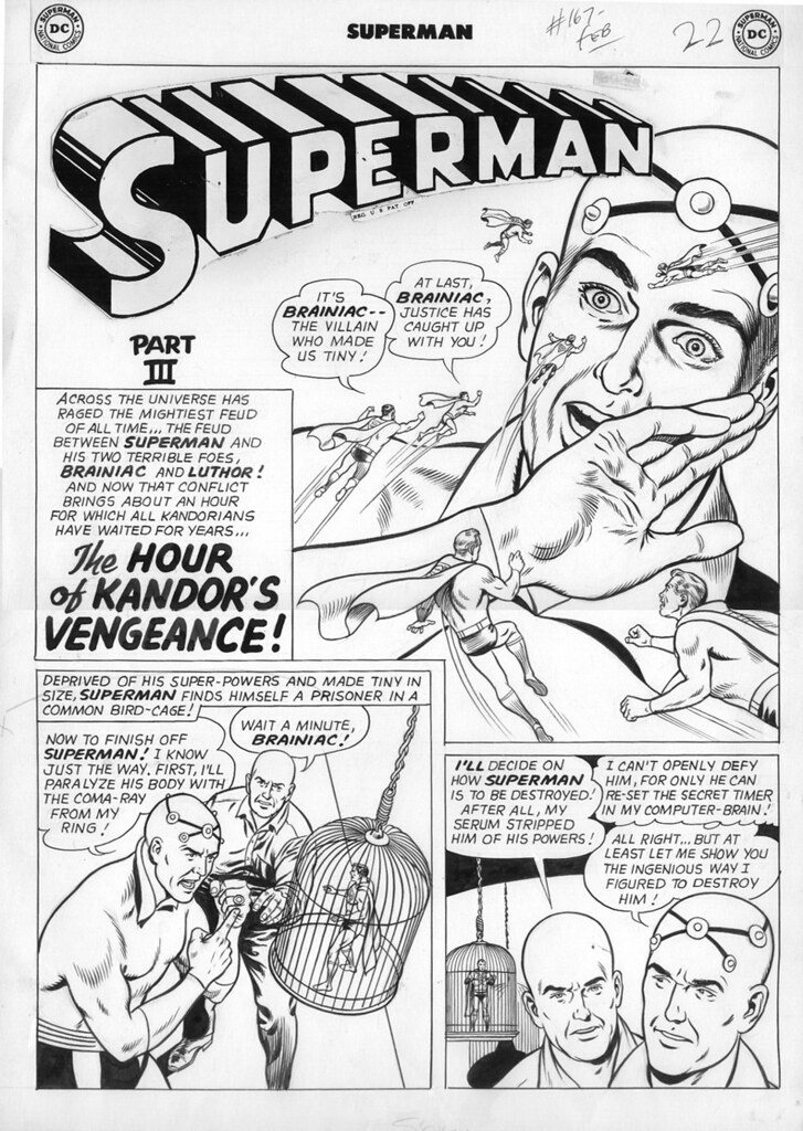
Two of Ira's contributions to comics have become immortal: he designed the Action Comics logo, and refined Joe Schuster's innovative, but crude, Superman logo turning it into the professional looking version that is known around the world. The logo stood basically unchanged from Superman 6 until Superman 385 in 1983 when it was modified with more rounded lettering, which is the way it's been since.
Well, no more, it seems! Bendis' Superman 1 had a house ad this week from DC where the new Superman logo was unveiled. It seems to have the "S" of the 1983 revamp, but the more squarish lettering of the Ira Schnapp version.
Here are the logos so you can see for yourself. You can click on the links or thumbnails to see larger versions. Vote in the poll and post your thoughts as to which you like best!
Ira Schnapp's original Superman logo rendered from Joe Schuster's design:
Super-6-1940.jpg
Superman logo 1983 modification, which has lasted until today:
SUPER-386-1983-new-logo.jpg
Latest modification to Superman logo, which takes elements from Ira's original and the 1983 update:
Superman 1 logo 2018.jpg
View Poll Results: Which version of the Superman logo do you like BEST?
- Voters
- 22. You may not vote on this poll
-
Oh, SCHNAPP! Gotta go with the Ira Schnapp version!
2 9.09% -
Love the 1983 revamp the best!
3 13.64% -
Loving the new one -- combines the best of both!
4 18.18% -
Any of these logs is ok with me!
13 59.09%
Results 1 to 15 of 28
-
07-04-2018, 08:29 PM #1Mighty Member

- Join Date
- Apr 2016
- Posts
- 1,692
 Bendis' Superman series to feature REVISED Ira Schnapp Superman logo???
Last edited by Comic-Reader Lad; 07-04-2018 at 09:44 PM.
-
07-04-2018, 08:34 PM #2Mighty Member
- Join Date
- Apr 2016
- Posts
- 1,692
To illustrate just how important a letterer Ira Schnapp was, here are some of the OTHER DC logos he designed:
action1june1938.jpg
3.TDC-main-wall-1.jpg
To give credit where it's due, I came across a lot of this background info about Ira Schnapp from this website if you're interested in more DC comics history:
https://13thdimension.com/oh-schnapp...o-of-them-all/
-
07-04-2018, 08:53 PM #3Ultimate Member
- Join Date
- Apr 2014
- Posts
- 18,725
I saw this a while back and posted it in the Bendis thread but it never got a response as I think it got lost quickly as the last post of a previous page at the time. But yeah, that really threw me for a loop as it was the last thing I would have thought of them to resurrect.
As for the poll I voted that I liked them all. But I admit when I first became a fan I really disliked the original design. I thought it was a little un-uniform and clunky. In fact I still do but with time it became part of its old-time charm I guess. The 1983 rounded revamp is more streamlined. This new one though seems like a fine melding of both.Last edited by Sacred Knight; 07-04-2018 at 09:05 PM.
"They can be a great people Kal-El, they wish to be. They only lack the light to show the way. For this reason above all, their capacity for good, I have sent them you. My only son." - Jor-El
-
07-04-2018, 09:17 PM #4Astonishing Member
- Join Date
- May 2014
- Posts
- 3,853
I guess I don't see how this is a melding, and not simply the return of the original version of the logo.
Buh-bye
-
07-04-2018, 09:33 PM #5A Wearied Madness

- Join Date
- May 2014
- Posts
- 12,545
I can barely tell much of a difference between them to be honest.
-
07-04-2018, 09:51 PM #6Mighty Member
- Join Date
- Apr 2016
- Posts
- 1,692
The "S" in the new Superman logo is the same as the 1983 revamp, not the Schnapp version. Note the diagonal of the "S" is more diagonal and the "S" overall is tilted in the same direction as the rest of the letters in the Schnapp version. The "S" also overlaps the "u" more in the revamps. Originally Posted by Dispenser Of Truth

-
07-05-2018, 04:58 AM #7Father Son Kamehameha <
- Join Date
- May 2014
- Posts
- 8,755
Whoa I didn't pay attention to the ad, that's an oddly interesting surprise.
-
07-05-2018, 10:49 AM #8Retired
- Join Date
- Apr 2014
- Posts
- 18,747
I was upset when they got rid of the squared off letters, which were always part of the charm of the logo. The initial S bugged me as a kid--I'd stare at it for hours wondering why it was off. But that's also part of the charm. It tells you that a real live person worked on these logos and not some computer. Yet that might also be why they got rid of the old logo. I don't understand all the ins and outs; however, it seems that hand-made lettering is harder to replicate and it's easier to use something that was done in a computer. I still think they could have got closer to the original design, but I'm happy to see them bring back a bit of the unique qualities of the old logo.
-
07-05-2018, 06:09 PM #9Unstoppable Member

- Join Date
- Nov 2015
- Posts
- 2,172
The differences between the two logos are so minor that I like both of them.
Somewhere, in our darkest night, we made up the story of a man who will never let us down.
- Grant Morrison on Superman
-
07-05-2018, 06:46 PM #10Retired
- Join Date
- Apr 2014
- Posts
- 18,747
You probably weren't a little kid who spent hours and hours of his life doing nothing but staring at every page of these comics, examining every line, every dot. I was so fascinated with the Superman logo back in the 1960s that even the cryptic letters that always appeared below seemed just as important as the ending of "Strawberry Fields Forever." Originally Posted by Deku
What did REG U S PAT OFF mean? Now I know that it means Registered U.S. Patent Office--but when I was a kid I didn't know what it meant and yet, because it always appeared with the logo, it seemed to have some great significance.
But it shouldn't be hard for fellow comic book nerds to relate to the passion some of us might have for these logos. You may not be obsessed with them, but dollars to do-nuts, as a comic fan, there's something you're intensely attached to.
Dial B for Blog did a good column on Ira Schnapp and the logo--worth checking out.
-
07-06-2018, 07:00 AM #11Unstoppable Member
- Join Date
- Nov 2015
- Posts
- 2,172
I have never been obsessed over something this small and IMO, insignificant. Originally Posted by Jim Kelly
Somewhere, in our darkest night, we made up the story of a man who will never let us down.
- Grant Morrison on Superman
-
07-06-2018, 08:52 AM #12Retired
- Join Date
- Apr 2014
- Posts
- 18,747
I once took a course on book design with a hightly respected typography designer in the publishing industry who told our class that he got into typography as the result of reading comic books when he was a kid. He was just fascinated by the lettering in comic books, so that became his passion.
-
07-06-2018, 01:37 PM #13Astonishing Member
- Join Date
- May 2014
- Posts
- 2,896
That's super cute, in fact. Also, man, this is some great art. Originally Posted by Jim Kelly
Personally, I think my favorite is actually the pre-Schnapp Joe Shuster version where the letters aren't quite so uniform. I like it so much more than the Schnapp one that honestly changing the logo to the Schnapp version at all strikes me as a mistake.
I also really like the pre-Crisis Superboy logo, and wish that there was a version of that which said "Superman" instead."You know the deal, Metropolis. Treat people right or expect a visit from me."
-
07-06-2018, 02:46 PM #14Unstoppable Member
- Join Date
- Nov 2015
- Posts
- 2,172
I still think it is a minor thing and so I don't care. You are not going to make me change my mind about this. Originally Posted by Jim Kelly
Somewhere, in our darkest night, we made up the story of a man who will never let us down.
- Grant Morrison on Superman
-
07-06-2018, 02:55 PM #15Ultimate Member
- Join Date
- Apr 2014
- Posts
- 18,725
I don't think he's trying to make you care, just pointing out for some people it is an interest.
"They can be a great people Kal-El, they wish to be. They only lack the light to show the way. For this reason above all, their capacity for good, I have sent them you. My only son." - Jor-El

 Reply With Quote


