

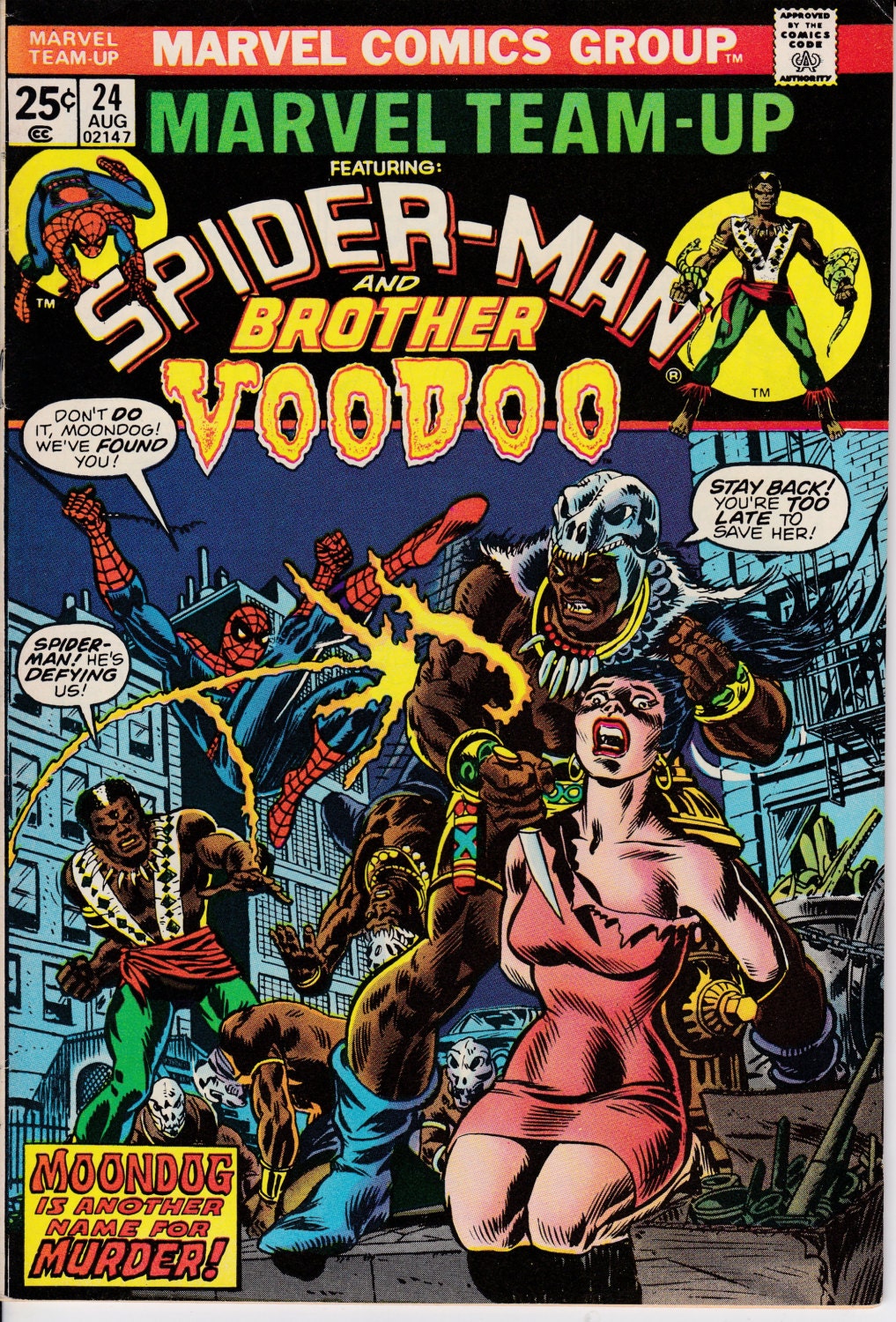
Any notice more diolog bubbles on the covers lately? Not the variant covers, but the actual standard covers.
Its a nice throwback, but I'm just not sure if it works any more these days with how covers are drawn.
Results 1 to 13 of 13
-
09-25-2018, 07:50 AM #1Mighty Member

- Join Date
- May 2014
- Posts
- 1,358
 More dialog bubbles on covers lately?
-
09-25-2018, 08:55 AM #2Son of Satan
- Join Date
- Jul 2015
- Posts
- 982
I've been diggin' it.
Batman - Daredevil
-
09-25-2018, 10:53 AM #3Retired
- Join Date
- Apr 2014
- Posts
- 18,747
Maybe what needs to change is the art not the dialogue balloons. Those painted covers can be so austere and static--and seem to promise what's inside the comic is a Metropoltan Museum of Art exhibition and not a fast-paced, action-packed adventure with people speaking in dialogue balloons all over the pages. Originally Posted by tib2d2

Back in the 1970s, I used to think that the Marvel covers were a little more tacky than the DC covers, because they seemed to have more hype. But in hindsight, I love the way Marvel went for the throat.


-
09-25-2018, 01:07 PM #4Unstoppable Member

- Join Date
- Nov 2015
- Posts
- 2,172
I like it. I think it gives the covers more personality.
Somewhere, in our darkest night, we made up the story of a man who will never let us down.
- Grant Morrison on Superman
-
09-25-2018, 02:20 PM #5Ultimate Member
- Join Date
- May 2014
- Location
- Louisiana
- Posts
- 12,302
Yeah... I'm liking it so far.
I think the trend I hated most on covers was the generic pose covers that was most common with Marvel's Ultimate line.
I think they're perfect for first issues, anniversary issues or on issues of a team book where they have a major line-up change, but I still prefer covers that appear to be a scene from the story inside.
Having story reliant covers helps in associating what story was in which comic and just glancing at the cover can help in remembering key points later."There's magic in the sound of analog audio." - CNET.
-
09-25-2018, 03:21 PM #6Mighty Member
- Join Date
- May 2014
- Posts
- 1,358
Agree, DC has been guilty of some quite misleading covers lately (first one comes to mind is Brainiac on the cover of last month's Detective Comics). I prefer covers that I can pull out past issues and quickly glance at the covers in order and be reminded exactly what was going on at that point in the series. If that makes sense. Originally Posted by Lee Stone
-
09-25-2018, 04:40 PM #7Ultimate Member
- Join Date
- May 2014
- Location
- Louisiana
- Posts
- 12,302
Totally makes sense to me. Originally Posted by tib2d2
"There's magic in the sound of analog audio." - CNET.
-
09-25-2018, 05:03 PM #8BANNED
- Join Date
- Jan 2018
- Location
- Brooklyn
- Posts
- 1,543
 They kept adding verbage to the cover, though, as the size of the books shrank. Reading comics in the 1970's, you wouldn't know how gutted the books became until you went to the conventions and saw real golden age books. Marvel alway had talkative covers, even FF#1. They wanted to scream at you and ahwk the books. Originally Posted by Jim Kelly
-
09-25-2018, 05:05 PM #9BANNED
- Join Date
- Jan 2018
- Location
- Brooklyn
- Posts
- 1,543
It wans't long ago that DC made up a cover and told the writer and artist to produce a story around the cover... Originally Posted by Lee Stone
-
09-25-2018, 05:20 PM #10Retired
- Join Date
- Apr 2014
- Posts
- 18,747
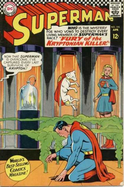
In fact, Cary Bates started out in comics by sending in cover ideas to DC. SUPERMAN No. 195 being one of those--with Curt Swan and George Klein doing the actual cover art, and the lettering by the immortal Ira Schnapp! Another newcomer, Jim Shooter, wrote the inside story inspired by that cover idea. Originally Posted by mrbrklyn
-
09-25-2018, 07:30 PM #11BANNED
- Join Date
- Jan 2018
- Location
- Brooklyn
- Posts
- 1,543
sounds like a current storyline as well Originally Posted by Jim Kelly
 .. Hello Mr Bendis
-
10-02-2018, 04:35 PM #12Seeker

- Join Date
- Apr 2014
- Posts
- 1,365
I couldn’t have put it better myself. Originally Posted by Deku
Pull List: Currently Empty
-
10-02-2018, 10:19 PM #13Extraordinary Member
- Join Date
- Mar 2018
- Posts
- 9,574
I get the personality argument, but I still don't like it because the texts tend to make me cringe, especially if the tone of the book doesn't match the cover. If the book is supposed to be campy then it fits, but if it tells a tragedy, horror or serious story, no.

 Reply With Quote


