

It's all good.Originally Posted by Mr MajestiK

Results 1,606 to 1,620 of 11160
Thread: Black Panther Appreciation 2019
-
02-07-2019, 04:33 PM #1606Old-School Otaku

- Join Date
- May 2014
- Posts
- 4,986

-
02-07-2019, 04:48 PM #1607Uncanny Member
- Join Date
- Apr 2014
- Posts
- 31,711
I think guys like BP, Spider-Man and Wolverive often leap at an opponent when they attack them. So croaching is probably somewhat of a default battle stance. Originally Posted by Cville
-
02-07-2019, 05:12 PM #1608Get Hectic!
- Join Date
- Apr 2014
- Location
- Los Angeles, CA
- Posts
- 1,388
The Revolution will not be televised...

Get Hectic!
-
02-07-2019, 05:14 PM #1609Ultimate Member
- Join Date
- Oct 2015
- Posts
- 14,262
Nah eff that, give me the MCU silver accents, have him be shining like he was in Priest era. Originally Posted by Rumble
My issue is this. Artist have no problem drawing cap thor, Ironman, with full details no problem, hell even Spiderman has more intricacies to his costume and they have no issue's drawing that. But for T'Challa? Nah he gotta look like a shadow with eyeballs, and sometimes he gets his necklace.
That red solar flare and the lighting up accent's when charging up the Force push should always be on display.. as silver then light up a different color depending on the tech being used. No more excuses dammit
-
02-07-2019, 05:37 PM #1610Extraordinary Member
- Join Date
- Sep 2016
- Posts
- 5,860
He looks better without the necklace because they get iffy panel to panel. lol Originally Posted by Ezyo1000
I like that image you used to start the tread. When they shadow it right, it looks better than with accents.Last edited by Cville; 02-07-2019 at 05:48 PM.
-
02-07-2019, 05:55 PM #1611Invincible Member
- Join Date
- Apr 2014
- Location
- Florida
- Posts
- 21,825
Originally Posted by Ezyo1000
well hot damn, I didn't even thinka bout that lol
I demand equality!Black Panther Discord Server: https://discord.gg/SA3hQerktm
T'challa's Greatest Comic Book Feats: http://blackpanthermarvel.blogspot.c...her-feats.html
-
02-07-2019, 05:59 PM #1612Invincible Member
- Join Date
- Apr 2014
- Location
- Florida
- Posts
- 21,825
I mean shit, this artist was able to put accents


That is not too much to ask lolBlack Panther Discord Server: https://discord.gg/SA3hQerktm
T'challa's Greatest Comic Book Feats: http://blackpanthermarvel.blogspot.c...her-feats.html
-
02-07-2019, 06:53 PM #1613Ultimate Member
- Join Date
- Oct 2015
- Posts
- 14,262
With A list writer's you can get away with all black and it's okay. But at this point I demand the MCU/Pantherjack makeover, he is knew if the easiest heroes to draw because his basic design. Give him some accents, even if it's just on the mask Originally Posted by Cville
It's really not. Very simple but makes a big difference. Originally Posted by MindofShadow
But at this point I want that Avengers level detail like the solar flare panel!
-
02-08-2019, 04:11 AM #1614Astonishing Member
- Join Date
- Aug 2016
- Posts
- 2,486
For me personally, I think accents (silver or purple) running around the suit would be nice, but unless they aren't a standardised design, I wouldn't blame artists that ditch them altogether. I guess we could qualify Stelfreeze's depiction of the kinetic energy thing as the standard, but they're far more complicated than checkers or hexagons (like Spidey's suit) and overall I think they look better when they pop out for a reason.
To be honest, I think a simple looking habit can actually work depending on the artist and how they choose to depict it.


Aside from stiff looking action and some weird depiction of T'Challa's feet in the suit, I thought Stelfreeze nailed a simple looking BP suit, probably because of how much his musculature used to show through the suit. When it's really done right, it looks powerful, sleek, techy and intimidating. Likewise the second artist with the colouring and shading really makes the suit look good in my opinion.
Compare that to something like this...
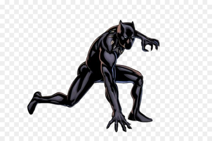
...which is just plain boring. It's just T'Challa in a full body plain catsuit with eyes and a necklace. Hell sometimes we don't get the necklace as pointed out (and we should because it at least gives off the air of an African king/warrior, and sometimes I wished it did look more like a necklace on him by hanging lower down his chest and not just around his shoulders and collarbones).
-
02-08-2019, 04:23 AM #1615Astonishing Member
- Join Date
- Aug 2016
- Posts
- 2,486
...But if you ask me, how I really want T'Challa's suit to look all the time in comics is the way Kenneth Rocafort who drew The Ultimates for a while depicted it.


I personally think this design is perfect (or at least the top half which is shown more is). The necklace design, the silver teeth/claw armbands, the teeth/claws on the lower arms, the subtle design lines going through out the suit and the armour plating, the accents on the helmet, the panther inspired nose and mouth. Only thing I'd add which I didn't see in Rocafort's art are the silver waist things the current MCU suit has and teeth/claws on the top of the boots with ninja style/tabi toes.
-
02-08-2019, 04:40 AM #1616Astonishing Member
- Join Date
- Aug 2016
- Posts
- 2,486
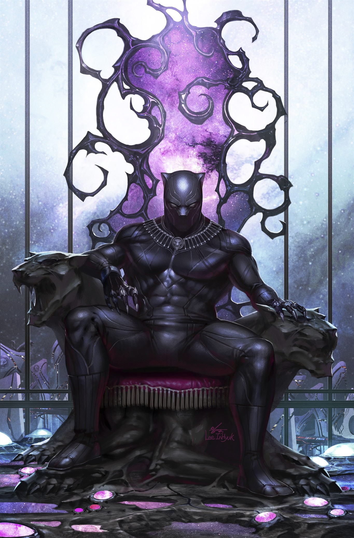
I also really like how artist Lee InHyuk drew the suit with details (except for the gloves, don't like what was going on there and should have kept it simple)

-
02-08-2019, 04:44 AM #1617Astonishing Member
- Join Date
- Aug 2016
- Posts
- 2,486
Other ways a simple looking suit can look good


I think at the very least we should get the necklace (and I have to admit Stelfreeze's design has grown on me a lot), the stripped gauntlets and boots. I really like how the claws look on the first image.
My Google Image searching told me though that T'Challa has some great cover and variant cover art but the art in his own book and panels leave a lot to be desired. I think that's another problem.Last edited by Blind Wedjat; 02-08-2019 at 04:52 AM.
-
02-08-2019, 05:09 AM #1618Uncanny Member
- Join Date
- Apr 2014
- Posts
- 31,711
I think the glowing accents should be there when he's using the force push abilities. its a visual indicator of what he's doind (or about to do). That goves them a practical storytelling purpose beyond aesthetics. Originally Posted by MindofShadow
-
02-08-2019, 05:15 AM #1619Invincible Member
- Join Date
- Apr 2014
- Location
- Florida
- Posts
- 21,825
Plain black can look good if there is artistic detail thrown in like some of your examples Blind. Like the Rocafort stuff is just damn good art.
Stuff like this:

Is just freaking lazy.
I don't even need super stylized tribal stuff like the movie. But even just subtle stuff like:

goes a long way IMO.
I really don't buy that Spider-Man's costume is inheritedly easy to draw because its just "hexagons" or whatever. Sure it is just "webs" when he is static and standing there but during his acrobatic combat scenes, those webs become different shapes and artist have no problem making it work. But throwing a little accents on BP's mask suddenly becomes this daunting, impossible task.
I just want artist to put the same level of work they put into BP as anyone else instead of going, "whew, I just spent 3 hours on Iron Man, now I can just throw some black on t'challa ot catch up"Black Panther Discord Server: https://discord.gg/SA3hQerktm
T'challa's Greatest Comic Book Feats: http://blackpanthermarvel.blogspot.c...her-feats.html
-
02-08-2019, 06:26 AM #1620Astonishing Member
- Join Date
- Apr 2015
- Location
- Haha
- Posts
- 3,848
Double stuffed oreo life baby! Originally Posted by dkrook
Oh... wait.. no that doesn't compute like i thought it would. oh my
It's refreshing to see them getting along Originally Posted by Tony Stark
The civil war ones? Those were bad ass but the movie suit grew on me (i wasn't feeling it when it first debuted). The movie suit had accents but mostly darker shade with only some silver. Originally Posted by Ezyo1000
I lean more with BlindW in that I like it really illuminated when kinetically charged, for the significance factor. But I do feel it's lazy to not give him any accents, especially in the mask. Even the panther quest animators gave him that.
Hell, you could take the image above, do away with all the shades of gray and just keep the silver accent parts (nose/forehead, necklace, gauntlets, waist) and it would be a big improvement. And not nearly as time-consuming as spider-man's suit is.Black Panther vs Thor
https://www.youtube.com/watch?v=baO2V3qTuMc&t=3s
Ref: Avengers Assemble Season 5: Black Panther Quest Ep13

 Reply With Quote


