

Jason facepalming like no one is a classic at this point.Originally Posted by Sergard

Results 3,916 to 3,930 of 4267
-
12-06-2019, 04:13 PM #3916Caperucita Roja

- Join Date
- Feb 2018
- Posts
- 3,762

-
12-06-2019, 04:24 PM #3917Astonishing Member
- Join Date
- May 2014
- Posts
- 4,171
I guess Pantalena is the cover artist for issue 43.
-
12-06-2019, 10:09 PM #3918Extraordinary Member
- Join Date
- Mar 2018
- Posts
- 9,574
Movement's stiff but otherwise good, it reminds me of those old Batman movie adaptation comics in the 90s. They also tend to have stiff poses and movements as if they're drawn by following a screenshot. Originally Posted by Sergard
By the way what are you guys best and worst Red Hood costume?
My favorite is the classic Under The Red Hood black leather jacket white shirt red helmet combo and the brown jacket black armor/tights red helmet (without the lips)
(I kinda want to see what the brown jacket black armor looks like if he wears tights all the way instead of cargo pants. Probably not as good though since it will be top heavy)
The current one looks really well drawn with a full head of hair and muscular Jason, because that short sleeves work really well with muscular arms, though the logo not so much because tzitzi said it looks like Madagascar penguin and I can't unsee it.
I also really like the mob boss suit with the Mortal Kombat mask and domino mask combo that one variant cover shows.
Least favorite is the Morrison Batman and Robin era, though I dig the red guns, and of course Battle for The Cowl
Don't really like Wingman either. So bulky, and of course I don't like the lips helmet or the Iron Man helmet since it reminds me of Iron Man
Don't really like the DC YOU costume unless Rocafort draws it because the fold in his vest-hood-jacket thing makes him look fat sometimes.
I find the Arkham Knight costume too complex and has so many busy details so I don't like that either.Last edited by Restingvoice; 12-06-2019 at 10:17 PM.
-
12-06-2019, 10:58 PM #3919Astonishing Member
- Join Date
- May 2014
- Posts
- 4,171
My favorite costume is Medri's, the vest and the cargo pants make for a utilitarian approach while the helmet has the perfect amount of detail without going Handsome Squidward.
Then is a tie between the Rebirth and the N52 (sans handsome Squidward helmet of course)
The UTRH one
Then Woods' Poor man Ermac
A power gap
Morrison's Pill Helmet.
-
12-06-2019, 11:02 PM #3920Caperucita Roja
- Join Date
- Feb 2018
- Posts
- 3,762
Mine would be the look he had in Countdown, which isn't much different from the UtH one.
I like Morrison's red hood costume, it's pretty in my eyes, even if it's, er, absolutely not practical, and tone deaf for the character previous story and tone (what a surprise). His Batman costume in BftC was awful.
I like a lot of lots the Rebirth one, way better than the one he had in N52 even when they're really look alike. I have a neutral opinion about the RH/A costume, and I love the Arkham Knight costume but I dislike the white and red Red Hood costume in the DLC. I don't like Wingman's costume, and I've grown to like the current look. The formal suit in the previous arc was stylish, loved it. I don't like the Hush design a lot, but coats are cool. And I'm neutral to the costume for the 3 Jokers.
-
12-07-2019, 02:39 AM #3921Don't Bully a Hurt Dragon
- Join Date
- Jun 2018
- Posts
- 2,909
Indeed. Iconic facepalm: Originally Posted by Zaresh
Batman Robin 10 Jason Todd facepalm.jpg
-
12-07-2019, 05:16 AM #3922Don't Bully a Hurt Dragon
- Join Date
- Jun 2018
- Posts
- 2,909
-
12-07-2019, 07:05 AM #3923All-New Member

- Join Date
- Jul 2017
- Posts
- 15
That's beautiful but kinda reminds me of Mortal Kombat!
-
12-07-2019, 08:40 AM #3924Don't Bully a Hurt Dragon
- Join Date
- Jun 2018
- Posts
- 2,909
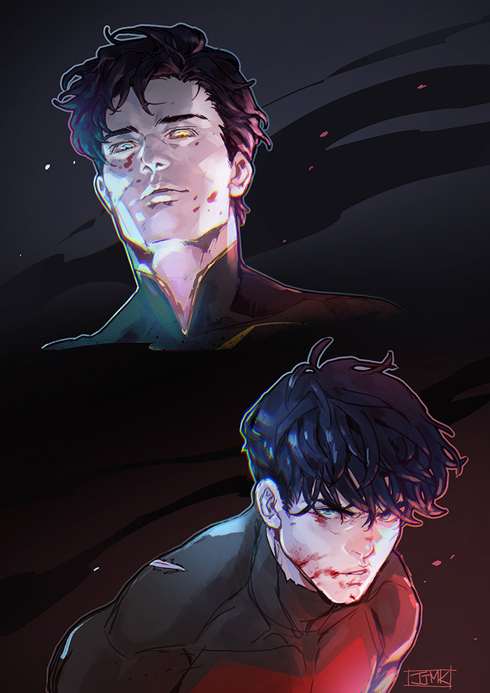
JJMK (Talon Dick and Jason)
-
12-07-2019, 08:47 AM #3925Astonishing Member
- Join Date
- May 2014
- Posts
- 4,171
Ultimately that is the biggest problem of Woods' design, unless is colored, the first thing that brings to mind is MK ninjas. Lacks on its own of anything that really brings up to mind Jason or Red Hood. Having the Red Bat would've helped immensely with that, but they had to go with that dumb emblem that is meaningless. Originally Posted by hova4life
-
12-07-2019, 09:12 AM #3926Anyone. Anywhere.Anytime.
3.jpg "Arsenal's Avatar")
- Join Date
- Jan 2017
- Posts
- 3,266
Woods’ proposed Prince of Gotham design reminds me of Tony Stark.
-
12-07-2019, 09:40 AM #3927Don't Bully a Hurt Dragon
- Join Date
- Jun 2018
- Posts
- 2,909
-
12-07-2019, 12:12 PM #3928Don't Bully a Hurt Dragon
- Join Date
- Jun 2018
- Posts
- 2,909
I wonder when or if Alfred's fate will be mentioned in RH:O.
nockuth
-
12-07-2019, 12:22 PM #3929Ultimate Member
- Join Date
- Sep 2017
- Posts
- 10,445
You can be sure someone will get a bullet in them for it. Originally Posted by Sergard
-
12-07-2019, 12:33 PM #3930Don't Bully a Hurt Dragon
- Join Date
- Jun 2018
- Posts
- 2,909
Like who? Originally Posted by Jackalope89
I just hope that Artemis and Bizarro will be back (to normal) when Jason gets the news.
He'll need the emotional support.


