My guess would be that the artist used Bruce' height as reference value and then chose some comic panels to determine the height of the Robins.Originally Posted by Aahz

At least Jason was very tiny in his post-crisis introduction compared to Bruce.
Results 1,471 to 1,485 of 4267
-
04-19-2019, 07:27 AM #1471Don't Bully a Hurt Dragon

- Join Date
- Jun 2018
- Posts
- 2,909

Last edited by Sergard; 04-19-2019 at 07:29 AM.
-
04-19-2019, 07:37 AM #1472
-
04-19-2019, 07:56 AM #1473Extraordinary Member
- Join Date
- Oct 2015
- Posts
- 9,376
But i would like to know which pnels were used. Originally Posted by Sergard
The Heights are often very inconsistent even in one and the same comic. These Panels are from the same comics as yousr just a couple of pages later, and here Jason reaches almost to the hight of Bruce rip cage, while in the the ones you postet he is barly above Bruce Belt.
Batman 408.jpg
-
04-19-2019, 08:50 AM #1474Don't Bully a Hurt Dragon
- Join Date
- Jun 2018
- Posts
- 2,909
-
04-19-2019, 09:07 AM #1475Ultimate Member
- Join Date
- Sep 2017
- Posts
- 10,445
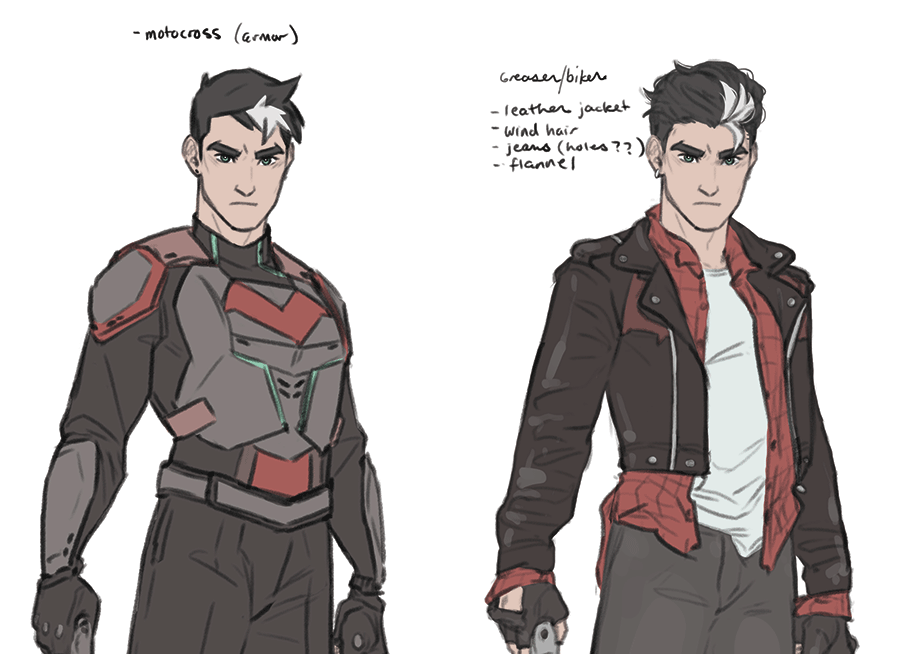
Motocross and greaser look best, from a personal point of view. Street, never been a fan of that hairstyle, and Jason has never struck me as a "thot".
-
04-19-2019, 09:39 AM #1476Astonishing Member
- Join Date
- May 2014
- Posts
- 4,171
I am glad DC never cares for fan redesigns because jeez, those are bad.
-
04-19-2019, 09:42 AM #1477Anyone. Anywhere.Anytime.
3.jpg "Arsenal's Avatar")
- Join Date
- Jan 2017
- Posts
- 3,266
Yeah, I’m not feeling any of them either. Originally Posted by Dark_Tzitzimine
-
04-19-2019, 09:52 AM #1478Extraordinary Member
- Join Date
- Mar 2018
- Posts
- 9,574
The greaser one just need a little touchup but the motocross one's just Keith from Voltron ^^ Originally Posted by Sergard
The THOT one made me laugh XD
-
04-19-2019, 12:05 PM #1479Astonishing Member
- Join Date
- Apr 2014
- Location
- SouthEast Tennessee
- Posts
- 4,650
That number 3 is um...awesome. lol. He would do just as well with out the top altogether. Originally Posted by Sergard
-
04-19-2019, 12:08 PM #1480Ultimate Member
- Join Date
- Nov 2016
- Posts
- 11,006
What!? You want peps to see his nips? Originally Posted by OBrianTallent
I like the Biker best.
Lol at that visible happy trail in that Thot Design. Also what do they mean part Dick Grayson?Last edited by dietrich; 04-19-2019 at 12:11 PM.
-
04-19-2019, 12:19 PM #1481Astonishing Member
- Join Date
- May 2014
- Posts
- 4,171
You guys realize that other than number 3, the "redesigns" are just mix and match of Arkham Knight (Number 2) and Injustice's (Number 1) designs, right?
-
04-19-2019, 12:31 PM #1482Caperucita Roja
- Join Date
- Feb 2018
- Posts
- 3,762
And for whatever reason, the "Thot" design reminds me of the designs Harley has nowadays. Originally Posted by Dark_Tzitzimine
-
04-19-2019, 12:33 PM #1483Ultimate Member
- Join Date
- Nov 2016
- Posts
- 11,006
Number 4 is the best of the mix. I mean it's not like them them being recycled is a bad thing. They are fan ideas based on those outfits. Originally Posted by Dark_Tzitzimine
Last edited by dietrich; 04-19-2019 at 12:35 PM.
-
04-19-2019, 02:52 PM #1484Don't Bully a Hurt Dragon
- Join Date
- Jun 2018
- Posts
- 2,909
Can you maybe be a little more disrespectful towards the artist? Originally Posted by Dark_Tzitzimine
If you don't like the designs, fine. But there is no need to be so rude/to belittle the artist's work. The only bad thing here is your behavior.
Since when are we criticizing fan artworks on the same level like official DC artworks?
This artist doesn't get paid to draw Jason. She just loves the character and enjoys making those designs - and shared them on her twitter so that other people can also enjoy them.
-
04-19-2019, 03:33 PM #1485Caperucita Roja
- Join Date
- Feb 2018
- Posts
- 3,762
Just in case, in my case, I want to make it clear that I didn't mean to be disrespectful to the artist. I was just agreeing in that the design were reminiscent of the AK designs (and they are, probably on purpose). And the last one reminded me of current Harley's (and I think that's on purpose too).