Lucas Werneck redesigned X-Men. Some unusual color choices in there, Yellow for Colossus and Iceman and Angel hmmm....
http://x-menfilms.com/blog/2020/02/2...ncept-artwork/

Results 406 to 420 of 433
-
11-02-2020, 12:48 PM #406Astonishing Member

- Join Date
- Nov 2014
- Posts
- 4,841

-
11-02-2020, 05:08 PM #407Astonishing Member
- Join Date
- Aug 2018
- Location
- Essex County, NJ
- Posts
- 2,972
Why did he give Gambit that hairstyle? Shaved sides and a man-bun? Ugh.
That being said, I really like the redesigns of Magik and Jubilee, and Cyclops' facial hair.
-
11-02-2020, 09:43 PM #408Astonishing Member
- Join Date
- Nov 2014
- Posts
- 4,841
"Ugh" would seem to very on brand for Remy. He's uber-douche bro-y. Originally Posted by CellarDweller


-
11-02-2020, 09:45 PM #409Astonishing Member
- Join Date
- Nov 2014
- Posts
- 4,841
Bringing over from the Jean Grey Mini-dress discussion...er Appreciation Thread...
\\ Originally Posted by Peanutsinspace
Originally Posted by Thirteen
-
11-05-2020, 06:39 AM #410Astonishing Member
- Join Date
- Nov 2014
- Posts
- 4,841
I was reminded of the Kia Asimaya (and Chuck Austen) period of X-design over in the Northstar thread...
They were the second round of designs attempting to be counterparts to the Frank Quitely/Morrison New X-Men book X-esthetic.


Last edited by Thirteen; 11-05-2020 at 07:37 AM.
-
11-05-2020, 06:49 AM #411Astonishing Member

- Join Date
- May 2014
- Posts
- 2,426
Those Lucas Werneck designs are gorgeous. I'd love to see the MCU X-Men look like that.
-
11-05-2020, 11:21 AM #412Sarveśām Svastir Bhavatu
- Join Date
- May 2018
- Posts
- 14,048
I remember loathing those Asimaya designs, vehemently. And they still look like rubbish.
Lord Ewing *Praise His name! Uplift Him in song!* Your divine works will be remembered and glorified in worship for all eternity. Amen!
-
11-05-2020, 08:09 PM #413Astonishing Member
- Join Date
- Apr 2014
- Location
- SouthEast Tennessee
- Posts
- 4,641
Same here! Like everything else from that run! Originally Posted by Devaishwarya
-
11-05-2020, 08:18 PM #414Astonishing Member
- Join Date
- Apr 2014
- Location
- SouthEast Tennessee
- Posts
- 4,641
I love these. I never thought about Cyke with facial hair but he could be quite sexy. Originally Posted by Thirteen
-
11-20-2020, 07:44 AM #415Astonishing Member
- Join Date
- Nov 2014
- Posts
- 4,841
Re-visiting the NYX (remember that title) that could have been by Brian Wood and artist David Choe, starring Rogue, Gambit, and Jubilee along with new characters.
The concept is attributed to then head honcho Bill Jemas:
"I have a very specific ideas about NYX, a story about mutants living in the underbelly of New York," Jemas said. "These are not flashy mutants like the X-Men or villains with great powers; these are mutants with hardly noticeable abilities who just want to get by. That's a story we have not told."
The concept was overtaken by Quesada and Josh Middleton (et al) run with new character Kiden, Tatiana and introducing X-23 to the printed page.
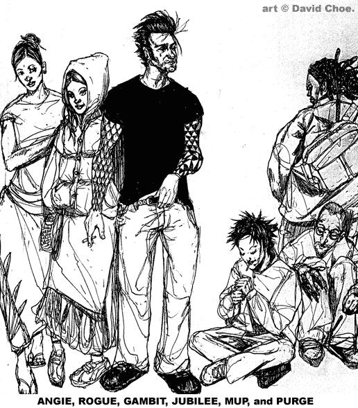
http://muertoz.blogspot.com/2014/10/nyx-max.html
-
11-20-2020, 08:45 AM #416Astonishing Member
- Join Date
- Nov 2014
- Posts
- 4,841
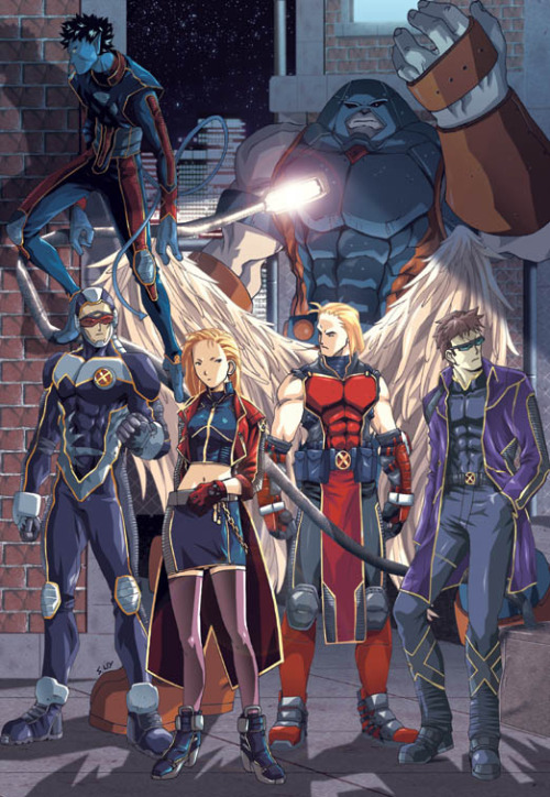
I was already tenderized by the Ian Churchill designs that preceded them. Where it was decided that Angel needed costume attachments so that he could perform mass air rescue support (not taking into account his hollow bones and bird physiology that would make that a difficult prospect), Nightcrawler went into full collared priest mode, and Iceman favored layering a Hawaiian shirt under his field togs. Originally Posted by Devaishwarya
An interesting attempt to be a coordinated, but independent, counterpart to the Quitely suits over in NEW X-MEN during the same period.


The interim work by Ron Garney was a reasonable palette cleanser.

-
11-20-2020, 12:24 PM #417Sarveśām Svastir Bhavatu
- Join Date
- May 2018
- Posts
- 14,048
Oh. My. Goddess. What is seen can never be unseen. Nor easily forgotten. (Garney certainly tried to make some sense of all that rubbish but still...lawdha'mercy!)
Lord Ewing *Praise His name! Uplift Him in song!* Your divine works will be remembered and glorified in worship for all eternity. Amen!
-
11-20-2020, 12:27 PM #418Invincible Member

- Join Date
- May 2014
- Posts
- 27,953
I liked the Churchill designs for the most part. The Garney looks were so bland and lackluster
-
11-20-2020, 08:58 PM #419Better than YOU!
- Join Date
- Apr 2014
- Posts
- 7,492
The only thing from any of those designs I liked was iceman's Hawaiian shirts. I don't even like the shirt itself. I just like the fact that when the team decided to wear matching leather outfits iceman apparently went "fine, but I'm wearing a Hawaiian shirt with mine."
-
11-21-2020, 06:57 AM #420Astonishing Member
- Join Date
- Nov 2014
- Posts
- 4,841
Maybe Bobby and Jean went shopping together off-panel? Logan already had his evil-mutant beater tank top in his closet already... Originally Posted by Alan2099