Originally Posted by Devaishwarya

Im pretty sure thats Xorn wearing his NXM leather jacket there

Results 301 to 315 of 433
-
05-13-2020, 06:15 PM #301Invincible Member

- Join Date
- May 2014
- Posts
- 28,136

-
05-13-2020, 06:19 PM #302Sarveśām Svastir Bhavatu
- Join Date
- May 2018
- Posts
- 14,093
Touche.
I stand corrected...I completely missed him there.Lord Ewing *Praise His name! Uplift Him in song!* Your divine works will be remembered and glorified in worship for all eternity. Amen!
-
05-13-2020, 06:27 PM #303BANNED
- Join Date
- Jan 2020
- Posts
- 4,026
okay you kinda destroyed me here, touche and well played Originally Posted by Havok83
-
06-08-2020, 12:14 PM #304Astonishing Member
- Join Date
- Nov 2014
- Posts
- 4,925
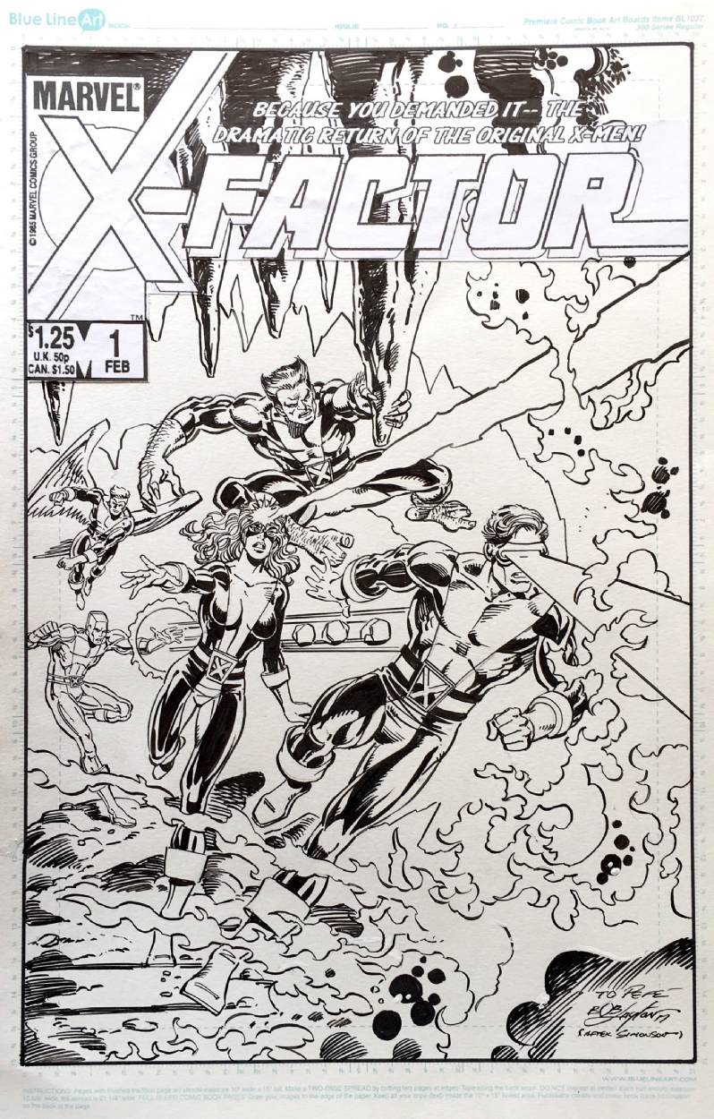
Bob Layton’s preliminary designs for the O5 for the Original X-FACTOR


-
06-08-2020, 12:32 PM #305Invincible Member
- Join Date
- May 2014
- Posts
- 28,136
Those are pretty lazy as they are nothing more than recolored versions of their original uniform. Wouldnt have been a good look since the New Mutants were wearing these designs Originally Posted by Thirteen
-
06-08-2020, 12:55 PM #306Astonishing Member
- Join Date
- Nov 2014
- Posts
- 4,925
More like they were all imitating Angel’s costume with the uniform stripe from torso to upper leg. First time red was introduced into Cyclops look in a prominent way (Stealing Beast’s color scheme). It looked like a mistake initially. And also the no skullcap idea for Scott. Originally Posted by Havok83
Speaking of head gear, I never thought about it but was Warren the first character to sport the headsock look?

-
06-08-2020, 01:51 PM #307Mighty Member
- Join Date
- Jul 2019
- Posts
- 1,576
warren definitely looked the best . Scott looked plain bad and the rest just looked basic/forgettable. Who approved red, yellow, AND navy all at once ? lol the redesigns they got later on were elite
can't lie though they look all super fresh in the uncoloured pic. Classic, clean-cut n all that. Layton was no slouch
-
06-09-2020, 11:24 PM #308Astonishing Member
- Join Date
- Nov 2014
- Posts
- 4,925
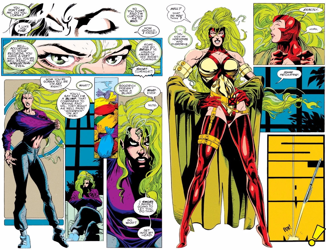
Remembering Lorna’s body dysmorphia costume change and when it got reversed...
-
06-10-2020, 02:09 AM #309Ultimate Member
- Join Date
- Feb 2017
- Posts
- 11,211
I think the best part of X-Statix was the character designs. I mean when you kill off that many main cast you NEED to make each character distinct I guess, and in that regard it was good.
gingen2.jpg
Gin Genie! Most of you would need to look her up on a wiki to have any idea who she was. But her look is subtly distinctive enough that you know you DON'T recognize her.
-
06-10-2020, 04:07 AM #310Extraordinary Member
- Join Date
- Apr 2016
- Posts
- 5,733
She was due for a new look(s), though neither were any good. What stands out to me is the costume that followed these, with the shorter hair and looser top. Originally Posted by Thirteen
B14051B7-214F-483F-910D-F7E839E0C716.jpg
-
06-10-2020, 06:12 AM #311Mighty Member
- Join Date
- Jul 2019
- Posts
- 1,576
is it bad that I love the red and gold costume in all its shameless tacky 90s glory ?? perhaps . I wish when they "updated" it like 4 issues later they'd kept the same colour scheme but nonetheless Its a cute look. Originally Posted by Thirteen
-
06-10-2020, 06:37 AM #312Ultimate Member
- Join Date
- May 2014
- Location
- Minnesota
- Posts
- 11,433
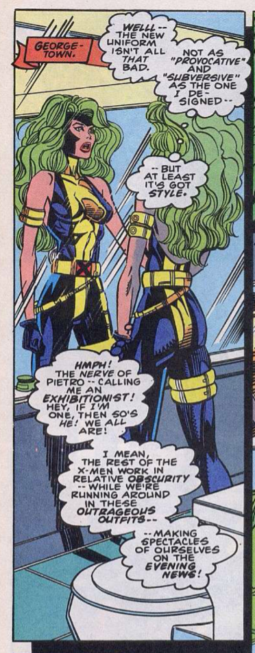
Ha ha ha her nonsense dual belt with leg strap thing and the standing on her tippy toes, sans heels is hilarious.
-
06-10-2020, 06:59 AM #313BANNED
- Join Date
- Mar 2016
- Posts
- 6,666
That happened a lot at the time. Were artists tracing from women wearing heels? Originally Posted by Fokken
-
06-10-2020, 08:16 AM #314Mighty Member
- Join Date
- Feb 2020
- Posts
- 1,781
I know some artists like J Scott Campbell who still draw tippy toes like that. I guess they consider it an attractive stance? Originally Posted by Maestroneto
-
06-10-2020, 08:18 AM #315Invincible Member
- Join Date
- May 2014
- Posts
- 28,136
I hated that look Originally Posted by CRaymond