
That makes quite a case for her Golden Age look!Originally Posted by Lee Stone

(Stanley Lau, or Artgerm, Catwoman #12 variant cover)
Results 76 to 90 of 140
-
03-15-2019, 11:25 PM #76Spectacular Member

- Join Date
- Jul 2014
- Posts
- 175

-
03-16-2019, 12:26 AM #77Extraordinary Member
- Join Date
- May 2017
- Posts
- 5,193
I think the BTAS design is the best.
-
03-16-2019, 07:10 AM #78Uncanny Member
- Join Date
- May 2014
- Posts
- 29,974
Actually, I think that slit is a little too high, and the front of the outfit is cut a little too low. Originally Posted by atomicbattery
A little less exposure would make it look a lot sexier to me. This much exposure starts getting too close to "cheap" and "low-class" for Selina.
-
03-16-2019, 08:36 AM #79Extraordinary Member
- Join Date
- Mar 2018
- Posts
- 4,875
I recently read Call For Comments: She-Ra and the Male Gaze – To Sexy or Not TOO Sexy, That is the Question…, and it touches a bit on some of the tension here. Originally Posted by Lee Stone
Because the purple dress is sexy, but it is not only that. It carries a bit of glamour. Catwoman wears it because it makes her feel good or strong or capable, and it shows in how she is presented as active and assertive. Her command of her own sexuality was an important part of that, but it was clear it was her own sexuality. Lee Stone posted a good image that I think illustrated that:

But here she is positioned differently. Her bosom is the centre of the image, and she is positioned as an object to look at, not a person trying to accomplishing something for herself. The front half of her skirt isn't between her legs, but moved to the side, and much of her bottom is also exposed; not because she moves but because of the way she is positioned. To me, this is an image rooted in the male gaze and which lets the sexualisation overwhelm everything else about the character.
(And then we have the thing with her breasts nearly as large as her head and thighs wider than her waist, but I digress.)Last edited by kjn; 03-16-2019 at 11:08 AM.
«Speaking generally, it is because of the desire of the tragic poets for the marvellous that so varied and inconsistent an account of Medea has been given out» (Diodorus Siculus, The Library of History [4.56.1])
-
03-16-2019, 10:44 AM #80Spectacular Member
- Join Date
- Jul 2014
- Posts
- 175
Wow.
I feel bad now.
A commenter on Artgerms Instagram said that the picture looked like a Gil Elvgren pinup, and Lau responded that that was indeed his intention. I love those mid-twentieth century pinup artists like Elvgren and George Petty (uh-oh- maybe I shouldnt admit to liking those guys. Oops!), and feel like Lau really captured the spirit of that era here- appropriate since its an homage to the cover of Batman#42 from 1947.
Please accept my sincere apology- Im simply not as aware of the implications of my gaze as I should be.
Heres a suggestion- maybe you can get some Twitter outrage going and DC will be forced to pull the cover!
-
03-16-2019, 11:31 AM #81Extraordinary Member
- Join Date
- Mar 2018
- Posts
- 4,875
No reason to feel bad for liking the cover, and I really liked the historical context—with Elvgren and Batman #42—that you offered now. It gave some additional context for the image. But other people view things differently, and that's cool too. Originally Posted by atomicbattery
But it's also interesting to compare Batman #42 cover with this image.

In a way, I think the Elvgren pinup style matches poorly with the homage to the Batman cover. The Batman cover shows a glamorous and sexy Catwoman, but it's not the be-all and end-all of her costume. She is also clearly reacting to Batman and Robin in a startled way, but her interaction is with them, not with the reader.
The Artgerm cover not only shows far more skin, but Catwoman's pose and the context for it are also changed. Here she is not startled, instead she is sexually inviting, in a "come here boys, and I'll show what I can do" way. And since Batman and Robin are removed from the cover, the focus for Catwoman's attention is moved from them to the reader.
Now, having a sexually confident and inviting Catwoman on the cover is no big deal: it's part of who she is, and has been since the beginning. What I react to is when she is reduced to only that, and I thus think it's worthwhile to call out such cases. Not to necessarily change them, but to learn from them.Last edited by kjn; 03-16-2019 at 01:22 PM.
«Speaking generally, it is because of the desire of the tragic poets for the marvellous that so varied and inconsistent an account of Medea has been given out» (Diodorus Siculus, The Library of History [4.56.1])
-
03-16-2019, 12:14 PM #82Uncanny Member
- Join Date
- May 2014
- Posts
- 29,974
Hey, it's lovely artwork. Originally Posted by atomicbattery
I just don't know if it's quite right for classic Catwoman.
-
03-16-2019, 12:44 PM #83Ultimate Member
- Join Date
- Apr 2014
- Posts
- 18,725
My issue with her The Batman look is that the ears are so gargantuan she looks like Crimson Fox.
That Artgerm variant is straight fire though."They can be a great people Kal-El, they wish to be. They only lack the light to show the way. For this reason above all, their capacity for good, I have sent them you. My only son." - Jor-El
-
03-16-2019, 02:27 PM #84Retired
- Join Date
- Apr 2014
- Posts
- 18,747
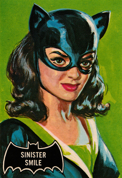
Well, I fell in love with Catwoman when she was played by Julie Newmar. But the look I preferred was from the bubble gum cards, by Bob Powell and Norman Saunders.


-
03-16-2019, 02:55 PM #85Extraordinary Member
- Join Date
- May 2016
- Location
- Gotham City
- Posts
- 8,091
As a fan of Batman brave&Bold I am agree with this. I prefer her with Long hair and with a cape.. Originally Posted by Lee Stone
Last edited by adrikito; 03-16-2019 at 03:00 PM.
-
03-17-2019, 09:59 AM #86Death becomes you
- Join Date
- Dec 2015
- Location
- Memphis
- Posts
- 6,857
I think if Julie Newmar had worn a cape on the Batman TV show Catwoman with a cape would be more acceptable now. Can you imagine Batman or Robin or Batgirl without a cape?
Catwoman's cape would have been legacy. But then we would have missed out on Julie's fabulous bottom, so good and bad.
-
03-17-2019, 01:30 PM #87BANNED
- Join Date
- Jun 2016
- Posts
- 4,154
what she requires is sharp claws to slice all those mice and a costume which doesn't make the infirm mistake pedigree.

-
03-17-2019, 07:31 PM #88BANNED
- Join Date
- Apr 2014
- Posts
- 6,983
I think she should be always presented as glamorous and classy.
-
03-22-2019, 12:16 AM #89Ultimate Member
- Join Date
- May 2014
- Location
- Louisiana
- Posts
- 12,302
 "There's magic in the sound of analog audio." - CNET.
-
03-22-2019, 12:17 AM #90Junior Member
- Join Date
- Apr 2014
- Posts
- 34,113
Not everything from the Adam West show made it into other media. Originally Posted by Osiris-Rex


 Reply With Quote


