

Hello to everyone here at CBR forums. I'm making a post to notify you all about our new graphic novel series, The Assassination of Franz Ferdinand. Today we released the prologue, and it's available free of charge in PDF format on our website. I'm quoting the official press release that has all the details:
Centrifugal Stories is happy to announce that the prologue to the graphic novel series "The Assassination of Franz Ferdinand" is now released. The graphic novel is available free of charge online and you can find download mirrors on the official website under the Issues Section.
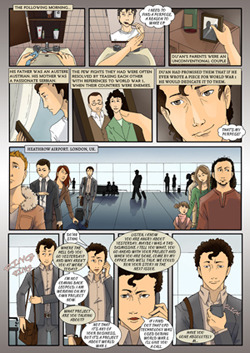
The prologue features 10 full color pages, introducing the two protagonists of the story, Duan Stahl and Eőrsike Lato. The former is an acclaimed writer for London-based history journal The Chronicler. Eőrsike is a young unemployed girl who visits Csór, a small village in Hungary, one week after her grandmother passed away.
The graphic novel is drawn by Ana Santo, a young talented artist from Portugal and the story is written by Dimitris Manos. Centrifugal Stories plan to release the first issue of the series in November. The plot will blend historical events with fiction and it will span different time periods.
So head over to the official website to download the Prologue.
Also, just to let everyone know, we are looking for people to translate and / or promote the graphic novel series to non-English speaking territories. Any help would be greatly appreciated.
Results 1 to 4 of 4
-
08-01-2014, 11:55 AM #1All-New Member

- Join Date
- Aug 2014
- Posts
- 8
 The Assassination of Franz Ferdinand: Prologue released
-
08-01-2014, 03:17 PM #2Spectral Member
- Join Date
- Apr 2014
- Posts
- 427
Thanks for sharing.
I dont know if you had already noticed this, but with the 'E' in Ferdinand being partially covered by the ghosts head it looks like it reads 'FFRDINAND'. Especially since the F and E typeface look so similar.
-
08-02-2014, 11:03 AM #3Amazing Member
- Join Date
- Jul 2014
- Posts
- 78
My first impression of your website was much more positive than my first impression of your comic book was, after I downloaded the PDF copy that you guys provided a link to on your site.
The website is very clean, nicely done. It engages my eye, well, and yields a somewhat soothing feeling just to sit and look at it.
The comic book in PDF format (which is my personal favorite format for a comic book, these days, by the way), brings a lettering issue to the fore very quickly. The choice of fonts for the lettering was not a good choice.
The coloring is decent. The art is not nearly as lovely as the artist, though. On the website, under the Creators section, you should consider bringing Dimitris section up side by side with Ana's section. The front page of the site is geared towards wide monitor screens, but the Creators section is geared toward smaller screens. Why?
The art is sufficient to tell the story, visually, in any event. But, it doesn't draw me into it. Perhaps the story will. I haven't read the comic, yet. I've only downloaded and browsed it, at this point.
Generally speaking, the speech bubbles are not particularly engaging, as a form of visual craft. The thought balloon on page 8 is a positive exception to the rest of the dialogue balloons. The text narrative boxes, you did a better job with, tha the dialogue balloons.
Before I read the story at length, though, I can already tell you - the lettering is the real villain, here. I don't want to read it, before I even start. That font makes your dialogue bubbles look cramped. The first speech bubble has dialogue that catches my eye, so that part of it interests me, but overall, the art and coloring are geared toward a subdued feeling. Not sure if that's what was aimed for, or not.
Utilize a different font for the lettering, and the quality of the visuals will rise, I think.
I'll get back to you on the story.
-
08-03-2014, 01:35 AM #4All-New Member
- Join Date
- Aug 2014
- Posts
- 8
Hi Ghost. Thanks for replying. You are correct about the headline. We will fix this before the release of our first issue. Originally Posted by Ghost

Originally Posted by CharlesM
Charles, first of all, I want to thank you for the detailed critique. You are right about the lettering, it is our achiles' hill. This is our first attempt at a graphic novel and beginnings are always bumpy roads. Our budget is small. The artist did not want to do the lettering as it's not her field of expertise. The budget wouldn't allow us to find someone extra to work on the lettering so I did it myself.
I promise that it will be something that we will focus on before the release of the first issue. The purpose of making a prologue to the story was two-fold. We wanted to introduce people to our story, and we also aimed to identify our weak spots. I hope that you will enjoy the prologue's plot despite the amateur lettering.


 Reply With Quote

