

The designs are more radical then any we seen previously. Almost as if the creative team is going really out of its way to be different or shock the audience.Originally Posted by Zero Hunter

I'm still willing to give it a shot as of right now. Curious what their take on Star and Ultra Boy will be.
Results 301 to 315 of 933
-
07-08-2019, 01:05 PM #301Astonishing Member

- Join Date
- Jun 2017
- Posts
- 3,018
 Idea's Open Discussion And Growth. Silencing Idea's Confirms Them To Be True In The Minds Of Those Who Hold Them. The Attempt Of Eliminating Idea's Proves You To Be A Fool.
-
07-08-2019, 01:11 PM #302Moderator


- Join Date
- Nov 2014
- Posts
- 115,637
Is that black guy with the goatee Bouncing Boy? He looks a little chubby from what we can make out.
Is blonde purple girl with the visor Triplicate Girl?
I assume the figure in the far back above the finger is Colossal Boy if only because he looks like he's in his giant form.
-
07-08-2019, 01:29 PM #303Extraordinary Member
- Join Date
- May 2014
- Location
- Rio de Janeiro/Brazil
- Posts
- 5,395
Each news I get from this reboot manages to reduce even more my interest, and this is comming from a really die-hard LSH fan. Sad.
Peace
-
07-08-2019, 01:47 PM #304Mighty Member
- Join Date
- Apr 2014
- Posts
- 1,717
I disagree. I like that they're leaning into the absurdity of the character. His design makes me think a bit of Marvel's Hercules at his most comically broad. Originally Posted by Frontier
-
07-08-2019, 02:01 PM #305Ultimate Member
- Join Date
- May 2014
- Posts
- 10,217
I wonder if she's a literal dream, in this incarnation, only visible to her teammates when they are asleep or unconscious, providing warnings to them in that state (and perhaps seizing control of the body of a teammate who has been knocked unconscious and causing it to jerk back up and fight some more, with her auto-piloting it!). Originally Posted by Frontier
"A dream, to some. A nightmare, to others!"
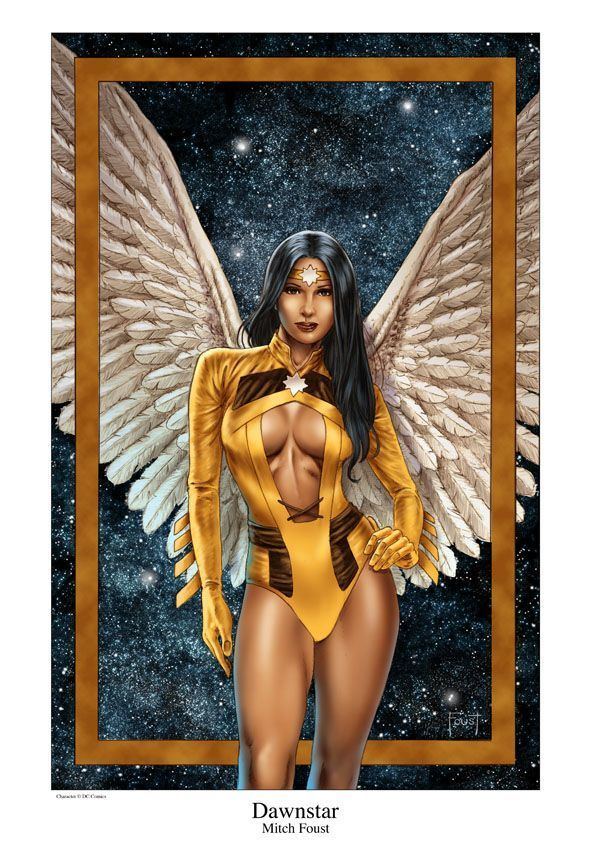
He's like Matter-Eater Lobo. Not a fan. Nor of the strung-out looking Element Lad or the kinda cringe-worthy Dawnstar (although the idea of 'spirit wings' that come and go is neat).I think Matter-Eater Lad is a bit too much.
-
07-08-2019, 02:14 PM #306Astonishing Member
- Join Date
- Apr 2014
- Location
- East Tennessee
- Posts
- 2,238
Same here, i may take a pass on this one. Originally Posted by Nomads1
-
07-08-2019, 02:44 PM #307Mighty Member
- Join Date
- Apr 2014
- Location
- Ohio
- Posts
- 1,483
Same here. Originally Posted by Nomads1
This does not look good.
-
07-08-2019, 03:10 PM #308Ultimate Member
- Join Date
- May 2014
- Location
- California
- Posts
- 12,103
This looks...really bad. Its hard to get excited about this as it seems like all of my favorite Legionnaires are there in name only. Theyre basically like entirely different characters.
-
07-08-2019, 03:38 PM #309Mighty Member
- Join Date
- Apr 2016
- Posts
- 1,692
OK, it's compare and contrast time again.
Here are the new designs by Ryan Sook below the classic originals. Which ones of these do you like better?

-
07-08-2019, 03:38 PM #310Astonishing Member
.jpg "protege's Avatar")
- Join Date
- May 2014
- Location
- Chandler az
- Posts
- 4,832
So who’s the guy in purple? And why does matter eater lad need to wear body braces?
Last edited by protege; 07-08-2019 at 04:21 PM.
-
07-08-2019, 03:39 PM #311Hey Baby--Wha's Happ'nin?

- Join Date
- Aug 2016
- Location
- New York
- Posts
- 4,235
So far the best design is still Shadow Lass. Matter-eater Lad looks alright but I don't care for him, Dawnstar looks over designed and just so obvious it looks stereotypical, the rest are bleh. It seems like they are going over the top for the designs and tone. Still interested in where this is going.
*Edit- Forgot about Dream Girl. She doesn't look bad but it seems they're taking her in the Sandman route or hinting a connection there.
-
07-08-2019, 03:45 PM #312Moderator
- Join Date
- Nov 2014
- Posts
- 115,637
The top designs, definitely. Simple, classy, while still colorful and cool. Originally Posted by Comic-Reader Lad
Dream Girl I'm okay on since she looks kind of cool visually but...I dunno, I'm not one to mind, but going from a leotard to actual nudity ?
?
-
07-08-2019, 03:51 PM #313Extraordinary Member
- Join Date
- Apr 2014
- Posts
- 7,727
Even the recent update of Dawnstar's look was 100 times less offensive sterotype wise than this mess that just looks like someone said "just draw and indian". That looks like something they would have come up with in the 70's when no one cared about representing a culture without being a blatant sterotype. I mean seriously how could someone not look at that and say "maybe this is not the best approach for a very underutilzed minority". Christ she might as well have feathers in her hair.
-
07-08-2019, 03:52 PM #314Hey Baby--Wha's Happ'nin?
- Join Date
- Aug 2016
- Location
- New York
- Posts
- 4,235
Blok's original Originally Posted by Comic-Reader Lad
Dawnstar original (Not really a fan of this either)
Neither for Dream Girl. Best design for me is her cartoon and post zero-hour designs.
Neither for Elemant Lad.
Matter-Eater Lad new design
Like both Superboys
-
07-08-2019, 04:00 PM #315Moderator
- Join Date
- Nov 2014
- Posts
- 115,637
Everytime I see these redesigns I just think to myself "I've seen better."
Which isn't a knock against Sook as an artist, I've just personally seen Legion designs that have updated their designs better without needing to be as different as they seem to be going with this.

 Reply With Quote


