

Dawny's wings look real, not those dumb "Spirit Wings" they gave her.
Results 661 to 675 of 933
-
08-06-2019, 05:50 AM #661Astonishing Member

- Join Date
- Apr 2014
- Posts
- 3,650

-
08-06-2019, 06:08 AM #662Extraordinary Member
- Join Date
- Apr 2018
- Posts
- 5,523
Especially when you have Brainiac Five who can deduce most anything needed. Originally Posted by Korath

-
08-06-2019, 09:46 AM #663Extraordinary Member
- Join Date
- Apr 2014
- Posts
- 6,935
Originally Posted by Frontier
And yet somehow both of them, along with Booster Gold and OMAC, are the best looking ones in this image because they weren't subjected to those redesigns. Originally Posted by Korath
-
08-06-2019, 09:56 AM #664Astonishing Member
- Join Date
- Aug 2016
- Location
- Toulouse, France
- Posts
- 4,437
I actually like all the new redesign so we'll have to disagree. Originally Posted by Zeeguy91
Especially compared to the old Legion designs, who only have nostalgia for themselves.
-
08-06-2019, 09:58 AM #665Extraordinary Member
- Join Date
- Apr 2014
- Posts
- 6,935
The old designs were just better. Not these overly-complicated messes. And I'd point to the fact that many people are not liking these new designs, save for maybe a few of them, as evidence that the old looks had more than nostalgia going for them. Originally Posted by Korath
Just looking at Dawnstar alone, her new design is really not good compared to any of her looks from before. This look alone:

blows her redesign out of the water.Last edited by Green Goblin of Sector 2814; 08-06-2019 at 10:02 AM.
-
08-06-2019, 10:35 AM #666Extraordinary Member
- Join Date
- Apr 2014
- Posts
- 7,738
Your wrong. Just flat out wrong. The members of the Legion have had multiple looks over the years some good and some very dated, but the best looks are the one that stick around in one form or another. None of these new looks are going to stick around long term because most are just ugly or look like they are trying to hard. Originally Posted by Korath
You keep bringing up nostaglia, but your main selling point seem to just be "its new so its good" which is never the case.
-
08-06-2019, 10:36 AM #667Astonishing Member
- Join Date
- May 2014
- Posts
- 3,895
I do think Dawnstar's Millenium look is a miss. That one from Crisis of 3 Legions was a nice update on the classic look. Sadly, everything has to go through the PC filter today because everyone is oversensitive.
I have to say that Gold Lantern looks sharp in the pic above. Ultra Boy's color scheme was always somewhat questionable, but I wish they had retained the primary red/primary green look with black accents. I really have to brace myself for this being not my Legion -- that may make it a bit more easier to digest.
-
08-06-2019, 10:40 AM #668Astonishing Member
- Join Date
- May 2014
- Posts
- 3,895
It's fine to prefer all the new designs, but try to be a little objective. Not everything new is an improvement just because it's new. Originally Posted by Korath
-
08-06-2019, 10:58 AM #669Astonishing Member
- Join Date
- Aug 2016
- Location
- Toulouse, France
- Posts
- 4,437
The old designs were ugly. Like, if you didn't read the books as a kid, you can't like them ugly. They are outdated in every way ! Like, it's so old that this "future" setting lose all lustre. The new one at least look futuristic, strange, in a good way. And people keep bringing up Dawnstar, but I'm sorry, I don't see how her current design his worst than the previous ones. Different, yes, but worse ? Certainly not. Originally Posted by Zero Hunter
I also can't help but notice that those spitting on the new design and this new book are all people who read the LoSH for quite some time, as far as a can tell. So, yeah. Nostalgia. Like those who clamored for the trunks' return or hate anything different from what they read before.
It isn't the case. it's justa matter of the old design being atrocious. Originally Posted by kcekada
But honestly, I kind of have given up on DC readership. Most of you guys don't seem to want new things.Last edited by Korath; 08-06-2019 at 11:14 AM.
-
08-06-2019, 11:15 AM #670Moderator

- Join Date
- Nov 2014
- Posts
- 116,165
I mean, I can see how they were a little old-fashioned and classic but I don't see what was ugly or atrocious about them. Originally Posted by Korath
Of course, I'm not referring to the exact Silver Age designs when I think of the Legion's looks.
-
08-06-2019, 11:40 AM #671Junior Member
- Join Date
- Apr 2014
- Posts
- 34,104
I don't often agree with Korath, but Dawnstar's new design is much better than this and there is a reason the old one wasn't used for the Legion/JL animated movie. Originally Posted by Zeeguy91
-
08-06-2019, 11:57 AM #672Extraordinary Member
- Join Date
- Apr 2014
- Posts
- 7,738
The new design that is so culturally insensitive it looks like it came form the 1940s? I mean it looks like they goggled offensive native american sterotypes and just drew what they read. Originally Posted by Agent Z
-
08-06-2019, 12:19 PM #673THE MARK OF MY DIGNITY

- Join Date
- Apr 2014
- Posts
- 10,105
Damn, I am so ready to jump into this world, man. Just look at them all, each with their own little story to tell set in a far off time period. The all look so distinct, diverse, and full of life, but with this sense of unity. Originally Posted by Lonewolf36
God, I can't wait to get into group dynamics, interpersonal chemistry, adventure, and world building."Mark my words! This drill will open a hole in the universe. And that hole will become a path for those that follow after us. The dreams of those who have fallen. The hopes of those who will follow. Those two sets of dreams weave together into a double helix, drilling a path towards tomorrow. THAT's Tengen Toppa! THAT'S Gurren Lagann! MY DRILL IS THE DRILL THAT CREATES THE HEAVENS!" - The Digger
We walk on the path to Secher Nbiw. Though hard fought, we walk the Golden Path.
-
08-06-2019, 12:32 PM #674Superfan Through The Ages
- Join Date
- May 2014
- Location
- Cairo, Egypt
- Posts
- 838

Still not sure about how I feel about this new status quo
Last edited by BBally; 08-06-2019 at 12:42 PM.
No matter how many reboots, new origins, reinterpretations or suit redesigns. In the end, he will always be SUPERMAN
Credit for avatar goes to zclark
-
08-06-2019, 12:37 PM #675Extraordinary Member
- Join Date
- Apr 2014
- Posts
- 6,935
Yes, because these: Originally Posted by Korath
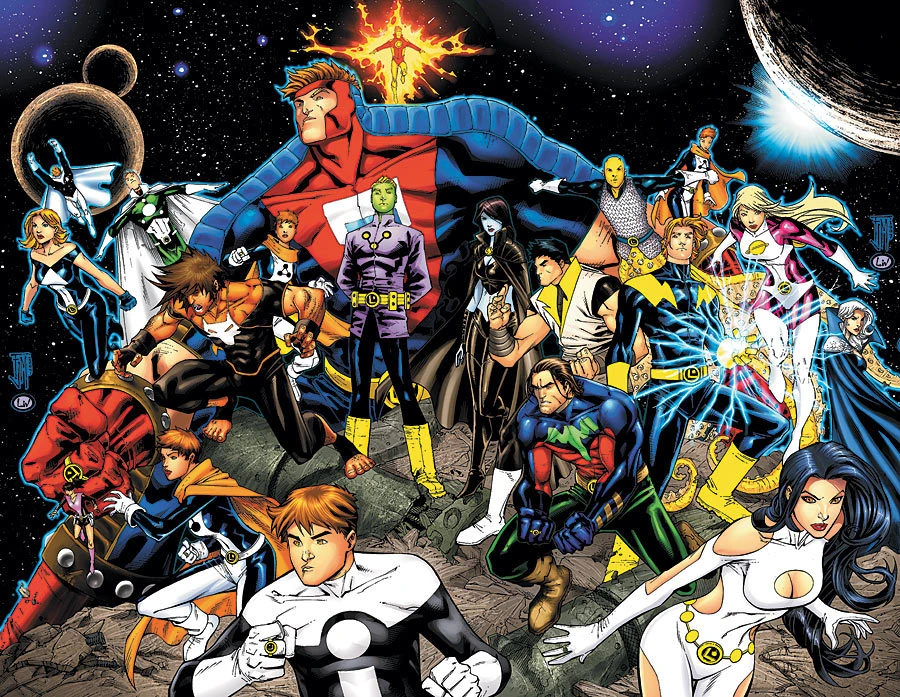

are soooooo outated.[/sarcasm]
Because nothing says future like wrapping your heroes in kevlar and plastic body platesThe new one at least look futuristic, strange, in a good way.
And people keep bringing up Dawnstar, but I'm sorry, I don't see how her current design his worst than the previous ones. Different, yes, but worse ? Certainly not.Well, let's look at Dawnstar's new look: Originally Posted by Agent Z

So, there's a few issues with this design just on its face.
1) Its extremely racist. Like, not even subtle at all. For one, putting warpaint on a Native American character without any reason besides emphasizing their Native American-ness is probably the most insensitive thing I've seen in a long time. That's especially true when Dawnstar has never really worn warpaint before. Also, I could be wrong about this, but it seems that Sook just...decided to design a symbol that vaguely looks Native American but doesn't seem to actually hold any real meaning.
2) Putting warpaint, an overt symbol of aggression, on Dawnstar, a character who has always been an introvert, is just inconsistent with her core personality traits.
3) It does away with one of the main things that made Dawnstar unique: her beautiful, large feathered wings. It was something that highlighted that Dawnstar came from another world and communicated how the Legion wasn't just Earthlings.
So, yeah, its a very problematic redesign all around.
Or they're just people who actually know the characters. And just because someone doesn't like a new direction because they prefer the older direction doesn't automatically mean nostalgia. It just means that they think the new direction is bad. And sometimes, guess what, they're right. After all, the New 52 failed not because people were just averse to something new. It failed because, at the end of the day, most of the New 52 books and story directions were bad and almost universally panned among those who actually read them. And yes, that included a large amount of new fans.I also can't help but notice that those spitting on the new design and this new book are all people who read the LoSH for quite some time, as far as a can tell. So, yeah. Nostalgia. Like those who clamored for the trunks' return or hate anything different from what they read before.
No, we just want good things from DC.But honestly, I kind of have given up on DC readership. Most of you guys don't seem to want new things.Last edited by Green Goblin of Sector 2814; 08-06-2019 at 12:46 PM.

 Reply With Quote


