I doubt that Lois was the target. After all, even if Lois were eliminated, Agger would just spill the beans to the next reporter who threatened to expose him (maybe following up on Lois's leads). Getting rid of the stool pigeon makes Lois irrelevant.
Results 16 to 18 of 18
Thread: Lois Lane #2 Discussion
-
08-10-2019, 02:52 PM #16Astonishing Member

- Join Date
- Jun 2014
- Posts
- 2,860

-
08-10-2019, 08:55 PM #17

Bought it. Read it. Liked it.
A couple things right off the bat ...
1. Mods, would you consider merging this thread and the Lois Lane #2 preview thread? They seem to cover the same ground.
2. Which LOIS LANE #2 cover did everyone get ... and why?
There was the standard cover by interior artist Mike Perkins:
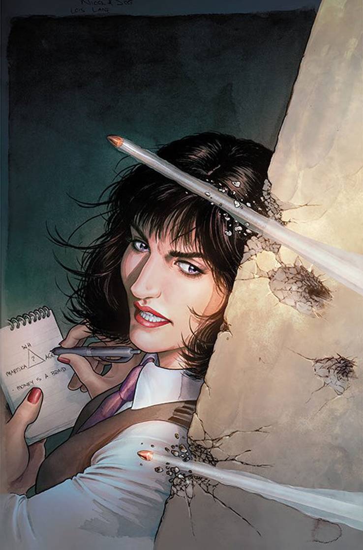
Or the variant cover by Nicola Scott:

Me, I went with the standard Perkins cover for issue #1 because I loved that Lois finally got her own distinct logo (even if I hated that her face was obscured by the newspaper she held).
Not so for issue #2. The standard cover gave me Lois 's face in full view ... but there was something off about it. She was serious like she is always supposed to be, but I dunno ... her face looked bad. Like it belonged to someone else. Which is weird because I didn't see that same bad face once on the interior of the issue.
And the variant cover by Scott just blows me away. THAT right there is how you sell Lois Lane to the masses! Yowza! Bought it despite the lack of the logo.
More thoughts to come ...
-
08-10-2019, 09:08 PM #18

Both. I love the Perkins cover because it's a modern, bold, powerful image of Lois and definitely has a razor's edge to it. Very "in-your-face" in the best way possible.
The Scott cover is a fantasic mix of classic elements, and it's great, too - her in the thick of it with determination in her eyes. Her look is a cross between early Post-Crisis and a HEAVY dose of Margot Kidder, and it's just great.
All-in-all, two very different takes on the same general idea, and they both work well.
I hope this thing sells like hotcakes!Hear my new CD "Love The World Away", available on iTunes, Google Music, Spotify, Shazam, and Amazon: https://smile.amazon.com/dp/B01N5XYV..._waESybX1C0RXK via @amazon
www.jamiekelleymusic.com
TV interview here: https://snjtoday.com/snj-today-hotline-jamie-kelley/


 Reply With Quote


