

Not really sure what I'm hoping to accomplish by posting this, but it's always fun to share what you are working on.
This is a concept piece for an book I've been bouncing around ideas for. I'm also currently working on establishing a style. Hand drawn with a mechanical pencil, then scanned in and digitally colored and inked using GIMP.
I've also been doing some pieces for the latest X-Jam in the X-books board. Might link in some of those later if I feel the want.
Results 1 to 15 of 25
Thread: Goggindowner's Art Stuff
-
08-08-2014, 06:42 PM #1Dirt Wizard

- Join Date
- May 2014
- Location
- The Aether
- Posts
- 1,444
 Goggindowner's Art Stuff
-
08-08-2014, 06:51 PM #2Dirt Wizard
- Join Date
- May 2014
- Location
- The Aether
- Posts
- 1,444
Alright, here are some pieces from the X-Jam.....
Oya

Madrox the Multiple Man

Surge

I have been using the X-Jam partially to develop the style I'm going for, so as the pieces get further along, they become more closely related to what I'm currently doing. Here, Oya was the newest piece I submitted.
-
08-12-2014, 12:37 PM #3Dirt Wizard
- Join Date
- May 2014
- Location
- The Aether
- Posts
- 1,444
2014-08-12 14.27.40.jpg
Cyclops sketch...
-
08-13-2014, 02:24 PM #4Amazing Member
- Join Date
- Jul 2014
- Posts
- 78
I like Madrox the Multiple Man
-
08-13-2014, 10:24 PM #5Dirt Wizard
- Join Date
- May 2014
- Location
- The Aether
- Posts
- 1,444

This isn't really anything, just me looking at how this new style might look in an actual sequential setting as apposed to just sketches and posed figures. Not sure, the verdict on this is still out for me. Needs work.
-
08-13-2014, 10:24 PM #6Dirt Wizard
- Join Date
- May 2014
- Location
- The Aether
- Posts
- 1,444
Thanks! It wasn't originally intended to be Madrox, but it was similar enough to edit and submit for the x-jam. Originally Posted by CharlesM

-
08-21-2014, 04:13 AM #7Dirt Wizard
- Join Date
- May 2014
- Location
- The Aether
- Posts
- 1,444
At the suggestion of an old collaborator, I am working on a two color palette now. This was my first attempt at it, and I'm generally satisfied with what I turned out. Still needs some fine tuning.

Last edited by Goggindowner; 08-26-2014 at 03:32 AM.
-
08-26-2014, 12:34 PM #8Amazing Member
- Join Date
- Jul 2014
- Posts
- 78
OK, Billy, as per your request, here we go. Originally Posted by Goggindowner
Clearly, the work is a tad on the crude side, but it often is with aspiring artists.
The background serves no useful purpose. It's a pretty shade of purple, and it's soothing to look at, but an actual background of something specific would have been visually more inviting.
The anatomy has some serious shortcomings, but it's far from the worse that I have seen. Your depiction of human anatomy is better from the chest, down, than from the neck, up.
Necks, in particular, are consistently problematic for you. Your human beings become giraffe-like.
Eyes are not one of your core strengths, as an artist. But, that said, you still muster up variety, when you draw eyes, which is actually a good thing. Your depiction of throats is all over the place. That's not good. The second guy from the left has a better looking throat than the two characters on the right. The big guy's neck works better, visually, than any of the thinner characters' necks. The black guy's neck isn't as visually problematic, primarily due to the fact that it's a mass of dark ink, so defects in the neck get obscured with that guy.
You have a little bit of variety in the poses of this group of characters, which is a plus. There's some stiffness, and some more relaxed feeling, associated with this group. So, that part is a mixed bag, visually speaking.
The guy with the energy coming out of his eye, why bother with a special effect like that, if you then intend to squander it? This is a good example of how NOT to tease the reader/viewer.
The girl with the fire - your rendering of fire is enormously problematic. I've seen worse, and I can tell that this is supposed to be fire, but special effects (such as the wielding of super powers) should be visually impressive, in most instances. If you only intend to hit at the power, then the less that you have on display, the better that it needs to look, as a general rule of thumb.
You've attempted to instill some degree of fashion sense into your characters. That's a plus, since people typically don't all dress the same.
Depicting human hair kicks your ass - but, you're depiction of hair has some merit to it. It looks rough, crude, but it is a skill set that you are altready on your way to developing.
Your work isn't clean. It has a very dirty quality to it. Many of your characters depicted on this page of this thread suffer from that same malady. That mechanical pencil that you're using is getting the best of you. I suggest that you consider experimenting with a few different pens, pencils, and markers.
On the color front, again, it's a mixed bag. But, you're not resorting to the neon range of colors very much, which is actually a huge plus. The world that we live in is ful of vibrant color, but it's not typically saturated in pure neon. Many amateur or aspiring artists or colorists go quick and heavy toward the neon range of the color spectrum, and it has a dreadful tendency to gut the visual interest of a given piece of artwork. Your resort to pale colors makes your coloring more pleasing to the eye, than it would be if it were saturated in neon. That bright yellow, for example, that is emanating from the guy in the green shirt, that's the worst application of color on this particular image. Using it to highlight would have been a better choice than a full paint of that special effect.
The big guy, his skin is somewhat on the gray side of things. Plus, he's wearing a medium gray shirt, and he's wearing dark gray trousers. What in the Hell were you thinking? He even has gray tape on his hand. You're destroying him, visually, when you go that route.
These characters are all posing, yet have slightly different poses. The differences, rather than the similarities, is what makes your posing better, visually speaking.
You are better at depicting facial expressions than your are at depicting facial anatomy. Far better, in fact!
The guy with the checkered shirt, why does he have such mismatched ears? It's not just aan anatomy problem. It's a lack of consistency problem, also. He's not the only character with ear issues in this image.
If you put your characters in action, rather than just standings till and posing face on for the camera, then the deficiencies that you do have will tend to be mitigated, somewhat, as the human eye will be more forgiving, since the action will serve as a distracting factor.
-
08-26-2014, 12:44 PM #9Amazing Member
- Join Date
- Jul 2014
- Posts
- 78
Quit playing with special effects in software programs. Learn to create a similar effect with pen or pencil, first. Otherwise, you're artwork is going to get dumbed-down, visually. Aspiring colorists tend to do this more than aspiring artists. It doesn't make your character depictions better. It's a visual distraction. It brands a scarlet letter A for amateur across your forehead. Special effects filters in software have a use - making up for the shortcomings of artists isn't one of them. Originally Posted by Goggindowner
-
08-26-2014, 12:52 PM #10Amazing Member
- Join Date
- Jul 2014
- Posts
- 78
You liked the challenge that I gave to Bob, in another thread, Billy. While I don't mind if you take up that challenge for yourself, also, how about if I give you an additional one of your own to undertake. Impress me - do both!
Challenge for Billy # 1
Batman and the Star-Spangled Kid trying to take down Juggernaut inside of a bank.
-
08-26-2014, 03:07 PM #11Dirt Wizard
- Join Date
- May 2014
- Location
- The Aether
- Posts
- 1,444
Charles,
Thanks for taking a look at a few pieces. A lot of the things you are pointing out were style choices I was making, and quite frankly I don't think the style was working for me. I was trying to play it a little too fast and loose, and I think by the time I got to that group shot I had let it get totally out of hand. I'm pulling back on that now, working on getting a cleaner and simpler style that reads well instead of muddles the inaccuracies of the work with scribble and messy lines (which is honestly what I was going for, which was crazy to try in hind sight).
Anatomy is my big hang up, and boy is that a problem for me. Anatomy is what I am really focusing on trying to get better at, because I know that regardless of style, correct anatomy and panel layouts that read well are all that matter in telling a story. People might like this style or that style better, but a story teller can do anything. I'm really trying to do that.
I actually HATED the lighting effects, but once I had decided that I hated them, I couldn't remove them thanks to the way GIMP layered them into the image. And of course, I fell victim to the "I haven't saved this at any point" affliction and was stuck with either living with it or starting completely over on the coloring and inking. You can see what I chose. Which is a shame, because as you pointed out, faces can get to be a bugaboo for me, and I was actually REALLY pleased with the way Oya's face turned out. Originally Posted by CharlesM
I actually worked up something for the other challenge today. It wasn't meant to work itself into a final piece, only a sketch to see how the layout worked. But, the day was long and boring and I ended up spending more time with it than intended and ended up with a full blown image. It's way too small, I can tell you that for sure, but I'll up load it once I get it onto something I can do that from. Originally Posted by CharlesM
I'll GLADLY draw you this Batman/Juggernaut/Star-Spangled Kid challenge, too.
-
08-26-2014, 04:12 PM #12Amazing Member
- Join Date
- Jul 2014
- Posts
- 78
This looks quite nice, actually - because the color combination that you chose to go with create strong visual contrast. Originally Posted by Goggindowner
But, this rather stark and limited color palette also means that this would work better as a web comic or comic strip, than as a comic book. These is very strong visual imagery, and it reminds me of comedian Paul Lynde's humor. It's great, but better in small doses than in extended durations, in any given sitting.
-
08-27-2014, 08:00 PM #13Dirt Wizard
- Join Date
- May 2014
- Location
- The Aether
- Posts
- 1,444
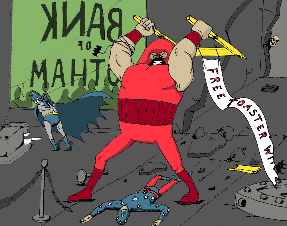
Here is the me specific challenge.
-
08-27-2014, 08:02 PM #14Dirt Wizard
- Join Date
- May 2014
- Location
- The Aether
- Posts
- 1,444
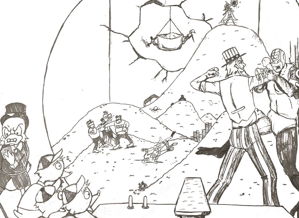
Here is the other challenge that I sort of hijacked. I originally intended to color this, but considering that I had limited time to work, I decided to spend it on the challenge that was offered up to me specifically. What this is is basically a rough sketch, which I would have then inked and colored.
My intent was to have Scrooge saying something to the effect of "Ach, I wish I'd called better superheroes."
On account of the fact they are totally not stopping the bad guys from stealing his gold.Last edited by Goggindowner; 08-27-2014 at 08:11 PM.
-
08-27-2014, 09:09 PM #15Amazing Member
- Join Date
- Jul 2014
- Posts
- 78
I laughed hard, when I first saw this. Very nice job on the Batman's pose, by the way. He's struggling, eh? Originally Posted by Goggindowner
This is sort of a comical style. The Batman looks a bit on the pudgy side (as if I've any room to talk about the World's Greatest Detective).
Anatomy-wise, there are major issues - but, you drew it in a style that isn't really serious (even though that's a serious grimace on Batman's face.
The free toaster banner is choice. That's a nice comedic touch, some quintessential bank humor going on there.
The backward lettering of the Bank of Gotham is a nice visual touch. You've even got crowd gathered outside, visible through the window. THe vault door has been ripped off. Plus, you've got that one dude's head sticking around the corner, looking in on the action.
Poor Star-Spangled Kid - he never had a chance, did he?
All three characters have torsos that are not flattering. Juggernaut's head is problematic - If I had not picked what characters were included in this challenge, then I may not have even guessed who Juggernaut was in this scene. It's obvious, if you know, but once you swing into comical style, shapes of characters get distorted.
Cracks and debris all over the place. The bat grappling hook and rope wrapped around Juggernaut's arm are nice visual flourishes. Even money bags lying around - although you really should have colored them different than the floor. They would stand out more and entertain the eye, better, if you had.
Batman's cowl and cape look really nice, and his boots are OK by me.
To me, scenes like this, unlikely encounters, tend to come across as very imaginative. It's good to see somebody new taking on Juggernaut.
THe ropes and rope stands, with one knocked over, that's another nice visual touch. The toaster banner is wavy, which is a plus.
The interior of the bank building, however, is fairly plain, judging by the walls and floor. Do banks that you go in to typically have walls and floors looking identical, color-wise?
All things considered, I think that you di a fine job. You definitely have some talent, when it comes to drawing art in a comical style.
The coloring utilizes medium pale colors, which looks good, No resort to the neon range of colors. The batman's cape has a darker color on the underside - again, its touches like that which really help to elevate a given piece of art, particularly a scene involving multiple characters. Even the soles of Batman's boot are darker than the upper side, which enhances the visual in a small, but beneficial, way.
I'm not sure how many of these challenges that you are up for, Billy, but I'm certainly enjoying the show.


 Reply With Quote
