Results 16 to 28 of 28
Thread: The most compelling comic pages
-
12-07-2020, 06:33 AM #16BANNED

- Join Date
- Nov 2014
- Location
- Marvel Studios
- Posts
- 13,533
 Wolverine #90
-
12-07-2020, 06:34 AM #17
-
12-07-2020, 06:34 AM #18BANNED

- Join Date
- Nov 2014
- Location
- Marvel Studios
- Posts
- 13,533
-
12-07-2020, 10:55 AM #19

Whoa.
Those pages are not appealing to me at all.
But they ARE good examples of what the OP described.
-
12-07-2020, 11:55 AM #20

Different tastes, different comics…

I have read in my life comics in colors and comics in black & white. For me, color is not a necessary element of comics. And some comics, like the Saga of the Swamp Thing, are much better without. (And I’m not the only one to think it…)
And here are other examples:

Nicola Mari with his black & white expressive style conveys very well the tragedy and darkness in Nathan Never’s adventures…

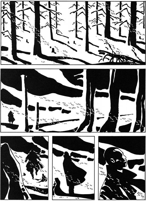
Black & white can also transmit dreamlike atmospheres like with Didier Comès’ book, Silence. (Note how the second panel looks a little bit like the negative of the first panel to punctuate the page…)Strength is the lot of but a few privileged men; but austere perseverance, harsh and continuous, may be employed by the smallest of us and rarely fails of its purpose, for its silent power grows irresistibly greater with time. Goethe
-
12-07-2020, 12:48 PM #21
 Yup, that’s why I made sure to say “to me”. I’m a fan of all the Kuberts from Joe to Emma, but those pages just flashed me back to all that was bad about nineties Marvel.Different tastes, different comics…
I’m w. you in the black & white though for me it depends on the story and the art style.
Jeff Smith, Michael Avon Oeming, Paul Grist, Ben Edlund...their art flows really well in b&w.
Some artists though, it just looks like it’s meant to be colored and no one got around it.
-
12-07-2020, 01:48 PM #22
-
12-07-2020, 02:55 PM #23
-
12-08-2020, 11:31 AM #24

When a comic page is in colors, it can be very pleasant, alluring… in the condition that the comic artist uses the colors cleverly.
Indeed, I find “a bit” irritating that, because we see, on a page, the same characters in the same scenery, all the panels have the same dominant color, as if making a comic is like using a “camera” planted in the ground and you can only put in the panels what you can get thanks to a machine…
With a little creativity, it is possible to have a good-looking page that doesn’t bore the reader, though. For example, you can put one panel in the page with a dominant color that is completely different from the rest like with this page from Enemy Ace: War Idyll by George Pratt: the old aviator is eventually out of his chamber. Before, the panels were dark, gloomy and now, under bright skies, the dominant color of the panels is light blue.
Still, there is a golden panel in the center of the page…

Or with with page of Ghost in the Shell by Masamune Shirow: the author is saving the reader from what could have been a boring bleuish and brownish page with a touch of red at the end…
 Strength is the lot of but a few privileged men; but austere perseverance, harsh and continuous, may be employed by the smallest of us and rarely fails of its purpose, for its silent power grows irresistibly greater with time. Goethe
-
12-08-2020, 05:03 PM #25

I like this as it's symbolic and covers a mood as opposed to action. The dialogue, especially in the last panel is brilliant.

-
12-08-2020, 05:26 PM #26
-
12-11-2020, 07:17 AM #27Extraordinary Member

- Join Date
- Apr 2014
- Posts
- 7,442

Moebius- Long Tomorrow. Kinda disagree the art should never overshadow the story. If it's really good the art is the story imho.

Last edited by CliffHanger2; 12-11-2020 at 07:19 AM.
-
12-12-2020, 05:12 AM #28

Well, when I was a child, every time I read a comic, the artist was good, and even more than good. The level was quite high.
So I thought it was quite normal stuff.
And, once, I met a manga whose art style didnt appeal to me at all. So much I thought I would never read it. And still despite the ugly style, I read it and even appreciated : overall, the comic was ok and the story, interesting.
For me, appropriate art is just the icing on the cake because if the art is impressive in a comic, but the rest is not there, its not enough for me to read it.Strength is the lot of but a few privileged men; but austere perseverance, harsh and continuous, may be employed by the smallest of us and rarely fails of its purpose, for its silent power grows irresistibly greater with time. Goethe


 Reply With Quote


 Youre right! Selenes trick!

