

Pretty simple and to the point, is there a WW emblem that you prefer over the other? General thoughts on them and should it change?
We've had the Eagle, the W, the Eagle W, and now the Dove

View Poll Results: Preferred WW Emblem
- Voters
- 51. You may not vote on this poll
-
Eagle
7 13.73% -
W
14 27.45% -
Eagle W hybrid
29 56.86% -
Dove
1 1.96% -
Other
0 0%
Results 1 to 15 of 39
Thread: Preferred Wonder Woman emblem
-
04-26-2021, 07:04 PM #1Extraordinary Member

- Join Date
- Apr 2014
- Posts
- 6,142
 Preferred Wonder Woman emblem
-
04-26-2021, 07:11 PM #2Ultimate Member

- Join Date
- Mar 2020
- Location
- Occupied Klendathu
- Posts
- 12,981
Can't say I've ever thought about this that much.

Eagle/W hybrid (the one in the movies).Last edited by Gaius; 04-26-2021 at 07:13 PM.
-
04-26-2021, 07:24 PM #3Extraordinary Member
- Join Date
- Apr 2014
- Posts
- 6,142
It's a big pet peeve of mine lol. Originally Posted by Gaius

Part of why I hated the New52 DC DTV movie WW is because her emblem was....not WW like at all.

-
04-26-2021, 07:27 PM #4The Last Dragon
- Join Date
- Mar 2020
- Location
- USA
- Posts
- 1,835
Eagle WW/hybrid.
But she does also need stars (white or gold) on her battle skirt.Zaldrīzes Buzdari Iksos Daor
-
04-26-2021, 07:33 PM #5Ultimate Member
- Join Date
- Mar 2020
- Location
- Occupied Klendathu
- Posts
- 12,981
Lol, I get you. I have plenty of things for comic characters that drive me up a wall when I feel artists get something wrong. Originally Posted by Primal Slayer
I warmed to that costume eventually (she looks better with hair not in a ponytail) but the thing I never got were the unconnected sleeves on the arms.
-
04-26-2021, 07:41 PM #6Mighty Member
- Join Date
- May 2014
- Location
- Los Angeles, CA
- Posts
- 1,436
As they are depicted here, I’d choose bottom row, center.
You see the rest of them are soldiers. But [Wonder Woman] is an artist.
I only support the made of clay origin.
-
04-26-2021, 07:47 PM #7Leftbrownie
- Join Date
- Feb 2015
- Posts
- 5,310
I loved the sleeves. this redesign also uses them and I think it's almost perfect Originally Posted by Gaius
-
04-27-2021, 04:36 AM #8Astonishing Member
- Join Date
- Jun 2016
- Posts
- 3,779
The breastplate needs to be accurate to the time period. If it's the Golden Age I wanta the biggest and most detailed eagle with it's talons clutching the belt. If it's Bronze I like the golden cups, the 80's double W's, Post-Crisis eagle/W hybrid, New 52 extra jagged
and razor sharp.
-
04-27-2021, 07:29 AM #9Spectacular Member
- Join Date
- Nov 2017
- Location
- UK
- Posts
- 150
I am really partial to the double-W because its so vivid and superheroic. I definitely have a nostalgic attachment to that symbol alongside the Superman S and the yellow-circled Bat insignia.
However I get that it just doesn't really fit the character's design anymore, and the in-story reasons for her double-W required some explaining. The various bird variations feel easier to rationalise as iconography for the Amazons than a straight double-W which either requires Diana to buy into the moniker of Wonder Woman, or to have it actually stand for something else like it did in the past.
-
04-28-2021, 11:25 AM #10Astonishing Member
- Join Date
- Apr 2014
- Location
- SouthEast Tennessee
- Posts
- 4,634
Front row, center. Slightly off topic, but I do wish that DC/WB would release a series of action figures featuring the most prominent costumes through the ages, much the way they are with the funko pops. Golden Age, Mod era, 80's eagle, 90's WW, New 52 and modern battle skirt version.
-
04-28-2021, 06:43 PM #11Mighty Member
- Join Date
- Apr 2014
- Posts
- 1,075
I like most, as long as it is balancced in proportion.
It should always have the border of red along to top. It frames the emblem and makes it stand out better. Plus, the gold right against her skin is too close in tone and makes her look topless..lol
It also needs to be well proportioned and balance the red of the bodice. Just running along the top of her bust is weird, and having the gold run all the way around is odd. Preferred versions are the Gokden and ( most) Silver Age versions of the eagle, plus the Bronze age eagle and =w= ( which is meant to be like a bird) and Perez version are of the better proportion, where the emblem is also on the torso, breaking up all the red.
Don't care forNu52 ( silver? Blecch) and Kingdom Come / Byrne style...
-
04-28-2021, 07:56 PM #12The Last Dragon
- Join Date
- Mar 2020
- Location
- USA
- Posts
- 1,835
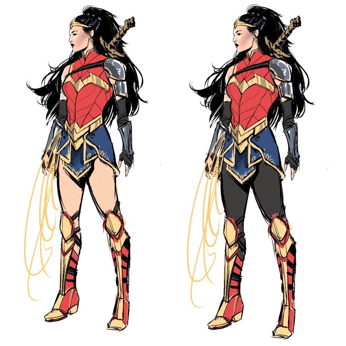
WW symbol.jpg I wanted to get a tattoo like this around my forearm just before my elbow joint. I think its how the emblem should be.
Zaldrīzes Buzdari Iksos Daor
-
04-29-2021, 01:35 AM #13Moderator
- Join Date
- May 2014
- Posts
- 8,431
Double W that just happens to look like an eagle.
-
04-29-2021, 02:22 AM #14Fantastic Member
- Join Date
- Jun 2015
- Location
- Washington, DC
- Posts
- 373
This is a pretty damn cool design! Originally Posted by masterwitcher88
My vote went to the strictly eagle design, but hybrids like the way Nicola Scott depicts it is probably my favorite. In the wrong hands, the double W can sometimes look like the McDonalds Golden Arches, so no on that.
Another peeve: when they connect the emblem to the belt. Dont know why, but that gets on my nerves...Last edited by Natamaxxx; 04-29-2021 at 02:25 AM.
-
04-29-2021, 09:28 AM #15Astonishing Member
- Join Date
- Jun 2016
- Posts
- 3,779
It's fine when the belt is high-waisted but the modern belts are worn lower around the hips and that's too much real estate to cover to connect them to the breastplate without it looking weird. Originally Posted by Natamaxxx
That would be great in live action, but in a comic it would be difficult drawing it the exact same way twice, much less over and over again for an entire issue. In that way it's similar to Lynda's palm tree eagle. Originally Posted by masterwitcher88
Above all I hate a wimpy emblem like on the professional volley ball player animated costume. That could be any kind of skinny bird or even a drone or something, it's definitely not an eagle or a double W.


 Reply With Quote


