

I liked this one at the time, but now it just seems a bit lazy.
While I realize it's in the same vein as the Swamp Thing logo I dislike, I feel it's more fitting for Animal Man. I like the juxtaposition of the more savage font vs the civilized one.
Results 61 to 75 of 77
Thread: Which Title Has The Best Logo?
-
09-01-2021, 04:37 PM #61Relaunched, not rebooted!

- Join Date
- Apr 2014
- Location
- San Jose, CA USA
- Posts
- 6,612

-
09-01-2021, 04:59 PM #62Relaunched, not rebooted!
- Join Date
- Apr 2014
- Location
- San Jose, CA USA
- Posts
- 6,612
Shade is a series that I will always love, but I'll never understood who greenlit this logo or why. It predates Magic Eye 3D images by a few years, otherwise I'd think they were the inspiration. This cover is one of the more coherent ones.
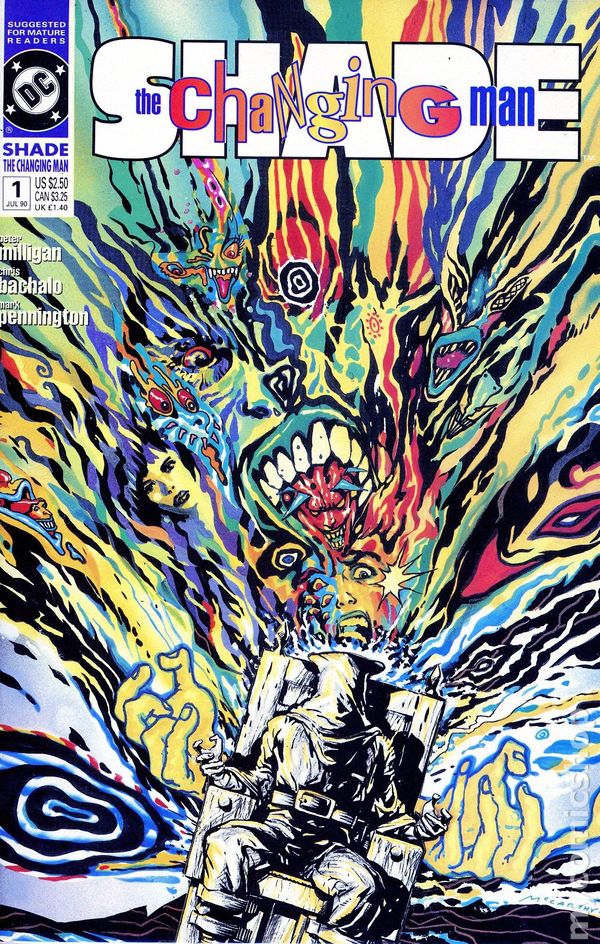
The books second logo is classic, and much more aesthetically pleasing. It still captures the feel of the series without causing eyestrain.

-
09-01-2021, 06:03 PM #63Retired
- Join Date
- Apr 2014
- Posts
- 18,747
Looking at the recent covers to see if there's any new designs (not revivals) that appeal to my tastes, the one that jumps out at me is this Johnny Constantine book. I haven't read the book, so I'm just going by how I connect with the design. I like the font design, because it has that organic feel to it and seems integrated with what the cover image tells me about the contents. It looks like a human being made it--even if a computer was involved--the letters are irregular which gives it that unaffected appeal.

-
09-01-2021, 11:39 PM #64Extraordinary Member
- Join Date
- Mar 2018
- Posts
- 9,574
That's true but I always separate cover than the interior, so when I see those covers with speech bubble or teaser words, even when they're artsy, my mind is... Originally Posted by Jim Kelly

Well... actually... depends. Some comic covers use the speech bubble and text art in a whimsy, and I like that, or if they have an art style that fits the tone of those texts, like pop art, or comic book line art that calls back to the 60s to 80s. They fit the tone, and they're fun.
But when you have realistic painted art work on the cover like they can stand on their own in an art gallery, then add words, they don't fit. The art style clash. They're the ones where I yell nooo don't cover the art because those type of arts are meant to stand alone.
-
09-02-2021, 04:18 PM #65Spectacular Member
- Join Date
- Feb 2016
- Posts
- 247
9D4A8ECB-BFBF-499C-9830-36D9C65539AC.jpg
I’m partial to this logo for WW.
The original cursive was good, but not as dynamic as this one.
The block letters may be a little too close to the Superman logo, but this is the one I associate the most with Diana.
The current one is a little too harsh for my tastes.
-
09-02-2021, 06:20 PM #66Retired
- Join Date
- Apr 2014
- Posts
- 18,747
That logo which was first used on issue 212, when Julius Schwartz became editor, is based on the second Wonder Woman title logo, which first appeared on issue 60. But there the 'r' was different and it wasn't in blocks-- Originally Posted by The I.A.D.C.

Since Schwartz was a Superman editor at the time, and he brought in a lot of Superman writers and artists to do Diana's 12 trials, maybe they wanted a subliminal association with Superman.
Taking a title logo and making it more three dimensional is something they'd done already--sort of--when they took the logo for the SUPERGIRL title--
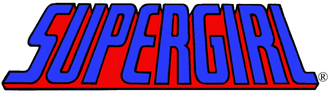
--and used it for THE SUPERMAN FAMILY--
.png/revision/latest?cb=20150716183921)
-
09-02-2021, 06:35 PM #67Retired
- Join Date
- Apr 2014
- Posts
- 18,747
I guess you could say the SUPERGIRL logo was already block-ish, but the FAMILY made it more so.
They then used that for the other FAMILY comics, like BATMAN FAMILY and SUPER-TEAM FAMILY
But this kind of title logo was everywhere in the 1970s--
-
09-02-2021, 10:46 PM #68Extraordinary Member
- Join Date
- Apr 2014
- Posts
- 6,935
I always loved this logo from the early-mid 2000s JLA run:

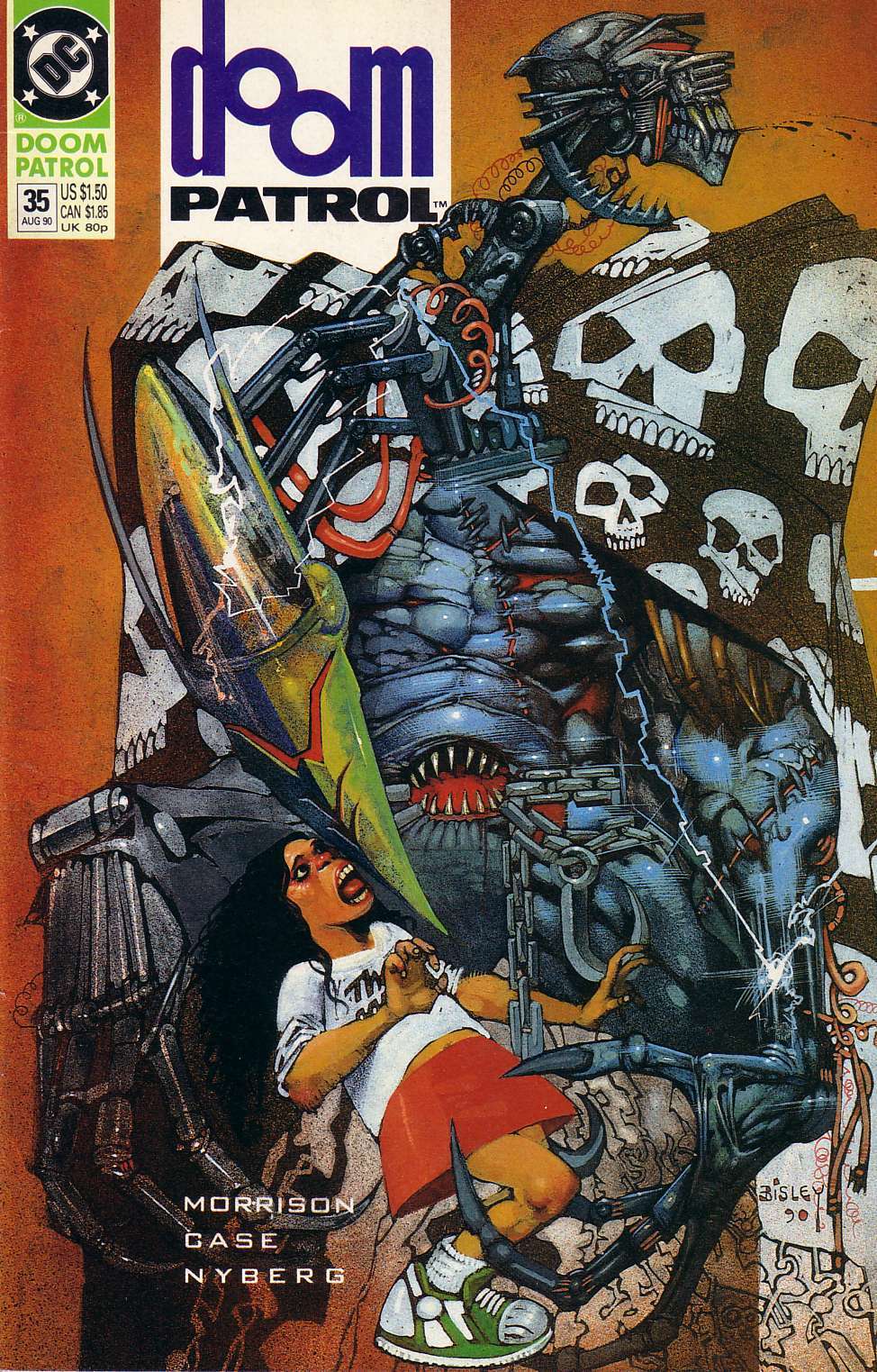
Also, the Morrison era Doom Patrol logos were great:
Last edited by Green Goblin of Sector 2814; 09-02-2021 at 10:49 PM.
-
09-03-2021, 03:09 AM #69Uncanny Member
- Join Date
- Jul 2016
- Posts
- 36,687
EARLY 2000s? That logo debuted in 2006. It's mid-late 2000s. (Also, I see that's a Wikia link, did they finally fix image hotlinking? It's been broken for months) Originally Posted by Green Goblin of Sector 2814
Appreciation Thread Indexes
Marvel | Spider-Man | X-Men | NEW!! DC Comics | Batman | Superman | Wonder Woman
-
09-03-2021, 01:02 PM #70All-New Member
- Join Date
- Jun 2014
- Posts
- 22
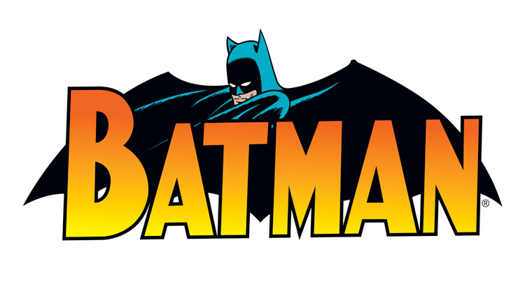
Favorite BATMAN logo, from late 70s-mid 80s.
A50F45D2-0A25-4DBC-B445-0616A3EFF985.jpg
-
09-03-2021, 01:40 PM #71Relaunched, not rebooted!
- Join Date
- Apr 2014
- Location
- San Jose, CA USA
- Posts
- 6,612
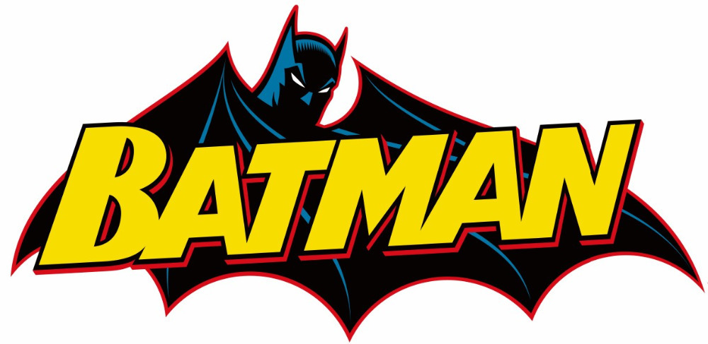
I know it's super basic, but this is still one of my favorite Batman logos. Something so classy and timeless about it.

-
09-03-2021, 01:53 PM #72Retired
- Join Date
- Apr 2014
- Posts
- 18,747
I find it interesting that most Batman title logos are variations on three basic designs.
There's the classic Batman--

The "New Look" Batman--
And the 1966 Batman--for me I remember this from the 1966 Batman bubble gum card wrappers--

What I find strange is when the title logos don't use some variation on the Batman head on a bat--when they just spell out the name in letters. Why? That seems so nondescript.
-
09-03-2021, 01:54 PM #73Relaunched, not rebooted!
- Join Date
- Apr 2014
- Location
- San Jose, CA USA
- Posts
- 6,612
If there must be a bat-head incorporated, I think this is my preferred look:
-
09-03-2021, 06:46 PM #74Extraordinary Member
- Join Date
- May 2014
- Posts
- 6,828
Agreed. This is a great modernization of the concept. Originally Posted by SJNeal
-
09-03-2021, 06:47 PM #75Extraordinary Member
- Join Date
- May 2014
- Posts
- 6,828
Agreed on both of them. I actually tried posting the JLA earlier, but the link didn't work. Originally Posted by Green Goblin of Sector 2814


 Reply With Quote


