
Results 16 to 20 of 20
Thread: Project: Cold Truths!
-
08-31-2014, 04:38 AM #16Astonishing Member

- Join Date
- May 2014
- Posts
- 2,404

-
09-01-2014, 05:18 AM #17Mighty Member

- Join Date
- May 2014
- Location
- Switzerland
- Posts
- 1,033
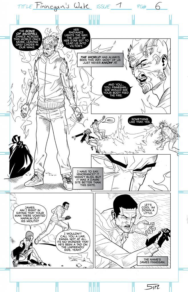
I think I should be a little more precise my with my critique of the coloring. It is not bad, that's for sure. The shading is very well done and it gives more depth to Ralph's pencils. But what puts me off are the textures of the skins, which are a little, lacking a better word, "artificial". I understand that skin is a very difficult area, though, and right now it's even better than some professional colorists at Valiant, DC or Marvel who abuse of the same color palette over and over.
I also get the feeling that the figures get a little softened in comparison to the b&w pages; I really like the use of sharp lines in those, but that is just a personal preference (don't take it too seriously). My suggestion would be experimenting with the color palette and maybe go for something more plain or pastel (if those are the words). But I guess your future publisher will help you better.
P.S. Digging the banter between Emma and James.
-
09-01-2014, 06:26 AM #18Amazing Member
- Join Date
- May 2014
- Location
- Adelaide, Australia
- Posts
- 91
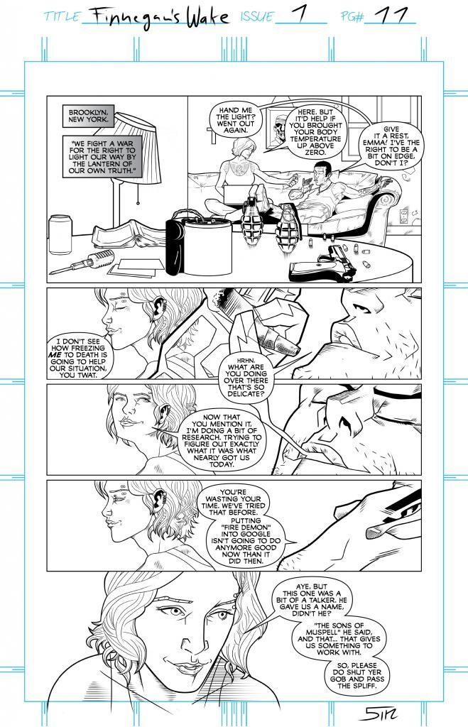
I love the dialog.
I saw these pages in your thread at Millarworld - the dialog really makes them shine. Nice work, I'm looking forwards to seeing more of this.Writer/artist of the 37th C superhero webcomic Universe Gun - www.universegun.com
-
09-01-2014, 06:59 AM #19Astonishing Member
- Join Date
- May 2014
- Posts
- 2,404
Excellent critique, and I'll definitely keep it in mind. As you say, I'll be waiting to see what (if anything) publishers have to say about this because they tend to be quite specific about colorists (part of why I didn't get the pages colored) and logo designs (I've also gotten a bit of criticism - very constructive, I hasten to add! - that the Logo might be hard to decipher). Originally Posted by Diamond

Glad you're digging the dialogue! It is a LOT of fun to write.
-
09-01-2014, 07:00 AM #20Astonishing Member
- Join Date
- May 2014
- Posts
- 2,404
Thanks Mike! The dialogue is hugely fun to write. I could write those characters forever. Originally Posted by Dr Mike 2000
The more I write, the more I see that banter is my favorite part of the whole thing.

 Reply With Quote
