

Best: 9,10, 5
Worst: 3, 7
View Poll Results: Preferred WW title logo
- Voters
- 31. You may not vote on this poll
-
Logo 1
3 9.68% -
Logo 2
5 16.13% -
Logo 3
0 0% -
Logo 4
0 0% -
Logo 5
3 9.68% -
Logo 6
2 6.45% -
Logo 7
4 12.90% -
Logo 8
0 0% -
Logo 9
3 9.68% -
Logo 10
10 32.26% -
Other
1 3.23%
Results 16 to 23 of 23
-
03-14-2022, 01:36 AM #16Mighty Member

- Join Date
- Mar 2015
- Posts
- 1,739

-
03-14-2022, 03:27 AM #17Retired
- Join Date
- Apr 2014
- Posts
- 18,747
It's just a trick of perspective. All the fronts of the letters are evenly spaced, but they're supposed to be three-dimensional and your focal point is centre and above--so some letters are to right and others left. If you imagine changing your focal point--right, left, below--the perspective would change and some sides would seem to "touch" or not "touch," depending on the angle. Originally Posted by Koriand'r

Really, I have to respect the letterer for respecting perspective and not cheating the image--he had to see in his mind how the letters would appear in three dimensions from a specific focal point.
You know, I thought about this a lot back in the day, staring at the logo so much and trying to figure out why the letters had to be that way. If they had "touched" it would actually be wrong from that perspective and it would have bugged some readers who understood those principles.
-
03-14-2022, 07:41 AM #18Astonishing Member
- Join Date
- Jun 2016
- Posts
- 3,796
STL143647.jpg Originally Posted by Jim Kelly
Nice try, but no. Say the entire logo were a decal or a sticker, that would be the weakest part and it would probably break when you pulled if off the backing if you weren't extremly careful. Forced perspective or not the red shadow of the o still should have touched the yellow of the n, if only for the sake of symetry and clean lines. Take this X-Men font for example, the red shadow of the hyphen touches the yellow of the X.
6a00e54ee394bf8833010535f439fa970c-800wi.jpg
-
03-14-2022, 11:03 AM #19Captain Bringdown
- Join Date
- Mar 2016
- Posts
- 1,299
Voted for 10.
6 would be a close second. 9 looks pretty cool, too.
-
03-14-2022, 12:32 PM #20Retired
- Join Date
- Apr 2014
- Posts
- 18,747
I respect your aesthetic perspective. I wouldn't have given this so much thought if I didn't. And I can appreciate that if you were designing a decal you might cheat the image to make it functional. But I wasn't making a "nice try." I was using actual science and a long tradition of drafting to explain why the lettering made sense to the letterer. To give me a flat "no"--as if I'm stupid and I don't know what I'm talking about--that's not showing me the same respect that I have showed you. Good day. Originally Posted by Koriand'r
-
03-14-2022, 03:06 PM #21Astonishing Member
- Join Date
- Jun 2016
- Posts
- 3,796
I wasn't trying to disrespect you, but you came off as extremely condescending and it sounded a whole lot like mansplaining. I'm an artist, I've designed a few logos in my time and anyway you slice it the letters should be uniformly aligned. After giving it more thought the red of the o should touch the next letter just way the red shadow of Woman does. Sorry that you're offended, you have a good day too. Originally Posted by Jim Kelly
-
03-14-2022, 04:20 PM #22Extraordinary Member
- Join Date
- May 2014
- Posts
- 5,013
1, 2, 7
10 charactersKeep in mind that you have about as much chance of changing my mind as I do of changing yours.
-
03-14-2022, 07:05 PM #23Astonishing Member
- Join Date
- Nov 2014
- Posts
- 4,921
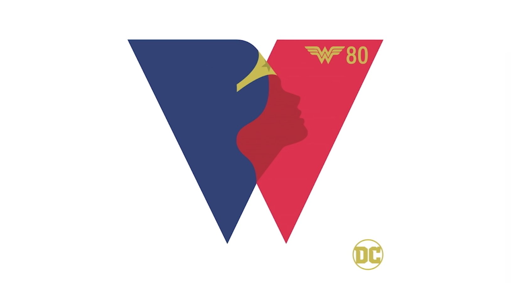
I voted 5 as the best but in the process of looking around, saw THIS for the first time. The 80th anniversary logo. Might be something to be made from this at some point.
 Protected by the Comics Code Authority
YES Capes. YES Masks. YES Secret Identities.

 Reply With Quote


