
I first noticed this in Hong Kong action films back in the '90s or so. Makes perfect sense. Certainly more than heels for a rooftop cat burglar/vigilante.Originally Posted by vitaminbee

Results 226 to 240 of 267
-
10-16-2023, 11:06 AM #226Extraordinary Member

- Join Date
- May 2014
- Posts
- 5,013
 Keep in mind that you have about as much chance of changing my mind as I do of changing yours.
-
10-16-2023, 01:47 PM #227Moderator

- Join Date
- Nov 2014
- Posts
- 116,091
Practicality doesn't always equal good design sense in my book.
-
10-16-2023, 02:05 PM #228Elektra Natchios
- Join Date
- Jun 2014
- Posts
- 1,194
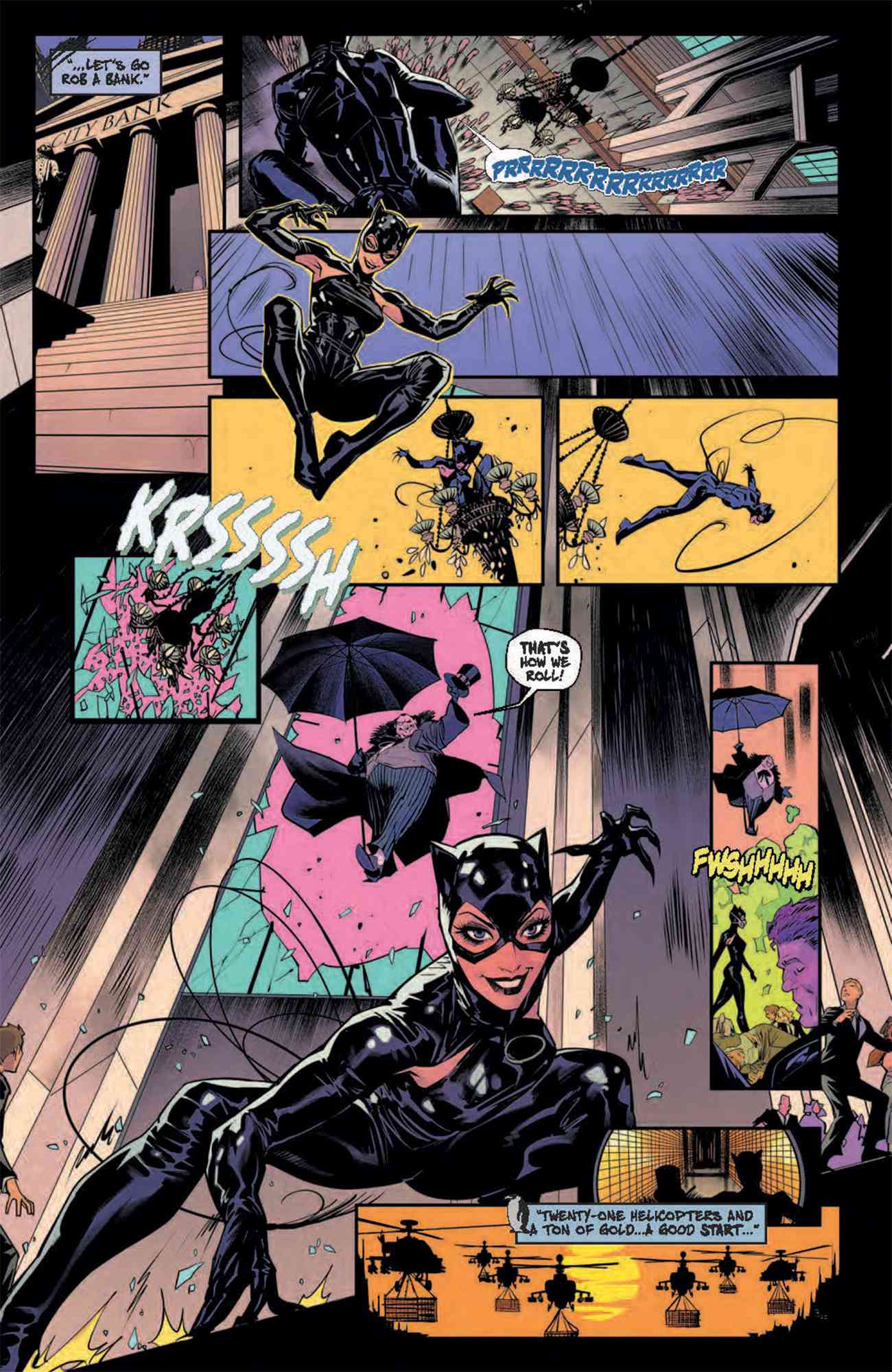
I think a balance helps between practicality and fantasy. The armpit stuff allowed for some new shapes and such and allow for her to look a little more like Batman Returns Catwoman. I think the new purple look is awful though. It's designed by someone who shouldn't be designing outfits. It also really depends on the artist who is drawing the outfit. Darwyn Cooke's look is amazing when drawn by Cooke/Stewart (sketchy) but then is awful under almost everyone else who draws it. Look at the one that you don't love. By Dan Mora, it looks really good. I think it looks better as one piece than a sleeve and a half glove.
Last edited by vitaminbee; 10-16-2023 at 02:07 PM.
-
10-16-2023, 08:23 PM #229Extraordinary Member
- Join Date
- Apr 2014
- Posts
- 5,853
The best costume designs “travel well;” artists with different styles can manage to make them work without them work. And sometimes a more limited design can either find itself with an artist’s style that makes it look bad… or a successful design can be consistently modified enough that it eventually becomes a poorer design than ti originally was. I think the “armpit” design isn’t particularly weak, but it’s got a few vulnerabilities because of how muchmore difficult it can be to make the armpit part work with the rest of the design aesthetic for some artists (I especially think it works best with an artists who emphasizes Selina having athletic shoulders, and not slyph-like ones.) Originally Posted by vitaminbee
The Cooke design actually lasted for quite a while… but I think it started coming off as trashy when more and more artists started perpetually yanking the zipper down. The outfit was not designed to bare that much cleavage, unlike other costumes; it’s Emma Peele-like design was meant to be more of an elegant “working woman’s catsuit.” Similarly, in my opinion, the 90’s costume was designed to work with a “glorious mane” of hair, and started coming off more goofy whenever the hair was removed.
I think the new suit feels like a poor reworking of the 90’s suit, especially with he half gloves and lack of hair.Like action, adventure, rogues, and outlaws? Like anti-heroes, femme fatales, mysteries and thrillers?
I wrote a book with them. Outlaws Shadow: A Sherwood Noir. Robin Hoods evil counterpart, Guy of Gisbourne, is the main character. Feel free to give it a look: https://read.amazon.com/kp/embed?asi...E2PKBNJFH76GQP
-
10-16-2023, 09:22 PM #230Elektra Natchios
- Join Date
- Jun 2014
- Posts
- 1,194
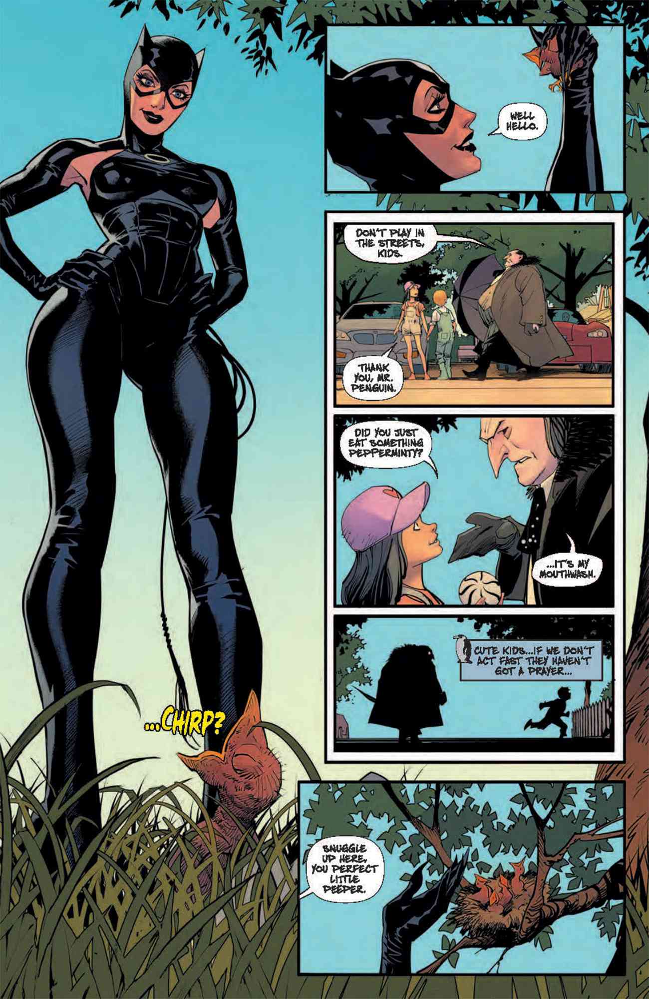
This is my biggest issue with the Cooke suit (after Cooke, Stewart, Rader, Pulido left, who all drew it perfectly... Gulacy was good too and Pete Woods) - they unzipped it constantly. It's my biggest pet peeve. Unzipping the suit is making something that is sexy (a catsuit is inherently sexy to begin with) and then sexualizing it by unzipping it. The last step is too much. It's almost out of character for Selina too. Then showing the seam of skin between the cowl and the body suit. Awful. Less is more! Originally Posted by godisawesome
Last edited by vitaminbee; 10-16-2023 at 09:24 PM.
-
10-17-2023, 08:56 AM #231Extraordinary Member
- Join Date
- Apr 2014
- Posts
- 5,853
Yeah... it felt like one or two artists started lowering the zipper, and then others followed suit - which sort of defeated the aesthetic "purpose" of the design in exchange for cheaper T&A. The Cooke design's simplicity relied on a tiny bit of faux-"form before function" reasoning, and following the "Rule of Sexy" via cleavage worked against that without maintaining the elegance of the original design. Not that superheroine cleavage can't have "elegance" in costume design - her purple dress costume did that - but it *definitely* leaned towards the more "trashy female costume design" side of things. It was sort of the equivalent to how Balent's art grew more and more exaggerated with the 90's costume, until it started to feel a bit like a parody. Originally Posted by vitaminbee
Now, an interesting facet of the armpit costume is that the more "complicated" torso can fail in some artists' hands because they struggle with texture and "substance" in the still generally tight clothing of heroes - a bit like how the Arkham games version of Catwoman's suit looked goofy in comic spin-offs, but worked better when the games could just map the costume out rather than require soemone to draw it.Like action, adventure, rogues, and outlaws? Like anti-heroes, femme fatales, mysteries and thrillers?
I wrote a book with them. Outlaws Shadow: A Sherwood Noir. Robin Hoods evil counterpart, Guy of Gisbourne, is the main character. Feel free to give it a look: https://read.amazon.com/kp/embed?asi...E2PKBNJFH76GQP
-
10-17-2023, 09:17 AM #232Moderator
- Join Date
- Nov 2014
- Posts
- 116,091
For me sometimes the Cooke suit just looked a little clunky/cumbersome from some artists.
-
10-17-2023, 10:38 AM #233Elektra Natchios
- Join Date
- Jun 2014
- Posts
- 1,194
The Arkham outfit was bad too. Took what Cooke did but made it all T and A. It was just a mess. Less is more. Originally Posted by godisawesome
-
10-17-2023, 11:51 AM #234Moderator
- Join Date
- Nov 2014
- Posts
- 116,091
I liked her green eyes...
-
10-20-2023, 08:38 AM #235Extraordinary Member
- Join Date
- May 2014
- Posts
- 5,013
All of this. Unfortunately, some artists just can't help themselves. Originally Posted by vitaminbee
Keep in mind that you have about as much chance of changing my mind as I do of changing yours.
-
10-20-2023, 08:59 AM #236Junior Member

- Join Date
- Apr 2014
- Posts
- 34,098
I guess DC looked at Marvel's Black Cat and said "Fine. You wanna rip us off? We'll do the same thing to you!". Originally Posted by godisawesome
Though I think Mortal Kombat vs DC is the first time I saw Selina with the zipper down.
-
10-20-2023, 10:36 AM #237Moderator
- Join Date
- Nov 2014
- Posts
- 116,091
-
10-21-2023, 06:54 PM #238Fantastic Member
- Join Date
- Oct 2017
- Posts
- 460

Last edited by Bryan; 10-21-2023 at 07:00 PM.
-
10-22-2023, 10:45 AM #239Moderator
- Join Date
- Nov 2014
- Posts
- 116,091
Apparently I just found out that the reason for the belt on the B:TAS costume was so she'd looked less "naked." Ha!
-
11-01-2023, 10:33 AM #240Extraordinary Member
- Join Date
- Mar 2018
- Posts
- 9,574
Cooke even included in the design notes that the suit should be a bit baggy so it's easier to move and not skin tight sexy Originally Posted by godisawesome
I was actually surprised when I saw that note because I came after they skintight and unzip it all the time


