It’s a bit annoying to me to that things that were once Amazonian were done in other comics. Diana deserves some free for some concepts!Originally Posted by Koriand'r

Results 526 to 540 of 3010
-
04-14-2023, 10:06 AM #526Astonishing Member


- Join Date
- May 2014
- Location
- San Francisco, CA
- Posts
- 4,554

-
04-18-2023, 07:31 PM #527Mighty Member
- Join Date
- May 2014
- Location
- Asgard
- Posts
- 1,687
Sampere's Wonder Woman is too masculine looking. I hope King isn't going to minimize Diana's femininity as that's core to the character. Its what seperates WW from a generic warrior character.
-
04-18-2023, 08:02 PM #528Junior Member
- Join Date
- Apr 2014
- Posts
- 34,114
How the hell is she too masculine looking? Originally Posted by Thor2014
The industry's state from before more practical costumes (briefly) existed says otherwise. Originally Posted by Koriand'r
Last edited by Agent Z; 04-18-2023 at 08:22 PM.
-
04-19-2023, 12:39 AM #529Fantastic Member
- Join Date
- Dec 2016
- Posts
- 329
Do you mean her face or her muscles? Originally Posted by Thor2014
-
04-19-2023, 05:15 AM #530Leftbrownie
- Join Date
- Feb 2015
- Posts
- 5,325
That's just ridiculous Originally Posted by Thor2014
-
04-19-2023, 07:42 AM #531Mighty Member
- Join Date
- Mar 2018
- Location
- Themyscira
- Posts
- 1,257
Masculinity (a vague, up-for-interpretation term anyway) is what separates WW from a generic warrior character? I thought her Themysciran backstory, her compassion, kind heart, and inherent reluctance to decapitate/disembowel/spinerip her way through her enemies was what separated her from the garden-variety "badass warrior chicks" that so many fanboys love. Originally Posted by Thor2014
-
04-19-2023, 12:09 PM #532Astonishing Member
- Join Date
- Nov 2020
- Location
- Otisburg
- Posts
- 2,211
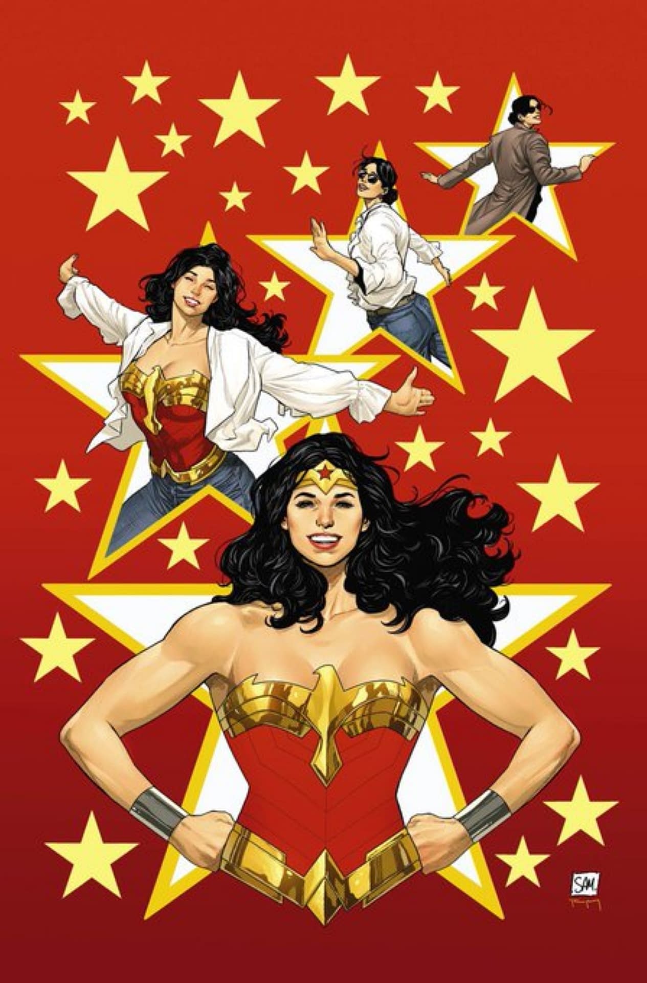
I like what Ive seen so far from Sampere. Diana looks fit, broad shoulders. He draws her hair well and while I dont love the more armor-y boots, I do like the white stripe there. Face kinda small as others have pointed out but overall I do like Samperes take. Hoping she also looks taller in comparison.
Look, you cant put the Superman #77s with the #200s. They havent even discovered Red Kryptonite yet. And you cant put the #98s with the #300s, Lori Lemaris hasnt even been introduced. Sam
Where the hell are you from? Krypton? Edgar Frog
-
04-19-2023, 01:58 PM #533Incredible Member

- Join Date
- Jul 2021
- Posts
- 611
Hey! Hi, Wonder Woman subforum! How are you doing?
... Originally Posted by Thor2014
*leaves to never return*
-
04-19-2023, 02:03 PM #534Fantastic Member

- Join Date
- Sep 2022
- Posts
- 392
I think Daniel Sampere is a helluva artist. The critiques are fine, but I also think they're overblown.
-
04-19-2023, 06:00 PM #535Astonishing Member
- Join Date
- Jun 2016
- Posts
- 3,799
Originally Posted by HotBoy
I don't think "masculine" is the right adjective, "unglamorous" fits better. There are no frills, no thrills and she looks like a corn-fed volleyball player from Idaho. She doesn't go to Coachella or drink dirty martinis, she goes to Branson, Missouri for country/western music and Bud Light. Originally Posted by Thor2014
In this post-Instagram world we live in with rampant BBL's and boob jobs, where cashiers at the grocery store wear contoured make-up, lace front wigs and fake eyelashes so long they can barely see past them, it's a little jarring and overly quaint.
-
04-19-2023, 07:05 PM #536Ultimate Member
- Join Date
- Mar 2020
- Location
- Occupied Klendathu
- Posts
- 13,020
Christ, the whinging already.
Sampere’s WW is pretty great actually. Nice change of pace from the Paquette covers and rotating artists we’ve had for the past year.Last edited by Gaius; 04-19-2023 at 08:12 PM.
-
04-19-2023, 07:08 PM #537Fantastic Member
- Join Date
- Sep 2022
- Posts
- 392
ALREADY. Book won't be out for months. All we've seen was a few pages and the complaints. ALREADY. Originally Posted by Gaius

-
04-19-2023, 07:24 PM #538Astonishing Member
- Join Date
- Jun 2016
- Posts
- 3,799
You goshdarn right, I love Paquette!
WW PACQUETTE EARTH 1.jpg
-
04-19-2023, 07:47 PM #539Fishy Member
- Join Date
- Jan 2018
- Location
- The Ocean
- Posts
- 3,696
I just want a creative team that's an actual creative team. Like, the artist isn't on for one arc and then dips. Originally Posted by Gaius
Hopefully that's what we're gonna get come September.~I just keep swimming through these threads~
-
04-19-2023, 08:13 PM #540Extraordinary Member

- Join Date
- Jun 2022
- Posts
- 5,360
Man Sampere's work on Action Comics was fantastic. It was a good time having him before he got poached for Dark Crisis. Originally Posted by I'm a Fish
Hopefully he's on here for a long time.

 Reply With Quote