

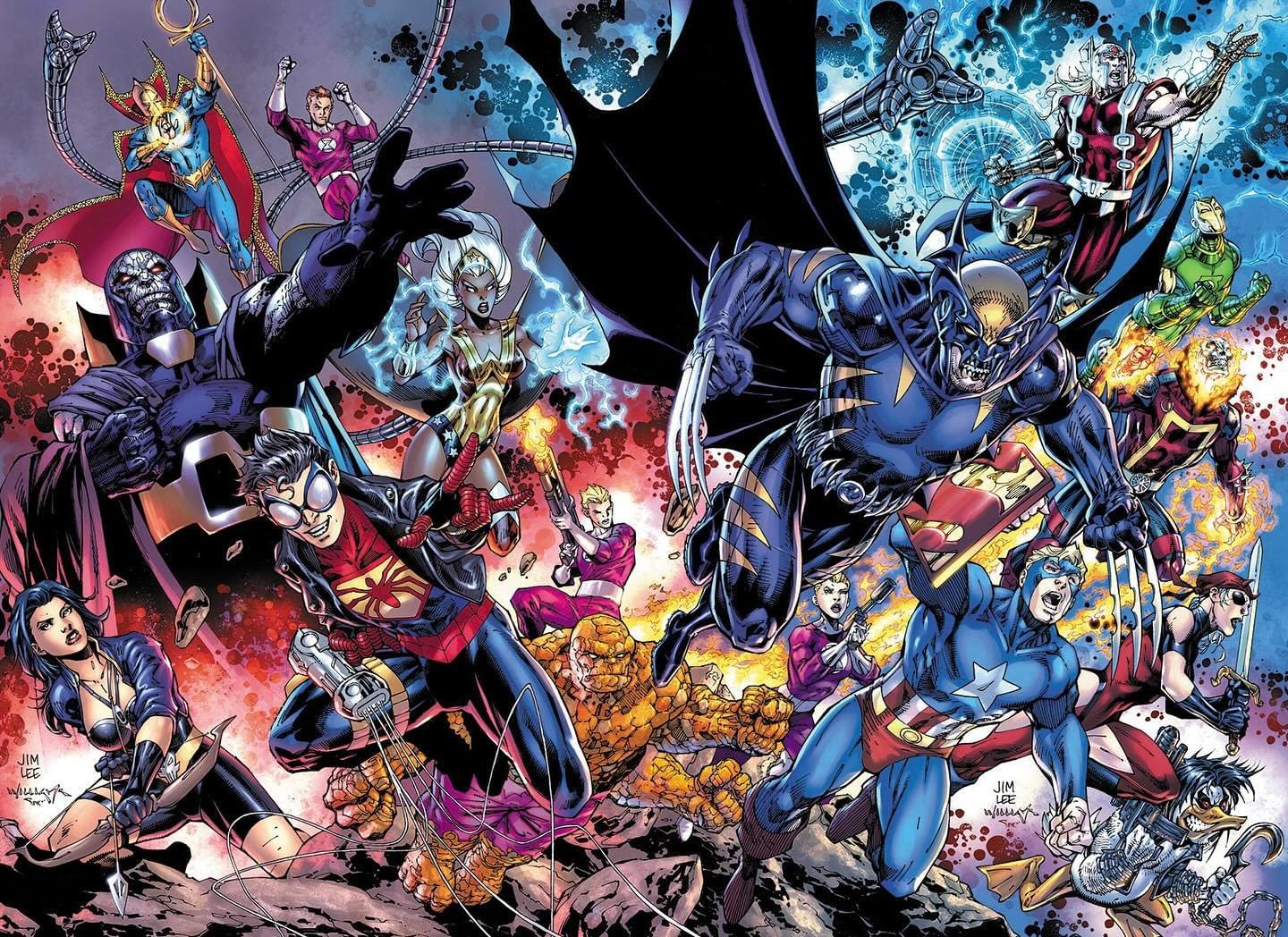
I agree on all points.(although I haven't seen the Amalgam cover) Maybe it's the inker that makes it look like someone trying to copy Lee, or he just didn't have as much time on this as he'd want. I mean, it's a crazy number of characters to try cramming into the space, so it's certainly not easy, but the oddest composition to me are Colossus's eyeline (it seems he's facing off against Wonder Woman, but he's looking into the distance rather than her), Superman's pose and tiny Robin right behind Deathstroke's backside. And yeah, the type of shading the colorist employs does this piece no favors.Originally Posted by M@Bowers2014

Results 1,111 to 1,125 of 1176
-
04-25-2024, 08:20 AM #1111Ultimate Member

- Join Date
- May 2014
- Posts
- 12,180

Last edited by j9ac9k; 04-25-2024 at 09:53 AM.
-
04-25-2024, 08:25 AM #1112Astonishing Member
- Join Date
- Nov 2015
- Location
- tOSU
- Posts
- 3,080
Jim Lee's art style isn't as popular right now, and I think that the actual quality of the work really hasn't been there for nearly a decade compared to his earlier work.
It's the Dynamic Duo! Batman and Robin!... and Red Robin and Red Hood and Nightwing and Batwoman and Batgirl and Orphan and Spoiler and Bluebird and Lark and Gotham Girl and Talon and Batwing and Huntress and Azreal and Flamebird and Batcow?
Since when could just anybody do what we trained to do? It makes it all dumb instead of special. Like it doesn't matter anymore.
-Dick Grayson (Batman Inc.)
-
04-25-2024, 09:14 AM #1113Incredible Member

- Join Date
- Jul 2021
- Posts
- 611
It seems to me like Jim Lee wanted to draw all the heroes looking at the camera doing a cool pose for the gallery. Not even remotely intending a symetric splash-page nor a fight, but superheroes posing up front. I guess he did it with the same philosophy he applied to the X-Men 1 cover. Only problem is, this doesn't resist a comparison, you can see between the two images that he spectacularly failed to deliver here.
-
04-25-2024, 01:22 PM #1114Ultimate Member
- Join Date
- May 2014
- Location
- California
- Posts
- 12,156
Here’s the Amalgam cover. It looks a lot better because the characters are leaping forward in the same direction. It’s not just random poses. Originally Posted by j9ac9k
-
04-25-2024, 04:57 PM #1115Extraordinary Member

- Join Date
- Jun 2022
- Posts
- 5,371
I think the guy's just out of shape. Originally Posted by Pohzee
He doesn't draw anymore so his artistic abilities have probably stagnated since he's no longer pushing himself as a creative.
-
04-25-2024, 05:21 PM #1116Moderator

- Join Date
- Nov 2014
- Posts
- 116,345
This is so Wildstorm. Originally Posted by Robotman
-
04-25-2024, 07:03 PM #1117Astonishing Member
- Join Date
- May 2021
- Posts
- 2,181
Good covers.
-
04-26-2024, 10:16 AM #1118Fantastic Member
- Join Date
- Nov 2023
- Posts
- 341
Why is there Darkseid on the cover instead of Thanoseid? Originally Posted by Robotman
-
04-26-2024, 11:10 AM #1119Astonishing Member
- Join Date
- May 2014
- Posts
- 2,521
That's how Thanoseid looked. He just made the gold parts silver for some reason. Originally Posted by Laser_Man
Last Read: Aquaman & The Flash: Voidsong
Monthly Pull List: Birds of Prey, Daredevil, Geiger, Green Arrow, Justice Ducks, Justice Society of America, Negaduck, Nightwing, Phantom Road, Shazam!, Space Ghost, Suicide Squad: Dream Team, Thundercats, Titans
-
04-26-2024, 12:37 PM #1120All-Star Member.
- Join Date
- Sep 2022
- Posts
- 249
I wish that existing crossover art had been used or that Alex Ross would have given the job of the crossover trade cover. Jim Lee doesn't draw regularly and it's very evident in his recent work. These covers are uninspired and dull. Ross, meanwhile, continues to be at the top of his game.
-
04-26-2024, 01:01 PM #1121Fantastic Member
- Join Date
- Nov 2023
- Posts
- 341
Thanoseid looked a lot different. They changed his entire color scheme. Originally Posted by Noodle
-
04-26-2024, 01:55 PM #1122Ultimate Member
- Join Date
- May 2014
- Location
- California
- Posts
- 12,156
It really was just Darkseid with gold trim. Originally Posted by Laser_Man

Not a very clever design.
-
04-26-2024, 05:22 PM #1123Extraordinary Member
- Join Date
- May 2014
- Posts
- 6,396
-
04-26-2024, 05:35 PM #1124Extraordinary Member
- Join Date
- May 2014
- Posts
- 6,396
-
04-26-2024, 06:15 PM #1125Moderator
- Join Date
- Nov 2014
- Posts
- 116,345
Still really curious what this is going to be.

 Reply With Quote


