Page 6 of 7 FirstFirst ... 234567 LastLast
Results 76 to 90 of 104
  1. #76
    Amazing Member PrydefulHunts's Avatar
    Join Date
    Dec 2023
    Location
    JSA Brownstone
    Posts
    90

    Default

    Quote Originally Posted by lemonpeace View Post


    Duke Thomas/The Signal
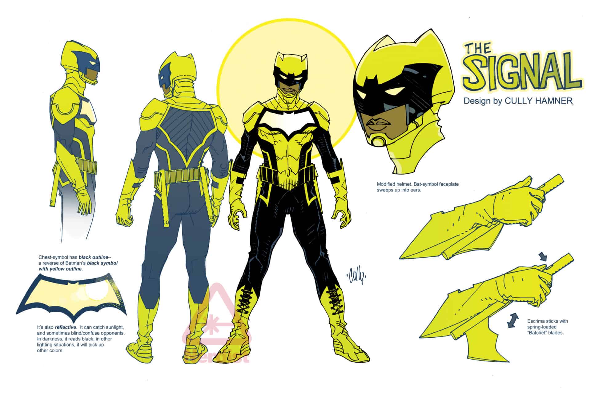
    while I have gotten used to it over time, I've been saying for years that his design is too bat-centric for a hero that has nothing to do with Bats outside of his mentor. had it just been the one bat on his chest and maybe MAYBE the ears i'd be fine but for him to have the ears, the bat on his face, bat wings on his back, bat on the chest, bat wings on his weapon and even bats on his toes? they dragged it. the only thing that speaks to Duke's character is the suit color and the reflective aspect of his insignia (which isn't always obvious). plus his overall design is a little too busy and lowkey clunky.
    I pretty much agree, the yellow suits Duke well, if he gets another redesign it should be the signature color of that suit.

  2. #77
    Extraordinary Member
    Join Date
    Oct 2015
    Posts
    9,376

    Default

    Quote Originally Posted by lemonpeace View Post
    Duke Thomas/The Signal
    while I have gotten used to it over time, I've been saying for years that his design is too bat-centric for a hero that has nothing to do with Bats outside of his mentor. had it just been the one bat on his chest and maybe MAYBE the ears i'd be fine but for him to have the ears, the bat on his face, bat wings on his back, bat on the chest, bat wings on his weapon and even bats on his toes? they dragged it. the only thing that speaks to Duke's character is the suit color and the reflective aspect of his insignia (which isn't always obvious). plus his overall design is a little too busy and lowkey clunky. a good design should be easy for anyone to draw consistently, the Signal design has too many little unnecessary details that get forgotten or misinterpreted from artist to artist. personally I feel his Future State design was a great update on his design, it scaled back the excessive bats and made it more streamlined. if they don't go with that then they need to overhaul all the bats motifs and give Duke his own symbol. something to do with light, or the sun, or day & night, something that speaks to Duke's character not just his batman affiliation. everyone knows he's Batman affiliated, he doesn't need to be an ad for his brand too.
    I mostly agree, but I also think that suit looks way to bight a for someone who is part of the Batfamily.

    Also not a Fan of the Armored look, that's something they have mostostly moved away from with the rest of the Batman characters after the new 52.
    Last edited by Aahz; 01-28-2024 at 02:15 PM.

  3. #78
    Astonishing Member Dark_Tzitzimine's Avatar
    Join Date
    May 2014
    Posts
    4,170

    Default

    I don't really care about Luke but is really dumb that he looks like a bootleg Wolverine. Yellow is such an ill fit as primary color for someone related to the Batfamily.

  4. #79
    Moderator Frontier's Avatar
    Join Date
    Nov 2014
    Posts
    116,212

    Default

    Quote Originally Posted by Aahz View Post
    I mostly agree, but I also think that suit looks way to bight a for someone who is part of the Batfamily.

    Also not a Fan of the Armored look, that's something they have mostostly moved away from with the rest of the Batman characters after the new 52.
    Well, he is meant to operate more in the day than the rest (not that we really see that at all).

  5. #80
    Mighty Member Bat-Meal's Avatar
    Join Date
    Feb 2017
    Posts
    1,687

    Default

    Quote Originally Posted by Aahz View Post
    I mostly agree, but I also think that suit looks way to bight a for someone who is part of the Batfamily.

    Also not a Fan of the Armored look, that's something they have mostostly moved away from with the rest of the Batman characters after the new 52.
    The bright color scheme and daytime theme make it difficult to fit Duke in with the rest of the Bat-Family, I mean - they work different shifts.

    Quote Originally Posted by Dark_Tzitzimine View Post
    I don't really care about Luke but is really dumb that he looks like a bootleg Wolverine. Yellow is such an ill fit as primary color for someone related to the Batfamily.
    Typo, you meant Duke not Luke. I have to agree about the suit though, unfortunately the first thing that popped into my head when I saw the suit was Wolverine.

    This is Luke:

  6. #81
    Extraordinary Member
    Join Date
    Oct 2015
    Posts
    9,376

    Default

    Quote Originally Posted by Bat-Meal View Post
    The bright color scheme and daytime theme make it difficult to fit Duke in with the rest of the Bat-Family, I mean - they work different shifts.
    The whole daytime shift thing doesn't make that much sense to me.
    Why would you put the least experienced member alone in charge of the city for half of the day, and for bit anyone else to be active at that time?
    And if he works in bright day light he should likely wear something that is even more stealthy, considering how the Batfamily usually operates.


    But even when we go with that, most of the Time you see Duke in current comics he is either part of some Batman event or teaming up with the Outsiders, and not doing the Day Time Protector thing.

  7. #82
    Extraordinary Member
    Join Date
    Oct 2015
    Posts
    9,376

    Default

    Quote Originally Posted by lemonpeace View Post
    personally I feel his Future State design was a great update on his design, it scaled back the excessive bats and made it more streamlined.
    I think that looked a bit to less like superhero costume to me, at the absolute minimum you would have to add a domino mask imo.
    Last edited by Aahz; 01-28-2024 at 11:56 PM.

  8. #83

    Default

    Quote Originally Posted by lemonpeace View Post


    Duke Thomas/The Signal
    while I have gotten used to it over time, I've been saying for years that his design is too bat-centric for a hero that has nothing to do with Bats outside of his mentor. had it just been the one bat on his chest and maybe MAYBE the ears i'd be fine but for him to have the ears, the bat on his face, bat wings on his back, bat on the chest, bat wings on his weapon and even bats on his toes? they dragged it. the only thing that speaks to Duke's character is the suit color and the reflective aspect of his insignia (which isn't always obvious). plus his overall design is a little too busy and lowkey clunky. a good design should be easy for anyone to draw consistently, the Signal design has too many little unnecessary details that get forgotten or misinterpreted from artist to artist. personally I feel his Future State design was a great update on his design, it scaled back the excessive bats and made it more streamlined. if they don't go with that then they need to overhaul all the bats motifs and give Duke his own symbol. something to do with light, or the sun, or day & night, something that speaks to Duke's character not just his batman affiliation. everyone knows he's Batman affiliated, he doesn't need to be an ad for his brand too.


    It's totally his best look. Duke just needs some protection for his head. Add a hood like Asssasins Creed.

  9. #84
    duke's casettetape lemonpeace's Avatar
    Join Date
    Jan 2016
    Location
    Brooklyn's WiFi
    Posts
    5,214

    Default

    Quote Originally Posted by Aahz View Post
    I mostly agree, but I also think that suit looks way to bight a for someone who is part of the Batfamily.

    Also not a Fan of the Armored look, that's something they have mostostly moved away from with the rest of the Batman characters after the new 52.
    Quote Originally Posted by Bat-Meal View Post
    The bright color scheme and daytime theme make it difficult to fit Duke in with the rest of the Bat-Family, I mean - they work different shifts.
    I mean, is that not the point of Duke's hero persona? in defense of the yellow/gold, he's supposed to be the antithesis to the dark philosophy of Batman, the brightness to his darkness, he's not supposed to "fit in" to typical style and aestethic of the Batfamily. the kid has invisibility, it really doesn't matter what color he is. besides, Huntress and Spoiler run around in bright purple, and Robin runs around in red, green, and yellow (sometimes in a speedo and elf boots); bright colors aren't an anomaly in the Batfamily. I feel like the issue of color for Duke is a catch 22, because people will complain he's too redundant yet will turn around a a nitpick at the thing that clearly distinguishs him and say it's too different. the color is the least pressing issue with his design, thats the one part that actually makes sense, it's almost everything else (from the symbols to the silhouette) that could use improvements.

    like it's supposed to be "armor" yet it only appears to be so from the shoulders up. again, most glaringly, he's supposed to be a solar-powered sunlight themed hero yet he's decked out in bats literally from head to toes. this kind of aestethic dissonance is the bigger issue with Duke's design, not his color.
    THE SIGNAL (Duke Thomas) is DC's secret shonen protagonist so I made him a fandom wiki

    also, check out "The Signal Tape" a Duke Thomas fan project.

    currently following:
    • DC: Red Hood: The Hill
    • Marvel: TBD
    • Manga (Shonen/Seinen): One Piece, My Hero, Dandadan, Jujutsu Kaisen, Kaiju No. 8, Reincarnation of The Veteran Soldier, Oblivion Rouge, ORDEAL, The Breaker: Eternal Force

    "power does not corrupt, power always reveals."

  10. #85
    duke's casettetape lemonpeace's Avatar
    Join Date
    Jan 2016
    Location
    Brooklyn's WiFi
    Posts
    5,214

    Default

    Quote Originally Posted by Aahz View Post
    I think that looked a bit to less like superhero costume to me, at the absolute minimum you would have to add a domino mask imo.
    I don't think so. because under the jacket he's still wearing his Signal armor. just have him open the jacket and he's no different from Midnighter or Red Hood. that style of design works imo because it's a good way of bending his We Are Robin style into his Signal persona. I also think it work for Duke not to have a mask (especially in the context of Future State). iunno if this is an unpopular take or not but I think a public identity actually makes a lot of sense for Duke. I think it's safe to say the irl public know him as "Duke Thomas" first and "Signal" second, and considering the social hero aspect of his character, i think it makes sense for Duke to one day do away with the masks and helmet and go bare-face. he has powers, he can turn invisible and he can see the future and he has a healing factor (to some degree), so it's not like he needs a mask or helmet for protect or to hide his identity if need be.

    Quote Originally Posted by the illustrious mr. kenway View Post


    It's totally his best look. Duke just needs some protection for his head. Add a hood like Asssasins Creed.
    I think a hood would be a good compromise. he does eventually adapt a hood onto his suit in the Future State timeline.
    THE SIGNAL (Duke Thomas) is DC's secret shonen protagonist so I made him a fandom wiki

    also, check out "The Signal Tape" a Duke Thomas fan project.

    currently following:
    • DC: Red Hood: The Hill
    • Marvel: TBD
    • Manga (Shonen/Seinen): One Piece, My Hero, Dandadan, Jujutsu Kaisen, Kaiju No. 8, Reincarnation of The Veteran Soldier, Oblivion Rouge, ORDEAL, The Breaker: Eternal Force

    "power does not corrupt, power always reveals."

  11. #86
    Mighty Member Bat-Meal's Avatar
    Join Date
    Feb 2017
    Posts
    1,687

    Default

    Quote Originally Posted by lemonpeace View Post
    I mean, is that not the point of Duke's hero persona? in defense of the yellow/gold, he's supposed to be the antithesis to the dark philosophy of Batman, the brightness to his darkness, he's not supposed to "fit in" to typical style and aestethic of the Batfamily. the kid has invisibility, it really doesn't matter what color he is. besides, Huntress and Spoiler run around in bright purple, and Robin runs around in red, green, and yellow (sometimes in a speedo and elf boots); bright colors aren't an anomaly in the Batfamily. I feel like the issue of color for Duke is a catch 22, because people will complain he's too redundant yet will turn around a a nitpick at the thing that clearly distinguishs him and say it's too different. the color is the least pressing issue with his design, thats the one part that actually makes sense, it's almost everything else (from the symbols to the silhouette) that could use improvements.

    like it's supposed to be "armor" yet it only appears to be so from the shoulders up. again, most glaringly, he's supposed to be a solar-powered sunlight themed hero yet he's decked out in bats literally from head to toes. this kind of aestethic dissonance is the bigger issue with Duke's design, not his color.
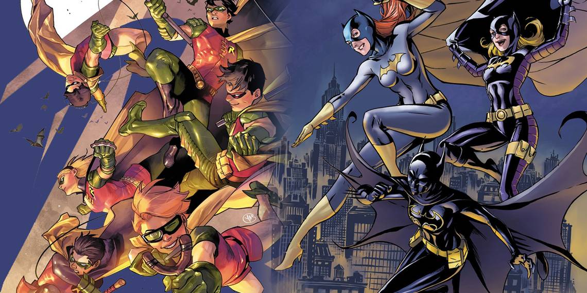
    Ok, this is my issue right here - he feels completely out of place in the Bat-Family with a power-set like that. Sure, Cass has a body-language-reading ability, and Luke has a power-suit (he's a technological genius so he maintains and upgrades it himself), and Jean-Paul I can't even remember what his deal is but similar to Cass I think. They each have been shown to have a counter-balance of some kind to their power set, Luke's suit can be taken down (hacked, power drain etc), Jean-Paul is prone to brainwashing or something (I haven't read any of his stuff in years), and Cass has difficulty communicating verbally. Duke's solar theme makes it seems like he should be with the Super-Family or a group of metas. This is my personal opinion.

    I know the part about the reflector says it reads black at night - but the artists need to color it black in night scenes.

    Yes, I realize I need to re-read the Azrael stuff.


    And as for the Purple and Red. Well Red often means danger, and Purple is a cold color. Neither is used as a safety color normally. As for the green, it's not a particularly bright green. I'll give you the yellow sections, but it's not the dominant color in their suits.
    Last edited by Bat-Meal; 01-29-2024 at 11:39 PM. Reason: Added Image.

  12. #87
    Mighty Member Bat-Meal's Avatar
    Join Date
    Feb 2017
    Posts
    1,687

    Default

    Ok, I can't keep quiet any longer - the costume is in bad need of a redesign IMHO. A yellow chest piece with a reflective part on it? Just no, not that combination.

    Quote Originally Posted by lemonpeace View Post


  13. #88
    Astonishing Member Dark_Tzitzimine's Avatar
    Join Date
    May 2014
    Posts
    4,170

    Default

    Quote Originally Posted by lemonpeace View Post
    I mean, is that not the point of Duke's hero persona? in defense of the yellow/gold, he's supposed to be the antithesis to the dark philosophy of Batman, the brightness to his darkness, he's not supposed to "fit in" to typical style and aestethic of the Batfamily. the kid has invisibility, it really doesn't matter what color he is. besides, Huntress and Spoiler run around in bright purple, and Robin runs around in red, green, and yellow (sometimes in a speedo and elf boots); bright colors aren't an anomaly in the Batfamily. I feel like the issue of color for Duke is a catch 22, because people will complain he's too redundant yet will turn around a a nitpick at the thing that clearly distinguishs him and say it's too different. the color is the least pressing issue with his design, thats the one part that actually makes sense, it's almost everything else (from the symbols to the silhouette) that could use improvements.
    This is precisely my problem with him.

    If you are going to make him so wildly different from the core aesthetics and philosophy of the family...then why make him a part of it, to begin with?

    The costume would work slightly better if Duke were just another of the vigilantes that have been flooding Gotham in the last years instead of forcing him into the family for no good reason. It still needs tweaks to not look like a bootleg Wolverine though.

  14. #89
    Mighty Member Bat-Meal's Avatar
    Join Date
    Feb 2017
    Posts
    1,687

    Default

    Do you prefer the Red & Gold or the Red & White costume for Azrael?


  15. #90
    Extraordinary Member
    Join Date
    Oct 2015
    Posts
    9,376

    Default

    Quote Originally Posted by Bat-Meal View Post
    Do you prefer the Red & Gold or the Red & White costume for Azrael?
    For Jean Paul Red & Gold, the Red & White costume is the Michael Lane version.

Posting Permissions

  • You may not post new threads
  • You may not post replies
  • You may not post attachments
  • You may not edit your posts
  •