

Check it out here.
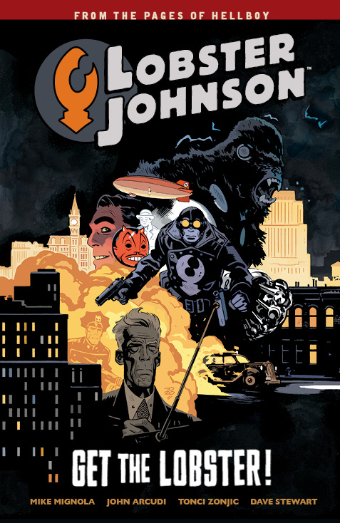
A slight change of text to the cover of the trade from what we've previously seen.
Results 1 to 9 of 9
-
09-09-2014, 02:48 PM #1Rogue Demon Hunter

- Join Date
- Apr 2014
- Posts
- 1,637
 December 2014 covers and an interview with Scott Allie
-
09-09-2014, 02:51 PM #2Rogue Demon Hunter
- Join Date
- Apr 2014
- Posts
- 1,637
And the BPRD #126 cover...
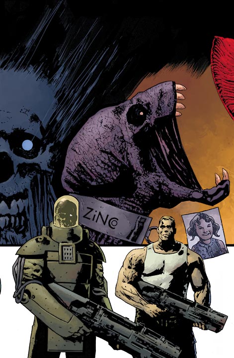
Interestingly, it seems the covers for this arc stitch together.

-
09-09-2014, 05:19 PM #3The Claw of Justice!
- Join Date
- Aug 2014
- Posts
- 581
That Lobster cover is awesome. This is the one instance where I'm perfectly OK with someone other than Mignola doing a Hellboy-universe trade cover. I like the new text on the cover too.
-
09-10-2014, 09:32 AM #4Amazing Member
- Join Date
- May 2014
- Posts
- 64
Agreed, Tonci did an amazing job with that cover. Originally Posted by LobsterJohnson

-
09-12-2014, 02:22 PM #5Amazing Member
- Join Date
- May 2014
- Posts
- 39
hmmm. I really don't see that as a cover stitch at all, but as a design choice for the arc covers. Originally Posted by middenway
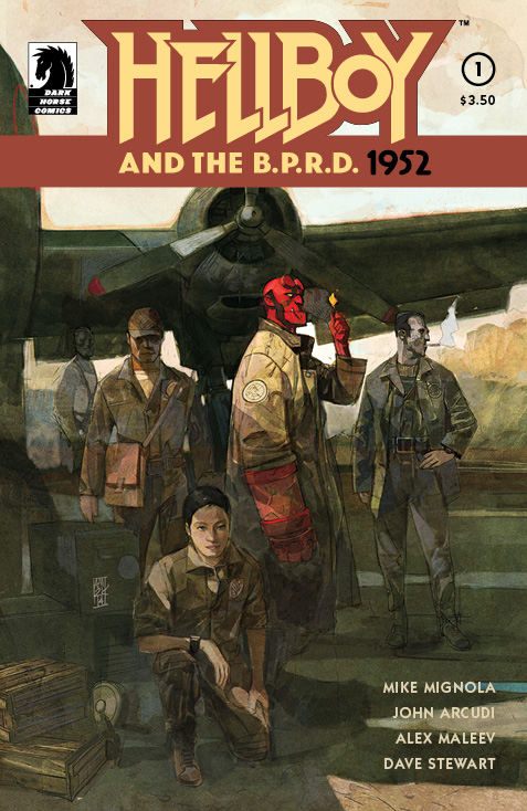
that Maleev 1952 cover is sweet. Looks like I'll have to get both the that one and Mignola's sketch variant too.
HELLBOY-BPRD-1-VAR-6f226.jpgLast edited by St. August; 09-12-2014 at 02:25 PM.
-
09-18-2014, 08:12 AM #6All-New Member
- Join Date
- Sep 2014
- Posts
- 27
I agree, if you look at the covers for The Reign of the Black Flame or Lake of Fire you can see that they all use similar layout/design aesthetics, but not necessarily part of a larger whole. Although they will still all look pretty bad-ass lined up together Originally Posted by St. August
Last edited by horror-of-sorts; 09-18-2014 at 10:55 AM.
-
09-18-2014, 10:37 AM #7All-New Member
- Join Date
- May 2014
- Posts
- 9
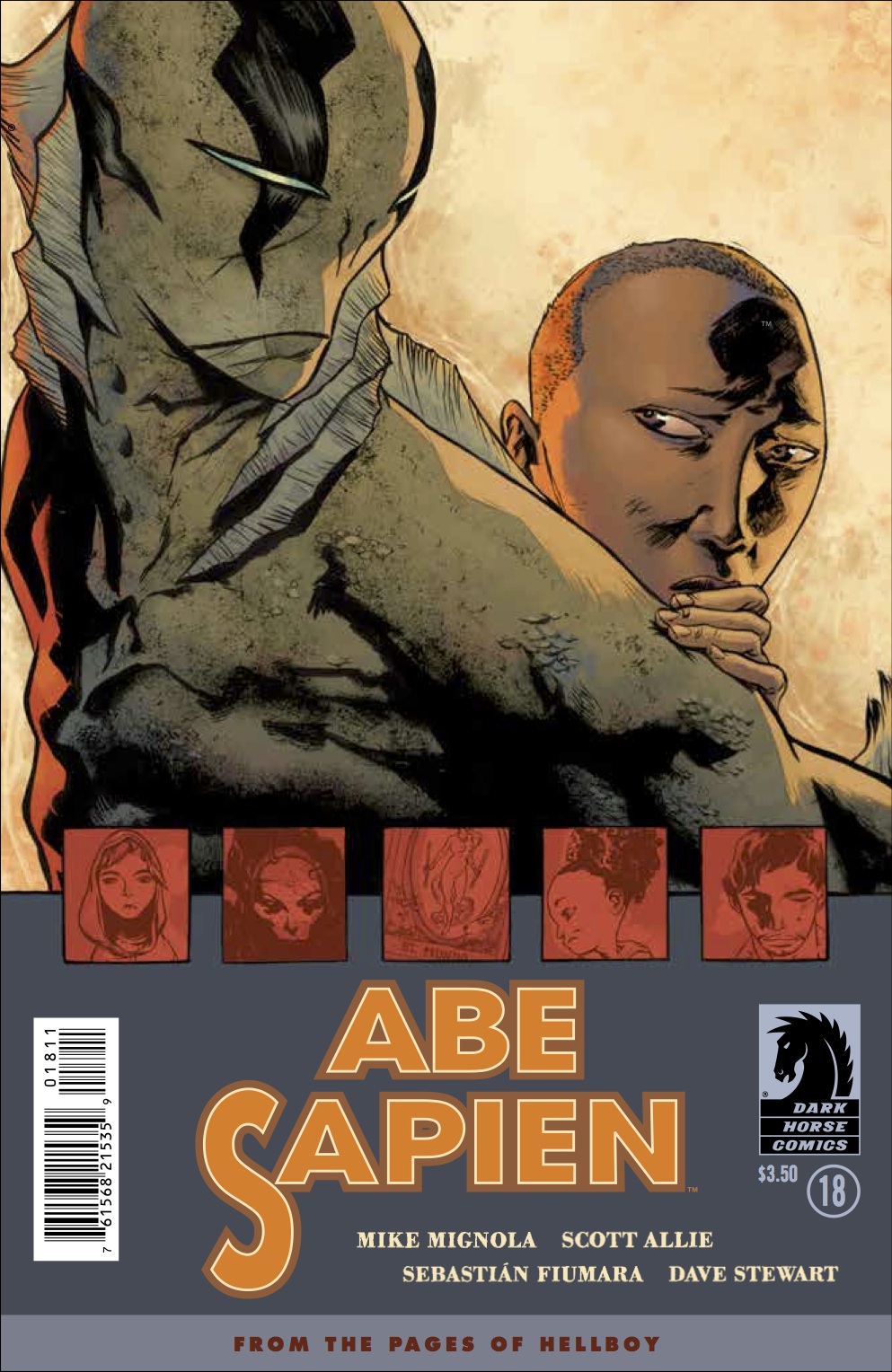
There's a tm mark on grace's head on that Abe cover. I hope they check that that isn't on the final printed version. There have been some mistakes that I've noticed in the past on other dark horse covers. I think on one of Richard Corben's poe covers they left a Will Eisner hall of fame logo mixed in with the artwork.
-
09-18-2014, 11:36 AM #8Amazing Member
- Join Date
- May 2014
- Posts
- 55
I am going to side with Mark on this one… The red shape in the upper left of #126 seems a bit too out-of-place to night tie in with cover of #127. Love the design and layout of these covers Originally Posted by horror-of-sorts
-
09-18-2014, 05:07 PM #9Rogue Demon Hunter
- Join Date
- Apr 2014
- Posts
- 1,637
That and if you look on the left of the second cover, you can see a tiny bit of Ted Howards' elbow. Originally Posted by Storey

 Reply With Quote


