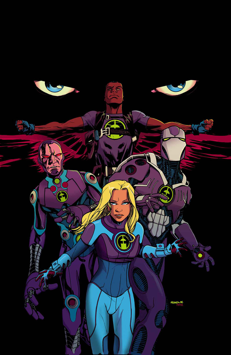
The Ultimates/Fantasy Four mashup with an average i.q. of 162... It's Joshua Hale Fialkov's Ultimate FF!
I don't seem to see nearly as much talk about this as I see about MM:USM, is it the art that's putting people off?
I personally can't wait till it double ships - a month is too long after a big reveal like that!
Results 1 to 10 of 10
Thread: Ultimate FF Appreciation
-
05-08-2014, 05:34 AM #1
 Ultimate FF Appreciation
-
05-08-2014, 10:42 AM #2All-New Member

- Join Date
- Apr 2014
- Posts
- 2

Can't wait for the next issue. The art is a little weird but the story has me super excited. Definitely my number one Ultimate book.
-
05-08-2014, 12:50 PM #3

I wouldn't say that it's the art putting me off, although it's not helping. To me, it's the overall design of the characters. Iron Man looks like he merged with Ult. Beetle. THe color choices? Visually off-putting to me.
-
05-08-2014, 01:27 PM #4

The visuals are the biggest detractor for me personally. I thought the line art, color palette, and costume design were ugly as sin and didn't really fit in the UU. Fialkov is a solid writer and I enjoyed what he had, but it wasn't enough for me to care about this book in any legitimate capacity.
I'll keep reading it for a few months but i found it very disappointing for a new #1. MM:USM #1 is the only GOOD book out of 3 so thats why we're all jumping on it. Great art, great writing, and a helluva cliff hanger. I hope All New Ultimates and UFF improve over the comings months though.
-
05-09-2014, 12:43 AM #5

What happened to the art between preview and release?!?
CBR preview:

Actual issue:

Was the colourist not able to do the whole issue? The preview colours really improve the art (still wouldn't have got rid of Falcons mask though) I see there's a new artist in July, hope he is better. I really liked the first issue and am excited to see where they go from here, continuity fixing and all, it's just the art that's the weak link.
-
05-10-2014, 07:45 AM #6

holy crap I never saw that preview.. what the HELL happened? It completely rounds out the characters pops all the details. How disappointing :/
-
05-10-2014, 07:49 AM #7

The drop in quality between the preview art and the final art is indeed shocking. I almost didn't recognize that preview art at first; I thought it was some future issue.
What were they thinking?!
-
05-10-2014, 10:02 AM #8BANNED

- Join Date
- May 2014
- Posts
- 1,546

Yeah, the colorist really dropped the ball on this one. The art just looks washed out and bland, let's hope he steps his game up next issue.
-
05-14-2014, 12:17 AM #9All-New Member

- Join Date
- May 2014
- Posts
- 3

not a big fan of the artwork... a BIG part of enjoying comics is the visuals. Without visuals, comics is just like reading a regular book... boring!
-
05-20-2014, 05:19 AM #10All-New Member

- Join Date
- May 2014
- Posts
- 29

How can there be such a big discrepancy? When they submit the preview art it seems that it should be still in the works or finished....but could get better.....not degrade in quality??


