
I know especially as its in no way his fault Kobik did this to him.
Results 1,561 to 1,575 of 2008
Thread: Captain America Appreciation
-
10-16-2016, 01:43 PM #1561Amazing Member

- Join Date
- Jul 2016
- Posts
- 82

-
10-16-2016, 01:54 PM #1562BANNED
- Join Date
- Jun 2016
- Posts
- 6,097
Alpha Storm :
Other heroes could brake this reality warping attack.I know especially as its in no way his fault Kobik did this to him.
He is still old Steve. I think that we should rather sympathize with hydra because they will be forced to be good.;d
-
10-16-2016, 04:10 PM #1563BANNED
- Join Date
- Nov 2014
- Location
- Marvel Studios
- Posts
- 13,533
 Happy Birthday Bob Hall!!!
-
10-26-2016, 11:28 AM #1564Astonishing Member
- Join Date
- May 2014
- Posts
- 2,832
Excellent moments for HydraCap, within both CIVIL WAR #6 & SR: CAPTAIN AMERICA #6 (from his POV, of course).
-
10-31-2016, 01:28 PM #1565Astonishing Member
- Join Date
- May 2014
- Posts
- 2,832
Here're the Exclusive Preview Pages for CIVIL WAR #7
-
10-31-2016, 10:52 PM #1566BANNED
- Join Date
- Nov 2014
- Location
- Marvel Studios
- Posts
- 13,533
 Happy Halloween!!!

Captain America Pumpkin Stencil
-
11-01-2016, 03:04 PM #1567Jesus Christ, redeemer!
- Join Date
- Aug 2014
- Location
- In the Tardis reading X-Books
- Posts
- 13,076
Cool. Pure b/w on the classic costume. Originally Posted by 616MarvelYear is LeapYear
 Now faith, hope, and love remain, and the greatest of these is love.--1 Corinthians 13:13
You had a dream; I have a plan--Cyclops
There's no point in being grown up if you can't be childish sometimes.--The Doctor
-
11-05-2016, 01:21 PM #1568BANNED
- Join Date
- Nov 2014
- Location
- Marvel Studios
- Posts
- 13,533
Happy Birthday Jim Steranko!!!
After spending five years co-starring with Iron Man in Tales of Suspense, Captain America had finally received his own full title in ’68, drawn by the legendary Jack Kirby — but still something was missing.
The letter pages of Tales of Suspense had been filled with pleas to set Cap’s escapades in the modern day, but under Kirby, the Star-Spangled Avenger’s adventures were still rooted in the past: fighting the Red Skull, flashing back to the death of Bucky, punching an Adolf Hitler impersonator.
Kirby introduced Batroc during this period, but also gave us Captain America battling — and actually being challenged for more than 30 seconds by — Paste-Pot Pete you can give him a snazzy new outfit and redub him the Trapster, but he’s still that guy with a sticky paste gun.
Then, with Issue #110, like he’d done with WWII warhorse Nick Fury, Jim Steranko kicked Steve Rogers into the swinging ’60s with hard-hitting action, groovy psychedelia, and the first (of many) fake-out “deaths” of Captain America. He gave us a new kind of Cap, a new sidekick, new adversaries and a new Steranko-designed logo. Under Steranko, Captain America absolutely thawed out from his decades-long deep-freeze.
Issue #111 features one of the most distinctive and intriguing comic-book splash-page sequences still to date: a series of colorful small panels set at a carnival arcade from the point of view of Steve Rogers.
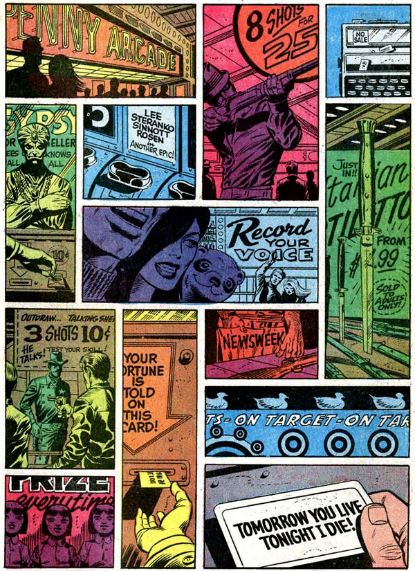
The multi-colored panels mirror bright flashing fairground lights.
During this time it was unusual for a penciller to color his own work — most of Marvel’s comics were colored by coloring-department manager Stan Goldberg.
Steranko’s keen sense of shading and coloring is as important a story-telling tool as his anatomy and dynamic movement, and for an artist to color his own work is still the exception rather than the rule in superhero comics.
In the sequence below, Steranko’s sharp sense of coloring helps to “pop” the top tier sequence by shading Cap’s attackers in single tones and a close-up of Steve’s face in brilliant red-alert vermillion.
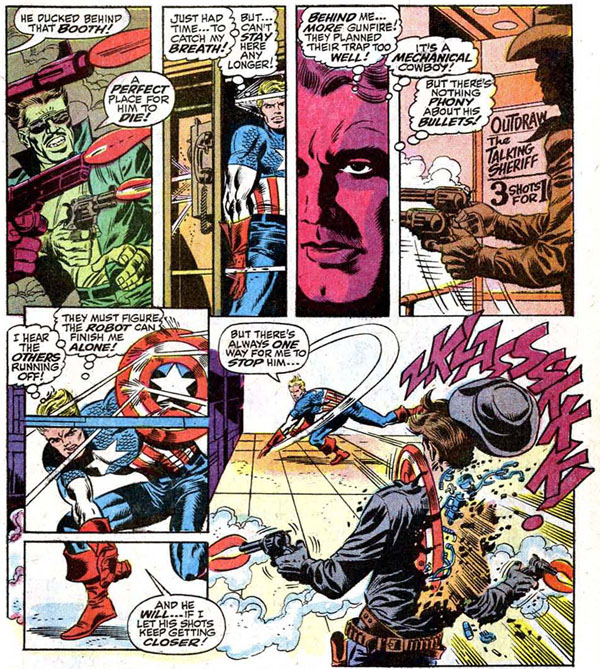
The bottom tier features another set of artistic tricks: the bullet that bisects the panel; Cap’s huge wind-up swing and toss so mighty his shield rips through a robot’s torso in panel two, the power of the toss increased by the perspective lines of the panels on the floor drawing our eyes along Cap’s attack.
Steranko’s not inventing these techniques — for example, a tiled floor to indicate perspective into the distance is a visual characteristic of Carmine Infantino.
But Steranko is mixing and matching artistic tricks and techniques here, combining and blending them in ways that spotlight the energy and dynamism of his characters and fight sequences.
1969 was a watershed year in American culture. The revolution of the big-screen, awe-inspiring visual blockbuster had kicked off the previous year with 2001: A Space Odyssey.
At the same time, the year’s films brought a gritty new breed of American protagonist to the screen with Midnight Cowboy, The Wild Bunch and True Grit.
The Beatles broke up. Nixon became president. Monty Python’s Flying Circus premiered. We went to the moon.
Everything was changing, and Marvel’s flagship superhero was no exception.
In these three short but sparkling issues, Jim Steranko finally fully brought Captain America, fist punching and shield slinging, into our contemporary age.
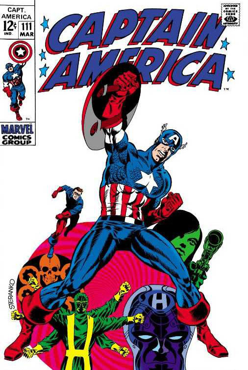
What Jim Steranko brought — to Captain America and others — is of such a brightness, energy, and immediacy, that it’s not off base to declare his Marvel work absolute true classics, the work of a master illusionist who makes us, shall we say … marvel at his skill!
http://www.webdevelopersnotes.com/jim-steranko-birthday
http://www.wherevent.com/detail/Pop-...-Birthday-Bash
Last edited by 616MarvelYear is LeapYear; 11-05-2016 at 04:11 PM.
-
11-06-2016, 11:07 AM #1569Uncanny Member
- Join Date
- Jul 2016
- Posts
- 36,739
I see the current Hydra Cap thing isn't the first time Steve has turned evil.
Tales of Suspense 66
EDITED because file shrunk to an unreadable size when uploaded as attachment.Last edited by Digifiend; 11-06-2016 at 11:12 AM.
-
11-08-2016, 01:45 PM #1570Uncanny Member
- Join Date
- Jul 2016
- Posts
- 36,739
We effectively have confirmation that the next big Marvel event is about Captain America, thanks to trade paperback solicits.
http://edelweiss.abovethetreeline.co...alogID=4069337
He's a hero. An Avenger. A living legend. The sentinel of liberty. Mankind's greatest threat? It's the story that shocked the world - and you won't believe where it's going next. Marvel's next big event begins right here, and Steve Rogers is in the dead center of the storm.
When Steve Rogers could no longer wield the shield, Sam Wilson stepped up as an all-new, all-different and very much all-his-own Captain America. The public was divided. And when a reinvigorated Steve returned to share the mantle, the protests grew louder. Sam just kept fighting on, the only way he knew. But is the world big enough for two Caps? And as Sam is pulled into the shocking events of Marvel's next big event, will he - and the world - have to choose?
-
11-08-2016, 03:00 PM #1571BANNED
- Join Date
- Jun 2016
- Posts
- 6,097
Digifiend :
Brevoort said this few weeks ago:We effectively have confirmation that the next big Marvel event is about Captain America, thanks to trade paperback solicits.
I think it's safe to say – and not even in the future, pretty much since Avengers: Standoff – the two Captain America books, Captain America: Sam Wilson and Captain America: Steve Rogers, and Thunderbolts and Uncanny Avengers are all operating in a linked state, and that linked state will only become greater and more profound the further in we get. There's big stuff on the horizon that I am not ready to talk about yet, and all of those books are vectoring directly towards that big thing as the things that are going on with Steve Rogers reach a head and reach a boiling point. Those events will spill out into other titles beyond that. But right this moment, all of those books are telling a piece of that overall journey.
http://comicbook.com/marvel/2016/10/...y-avengers-an/
-
11-08-2016, 04:15 PM #1572Uncanny Member
- Join Date
- Jul 2016
- Posts
- 36,739
Yeah, but now we know, as rumoured on 4chan, that that was referring to 2017's big event.
-
11-09-2016, 12:21 PM #1573Astonishing Member
- Join Date
- May 2014
- Posts
- 2,832
It's another winner with SR: CAPTAIN AMERICA #7; as this goes into more of Steve's planning into wanting the best for Hydra. Two of the most important moments are revealed as follows.......
spoilers:
end of spoilers1. During Steve's training within the HYDRA Camp; it's revealed that his special friend (who've been talking to and protecting him) turns out to be.......HELMUT ZEMO.
2. Helmut/Baron Zemo is revealed to be alive....!!
Also, both HydraCap & SamCap are seen among the heroes within Today's POWER MAN & IRON FIST #10.
-
11-09-2016, 12:45 PM #1574Ultimate Member
- Join Date
- Apr 2014
- Posts
- 10,399
Not entirely surprised by this honestly. I mean isn't his current ongoing storyarc Steve trying to bring down the collective force of SHIELD, Red Skull, and the entire MU? Originally Posted by Digifiend
"It's fun and it's cool, so that's all that matters. It's what comics are for, Duh."
Words to live by.
-
11-09-2016, 01:00 PM #1575Uncanny Member
- Join Date
- Jul 2016
- Posts
- 36,739
That HAS to be leading up to something in spoilers: Originally Posted by PaxHouse
end of spoilersThunderbolts! Zemo was the team's founder and the ONLY original member not already confirmed to appear in issue 10.


