I'm all about that spin.
It's inviting, easily recognizable/readable, and I think it looks a bit more professional than the current one.
Results 16 to 30 of 36
Thread: Your favorite DC Logo
-
02-09-2015, 12:08 AM #16Fantastic Member

- Join Date
- Apr 2014
- Posts
- 479

-
02-09-2015, 12:27 AM #17long time member
- Join Date
- May 2014
- Posts
- 2,625
Favorite

this one below was great too.
 "History of the DC Universe" by Wolfman and Perez, when the DCU use to make sense.
-
02-09-2015, 02:04 AM #18Boing Boing Baggies.
- Join Date
- May 2014
- Posts
- 3,860
I would like all the documents full of all the research you did, to come to this fact. Originally Posted by Marvel_Is
 "Yes...Mondo Cool"- Vegeta.
-
02-09-2015, 05:32 AM #19Astonishing Member
- Join Date
- May 2014
- Posts
- 3,568
The bullet where my nostalgia lies, but honestly it looks old fashioned. I think the current one is the best - though the one before was fine too.
-
02-09-2015, 05:41 AM #20Just a Host.
- Join Date
- Apr 2014
- Posts
- 4,879
This one. It's definitely the BEST. Originally Posted by Pharozonk
"All it takes for sexism to prosper is for good men to see nothing."
-
02-09-2015, 09:00 AM #21Nostalgia Fanwanker
- Join Date
- Apr 2014
- Location
- Atlanta, GA
- Posts
- 4,212
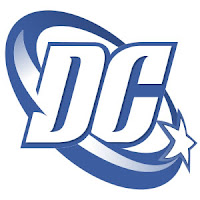
The current logo is so bland and generic that it almost hurts.
"In any time, there will always be a need for heroes." - the Time Trapper, Legion of Superheroes #61(1994)
"What can I say? I guess I outgrew maturity.." - Bob Chipman
-
02-09-2015, 10:20 AM #22Just a Host.
- Join Date
- Apr 2014
- Posts
- 4,879
The current one is that one where it's peeling from itself, yes? Originally Posted by Pharozonk
You'll have to forgive me as I'm not reading any current DC books (yet).
If that is the one, it may look like it hurts for that reason."All it takes for sexism to prosper is for good men to see nothing."
-
02-09-2015, 10:25 AM #23Spectacular Member
- Join Date
- Oct 2014
- Posts
- 154
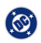
I grew up with the blue bullet (it was other colors at times too) and the spinning star logo and still love those, the new logo isn't very good. I don't like it at all.
-
02-09-2015, 10:46 AM #24Fate's Law Prevails
- Join Date
- Apr 2014
- Location
- Like Savoir-Faire...Everywhere!
- Posts
- 1,853

Pure and simply the classic of classic logos."Yes, I can do that!" - Ivan Lawrence Blieden
"The true is inimitable, the false untransformable." - Robert Bresson
"The boundaries which divide life from death are at best shadowy and vague. Who shall say where the one ends, and where the other begins?" - Edgar Allan Poe
"Those who believe need no explanation." - Dionysos, The Bacchae by Euripides
Marvel Future Fight: InimitableMaven, Alliance: Fates Law / Yahtzee With Buddies: TheInimitableMaven
-
02-09-2015, 11:04 AM #25Mighty Member

- Join Date
- May 2014
- Location
- Right behind you
- Posts
- 1,587
I actually like the current one and second is the Bullet.
-
02-09-2015, 12:20 PM #26Nostalgia Fanwanker
- Join Date
- Apr 2014
- Location
- Atlanta, GA
- Posts
- 4,212
Yep, that's the one. The classic DC bullet was such as good design. I don't know why they did away with it. Originally Posted by Cold Water
"In any time, there will always be a need for heroes." - the Time Trapper, Legion of Superheroes #61(1994)
"What can I say? I guess I outgrew maturity.." - Bob Chipman
-
02-09-2015, 12:32 PM #27DC/Collected Editions Mod
- Join Date
- May 2014
- Posts
- 19,548
Well, it's one that I grew up with (and remember even being introduced), though I'm not sure it can be considered any more classic than the one used during the Golden and Silver Ages. Originally Posted by Pharozonk
Me? I'll go with...:
181_scaled_image.jpg
... for no other reason than it's the one that I saw when I first started buying comics (though it's not the first DC logo that I saw). If I actually left nostalgia out of this, however, then the DC Spin would be the one for me.A bat! That's it! It's an omen.. I'll shall become a bat!
Pre-CBR Reboot Join Date: 10-17-2010
Pre-CBR Reboot Posts: 4,362
THE CBR COMMUNITY STANDARDS & RULES ~ So... what's your excuse now?
-
02-09-2015, 07:56 PM #28007 girl.
- Join Date
- Apr 2014
- Location
- The world is my Garden
- Posts
- 602
I've always had a fondness for the logo that flashes in my avatar every 5 seconds, but would it fit on the covers for any of the New 52 books? Nope.
Kings 21:23
And of Jezebel also spake the LORD, saying, The dogs shall eat Jezebel by the wall of Jezreel.
-
02-09-2015, 08:51 PM #29Incredible Member
- Join Date
- May 2014
- Posts
- 543
"The Line of DC Super Stars" version is where I came in so it's the one that makes me smile to see. It was also around the Bicentennial so ever cover referred to that. Collect all thr tops & you won a Superman belt buckle I think!
The classic DC bullet is 2nd. Just a strong image. The current one is a little vague to me. Nothing about it says comic books, which is probably the point.
-
02-10-2015, 12:17 AM #30Astonishing Member
- Join Date
- May 2014
- Posts
- 2,896
I contend that the bullet is far and away their best logo. I don't care what color it is, I just think it's great. The first time I ever bought a book with the swish on it, I was actually confused. That was back before I kept tabs on things like changing logos, of course.

 Reply With Quote