

Mine is the DC Spin. First one that I saw when I was introduced to DC (Well maybe not so much introduced, but when I started paying more attention to the company) so its the one I think of when I think DC.
Results 1 to 15 of 36
Thread: Your favorite DC Logo
-
02-08-2015, 11:04 AM #1All-New Member

- Join Date
- Apr 2014
- Posts
- 23
 Your favorite DC Logo
Last edited by Superman 1265; 02-08-2015 at 11:10 AM.
-
02-08-2015, 11:10 AM #2Incredible Member
- Join Date
- May 2014
- Posts
- 955
My favorites: the blue bullet, the red National Comics and the spin. Current one is awful -- if I didn't already know it was the DC logo, I'd have no idea what it is supposed to be.
-
02-08-2015, 11:20 AM #3Mighty Member
- Join Date
- Apr 2014
- Posts
- 1,920
I like the simple, red 'DC' inside the circle. A little tweaking and that could be a great, modern logo. Stark (but iconic) simplicity is where it's at.
It's weird, but the current logo somehow is both simple and needlessly busy at the same time. I guess it's because you have what should be simple forms interrupted by that realistic fold with the 3-dimensional shading. Maybe get rid of the fold, move the 'D' a bit to the left and have the top and bottom edges of the 'C' emerge from behind the 'D' instead of being uncovered by a peeling sticker.
-
02-08-2015, 11:23 AM #4Extraordinary Member
- Join Date
- Apr 2014
- Posts
- 6,402
Regardless of the product, this ^ is the more memorable, "catchy" overall better executed logo.
Who ever was in charge of DC's branding/marketing is an idiot letting it through to another company.
What's ridiculous is it even has the reworking of star theme, which might be why DC finally dropped it in their "new" one.
And with slight shading it even conveys a comic book betterthan that new bandaid/peeling sticker one.
Last edited by Güicho; 02-09-2015 at 01:30 PM.
-
02-08-2015, 11:29 AM #5Metahumane
- Join Date
- May 2014
- Location
- Nashua, NH
- Posts
- 1,397
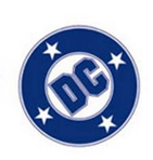
Classic blue bullet (third to last).
-
02-08-2015, 11:38 AM #6Boing Boing Baggies.
- Join Date
- May 2014
- Posts
- 3,860
Current one. Hated it at first but now it has grown on my me so much it is my fav.
"Yes...Mondo Cool"- Vegeta.
-
02-08-2015, 11:47 AM #7The Winged Wonder
- Join Date
- Apr 2014
- Location
- Central Florida
- Posts
- 834
The blue bullet. But the current one isn't bad, either. Much better than the generic previous version, anyway.
Batman: I need your help finding a man named Vulko.
Hawkman: You want him dead or alive?
- Justice League #17
-
02-08-2015, 11:55 AM #8Nostalgia Fanwanker
- Join Date
- Apr 2014
- Location
- Atlanta, GA
- Posts
- 4,212
The classic DC Bullet all the way
 "In any time, there will always be a need for heroes." - the Time Trapper, Legion of Superheroes #61(1994)
"What can I say? I guess I outgrew maturity.." - Bob Chipman
-
02-08-2015, 11:55 AM #9Retired
- Join Date
- Apr 2014
- Posts
- 18,747
For nostalgia reasons and in no particular order, my 4 favourites are: the DC Line of * Super Stars * bullet, the DC/National Comics/Superman bullet, the 4 stars DC bullet and the simple DC whatever with a pic of the feature inside the comic.
The DC/National Comics/Superman bullet was what was on the comics when I first started buying. Mind you the Go-Go checks were also on those comics and to me the Go-Go checks are as much an emblem of DC as anything else they've used. The thing about DC/National Comics/Superman is that it was very confusing. It seemed like the company couldn't decide what it was and it gave you a multiple choice. If you looked inside on the indicia you got a fourth option: National Periodical Publlications. So what was it? The Go-Go checks were a much easier way to identify these comics and you could always see them in a spinner rack.
I liked when they had an image of the hero or heroes or sometimes a representative image (like a gothic bat for the mystery titles) in the upper left hand corner. I was always interested to see which image they would use for which comic.
The Line of * Super Stars * was a catchy slogan. The 4 stars Milton Glaser bullet was simply an evolution from that--I don't know why they had to pay a designer so much to come up with that, since it is a mere tweaking of what they already had. With all the expert letterers and designers in their employ, why go outside the company for a logo design? You would think Joe Letterese, John Workman or John Costanza could have done something like that in an afternoon.
-
02-08-2015, 12:02 PM #10Fantastic Member
- Join Date
- May 2014
- Posts
- 377
9th.
Current one is convoluted and ineffective.
-
02-08-2015, 12:03 PM #11Incredible Member
3.jpg "deadboy80's Avatar")
- Join Date
- May 2014
- Location
- HAHAHAHAHAHAHAH
- Posts
- 641
The yellow and red, and the red, white, blue are the best.
-
02-08-2015, 12:03 PM #12Incredible Member
- Join Date
- May 2014
- Posts
- 769
I like the bullet.
Did you know that every atom in our bodies was once part of a star? Think about that EVERYTHING changes. Caterpillars turn into butterflies and stars turn into @$$holes.
-
02-08-2015, 12:14 PM #13BANNED
- Join Date
- Aug 2014
- Posts
- 419

Literally #1 with a BULLET.
-
02-08-2015, 12:19 PM #14Old post count: 2,290
- Join Date
- May 2014
- Location
- On a Hellmouth
- Posts
- 218
My favorite is probably the spinning star. It was the logo in use when I got into DC, so it has the nostalgia factor for me. I also like the blue bullet. I'm not terribly fond of the current logo, but I've kind of gotten used to it. I would gladly welcome a change, though.
I'm still waiting for a new Wonder Twins ongoing. Let's make it happen, DC!
-
02-09-2015, 12:02 AM #15BANNED
- Join Date
- Apr 2014
- Location
- Battlepizza (aka - Cattleworld)
- Posts
- 1,048
If DC would go back to using the bullet logo, they'd sell more comics. #Facts.


 Reply With Quote


