
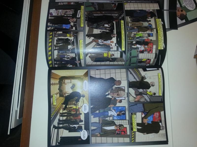
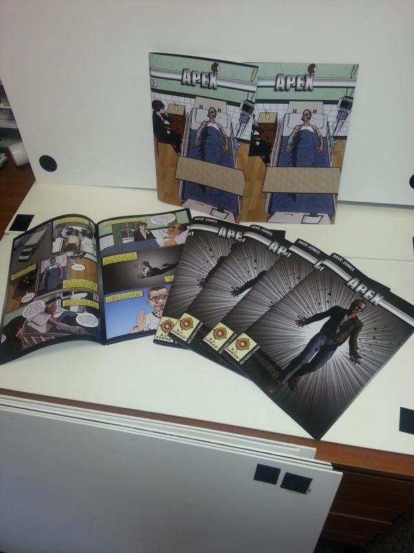
Hi comic fans. I would like some feedback from people. At the beginning of the year I started a new comic that will be submitted to some of the known publishers such as image and 2000AD. I am now going to add them here for you to view for free I want your opinions. You can view it online or download and open via your preferred pdf program. These are only the first 2 parts of what I hope to be a very long series, So without further ado I present
Apex issue 01
http://djcomics.files.wordpress.com/...3/apex-001.pdf
Apex Issue 02
http://djcomics.files.wordpress.com/...3/apex-002.pdf
on a second note I just got them professionally printed too.
Results 1 to 7 of 7
Thread: Apex, My New Comic
-
05-25-2014, 04:05 AM #1All-New Member

- Join Date
- May 2014
- Posts
- 2
 Apex, My New Comic
-
05-26-2014, 01:16 AM #2Spectacular Member
- Join Date
- May 2014
- Posts
- 155
I liked the beginning (with the animals), even though it's a bit odd that the rabbit didn't see the beasts coming (There were two of them, and they even had time to switch places). I also liked the ending. Everything in the middle was decent, but those scenes in the forest were definitely standouts.
The art is... Interesting. Did you, and don't get offended, take pictures with a camera and then reworked them with Photosop? There's just some cold feeling about it.
-
05-26-2014, 01:26 AM #3Spectacular Member
- Join Date
- May 2014
- Posts
- 155
Man, I really wish you the best, but the artwork (Pretty sure it's pictures photoshopped) really drags the story down.
-
05-26-2014, 01:51 AM #4All-New Member
- Join Date
- May 2014
- Posts
- 2
no they aren't pictures that have been photoshopped, they are 3D rendered scenes & all the line work was hand done via drawing tablet
-
05-26-2014, 02:33 AM #5Spectacular Member
- Join Date
- May 2014
- Posts
- 155
Okay, but the effect is IMO similar. The characters look stiff and bit odd. It's not bad, just very... Different.
-
05-26-2014, 03:14 AM #6Spectral Member
- Join Date
- Apr 2014
- Posts
- 427
Best of luck with your submission! I hope it works out for you, definitely has potential.
I have some feedback:
The art is interesting, I like how it almost looks like a cel-shaded videogame in some parts. But I do agree with the other two posters, some of the poses do seem kindof stiff somehow? I understand why using 3d models would help though. Especially in the scenes with large groups of people and getting all the perspectives for buildings and interiors to look right.
I also agree that the forest scenes are interesting and were a clever way to present the apex idea. I liked the scenes where Simon was in his bedroom at night. The color being hues of blue instead of city browns and greys was a bit of a welcome palate cleanser. The deep shadows also made the scenes interesting to me because it seemed to convey his anger and frustration, along with the different color.
The scenes where Simon was back at the Valentines Club looking in the mirror and laying on the bed also stuck out to me. They look more naturally hand-drawn and dont have distracting textures. Also, again the deep shadows were a nice touch while he was laying on the bed.
A small suggestion, but maybe try using a flat black or white for the background color (behind all the panels) instead of a gradient? Its a minor nitpick, and maybe just my personal preference.
Last thing I can think of is to try to change up the logo some. Simple logos can work, like Sagas for instance. But I would avoid details like gradients, shadows or glows and try to manipulate its actual shape or perspective somehow. Maybe even try just outlining it in black and making it flat white without the bar behind it?Last edited by Ghost; 05-26-2014 at 03:28 AM.
-
05-26-2014, 04:56 PM #7BANNED
- Join Date
- Apr 2014
- Location
- Old School
- Posts
- 3,061
 Originally Posted by greenish lantern
 I have to disagree. I read the book and the art didn't drag the story down at all. It felt more Indy than Marvel or DC. perhaps if he were trying to work for them he would have to change his style significantly. Originally Posted by greenish lantern

 Reply With Quote
