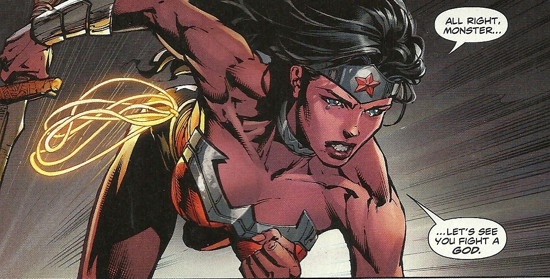
Haha. Looks a bit mad innit? A bit like the Superman cover, "funny looking". I'm thinking it looks funny because it's meant as such.
Btw Miller drawing anatomy that doesn't match up isn't something new.
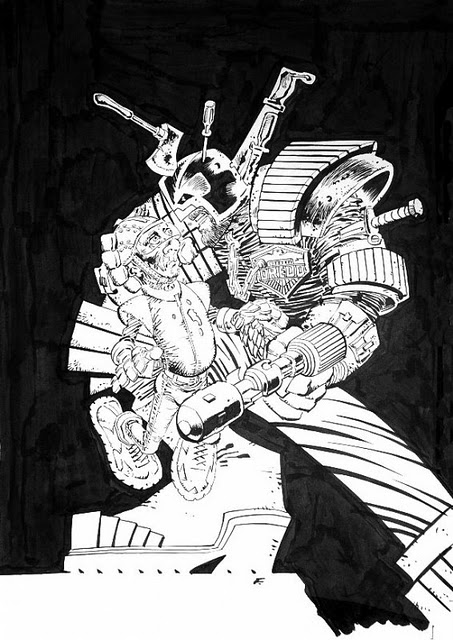
Here's a pin up he did for Judge Dredd. Meant for a cover (which went unused).
Miller is not on art duty in TDKIII other than the Atom mini comic (which btw looks really good) as of yet. No worriesOriginally Posted by Nyssane


Results 16 to 30 of 57
-
11-18-2015, 11:21 AM #16Mighty Member

- Join Date
- May 2014
- Location
- The north.
- Posts
- 1,386

-
11-18-2015, 11:37 AM #17Extraordinary Member
- Join Date
- Apr 2014
- Location
- Appleton, WI
- Posts
- 6,834
Originally Posted by Shaggy
This about sums up my feelings. This piece is overly sexualized trash.Currently(or soon to be) Reading: Absolute Power, Batman/Superman: World's Finest, Birds of Prey, Green Arrow, Green Lantern, Justice Society of America, Shazam, Titans, & Wonder Woman.
-
11-18-2015, 11:58 AM #18Mighty Member
- Join Date
- May 2014
- Location
- The north.
- Posts
- 1,386
Btw, what's so "sexualized" about it? That her arms are thicker than her bum? That there isn't any back breaking T'n'A?
While the pose looks a bit off (again, I don't think Miller is being too serious with either this piece, or the Superman cover), I've seen much worse lately.Last edited by borntohula; 11-18-2015 at 12:07 PM.
-
11-18-2015, 12:03 PM #19Junior Member
- Join Date
- Apr 2014
- Posts
- 34,117
The corset looking like it's about to tear and the emphasis on her ass are pretty sexualized. Originally Posted by borntohula
And honestly, "he's not being serious" really doesn't seem like a good excuse for this art.
-
11-18-2015, 12:05 PM #20Invincible Member
- Join Date
- Apr 2014
- Posts
- 24,953
I was thinking the same thing. While I do think it is on that end of the spectrum, it's pretty tame compared to some of what's in the current run. Originally Posted by borntohula
-
11-18-2015, 12:19 PM #21Mighty Member
- Join Date
- May 2014
- Location
- The north.
- Posts
- 1,386
I'm not excusing Miller's art because some doesn't take liking to it. I'm just interested in how the poster is sexualizing Diana. Originally Posted by Agent Z
So the corset is basically a corset. As for her behind, what about it? While she puts on a pout, it's not much worse than the one on the album cover of Springsteen's Born in the USA.
Personally, I chuckled a bit when I first saw it, which I think probably was the intention. Just as with his Superman cover (with the big hands and junk swinging).
I'd say it's more or less nothing. Alot of hate for a silly looking poster. Originally Posted by numberthirty
Last edited by borntohula; 11-18-2015 at 12:23 PM.
-
11-18-2015, 12:51 PM #22Mighty Member
- Join Date
- May 2014
- Location
- Los Angeles, CA
- Posts
- 1,437
@borntohula
I'm not reading the current run and don't know what the Finches are doing in general, but I'm just wondering if you included that panel above in this thread because it's your idea of a sexualized Diana?You see the rest of them are soldiers. But [Wonder Woman] is an artist.
I only support the made of clay origin.
-
11-18-2015, 01:02 PM #23Mighty Member
- Join Date
- May 2014
- Location
- The north.
- Posts
- 1,386
No. Originally Posted by Largo161
I was doing a google on Finch Wonder Woman, and that showed up. It made me chuckle, so I posted it.
But I removed the picture shortly afterwards, since I don't want to pit Miller's art versus Finch's. That's just infectious and will turn the thread into the usual debate on the sexiest WW drawings.
Sorry if that's what the thread will turn into.Last edited by borntohula; 11-18-2015 at 01:14 PM.
-
11-18-2015, 02:08 PM #24BANNED
- Join Date
- Jun 2015
- Posts
- 4,454
you know that bruce is a real man, with agency that posed to that disco. wonder owman is a character with no agency, that was drawn like that by a man. it is much worse and different situation. Again one wrong, doesn't make another wrong to be right Originally Posted by borntohula
it is heavily sexualized the way she poses, and we only see her behind and part of her face. it is one of the oldest sexualization technics
-
11-18-2015, 02:14 PM #25BANNED
- Join Date
- May 2014
- Posts
- 6,110
This talk about sexualizing when Dick Grayson is showing butts all around on his comic every issue. But hey, he`s an acrobat.
Drawing is fine. Not hot about the legs, tho, they seem overlystylized, but that`s Miller style curently, so I`m not shocked or surprised.
-
11-18-2015, 02:29 PM #26Mighty Member
- Join Date
- May 2014
- Location
- The north.
- Posts
- 1,386
Well, I meant it as "a pout, it's not much worse than the one on the album cover of...", pout measurement or what to call it. Wasn't meant to try to make some point about men being portrayed as "this or that" in comics. Originally Posted by Tayswift
Regardless, you've now written "it is heavily sexualized the way she poses, and we only see her behind and part of her face. it is one of the oldest sexualization technics". Not sure I agree, but it's interesting to read what you mean
-
11-18-2015, 04:56 PM #27Extraordinary Member
- Join Date
- Apr 2014
- Location
- Appleton, WI
- Posts
- 6,834

While I can't speak for anyone else, what I find to be overly sexualized about this piece is:
1.) The amount of skin visible.
2.) The pose emphasizes the buttocks.
3.) The use of fishnets in the "costume".
While none of these alone would probably make me think of the drawing as overly sexualized, the combination of the 3 definitely do. It's probably a good thing that Miller didn't use the double "W" insignia in his design or some people may have thought it stood for "Wonder Whore".
Last edited by Dr. Poison; 11-18-2015 at 05:07 PM.
Currently(or soon to be) Reading: Absolute Power, Batman/Superman: World's Finest, Birds of Prey, Green Arrow, Green Lantern, Justice Society of America, Shazam, Titans, & Wonder Woman.
-
11-18-2015, 05:30 PM #28Invincible Member
- Join Date
- Apr 2014
- Posts
- 24,953
Maybe we should just dress her up like a nun. That would nip that "Exposed Flesh/Fishnets" thing right in the bud.
-
11-18-2015, 05:32 PM #29Mighty Member
- Join Date
- May 2014
- Posts
- 1,462
His style is obviously very divisive. I like it because it is so extremely unusual and unorthodox. From DKSA to today, it's almost like his vision incorporates elements of Surrealism or even Futurism, breaking every rule in the technique book, you know?
Don't get me wrong, I don't think I can look at his art on a regular basis -- it's just too exhausting! -- but whenever I do I have fun analyzing it (his pictures demand analysis!) ... ie What's going through this artist's mind? Is he tortured or playful or both?
Anyway, it's very fascinating IMOLast edited by friendly-fire-press; 11-18-2015 at 05:35 PM.
-
11-18-2015, 05:33 PM #30Astonishing Member
- Join Date
- May 2014
- Posts
- 2,828
So what if it's overly sexualized?
That's his interpretation of Diana
And that's how she and many women dominate men.
Marston would be proudLast edited by Nick Miller; 11-18-2015 at 05:35 PM.

 Reply With Quote