

The new suit in Batman #50 has been revealed. What are your thoughts?
I personally dislike it. I think it is overly complicated and unnessicary. It is not a suit you look at and think of as the Batman. The symbol just looks silly to me with the gold trim.
View Poll Results: Do you like the new Batsuit?
- Voters
- 81. You may not vote on this poll
-
Love it
43 53.09% -
Hate it
38 46.91%
Results 1 to 15 of 55
-
03-23-2016, 08:41 AM #1Astonishing Member

- Join Date
- Nov 2015
- Location
- tOSU
- Posts
- 3,073
 New Batsuit: Love it or Hate it? (Poll)
Last edited by Pohzee; 03-23-2016 at 08:54 AM. Reason: Wanted to add, no neutral since it doesn't really add much. Sides are obviously oversimplified for clearer results.
-
03-23-2016, 08:47 AM #2Fantastic Member
- Join Date
- Apr 2014
- Posts
- 458
I was thinking of making such a poll. I voted "Love it". My answer from another thread:
I really like the new suit! I am not in love with the symbol, but I think it's nice and it will grow on me. As for the rest, it is everything I hoped for! Modern and streamlined, without unnecessary lines making it too busy for no good reason. I hope it stays for as long as the Lee one did. It's only fair!
-
03-23-2016, 08:48 AM #3Not a Newbie Member
- Join Date
- Feb 2015
- Location
- Arkham, Mass (lol no)
- Posts
- 9,207
The yellow/gold trim is just so jarring and radical and just horrible. Silly.
Things I love: Batman, Superman, AEW, old films, Lovecraft
Grant Morrison: Adults...struggle desperately with fiction, demanding constantly that it conform to the rules of everyday life. Adults foolishly demand to know how Superman can possibly fly, or how Batman can possibly run a multibillion-dollar business empire during the day and fight crime at night, when the answer is obvious even to the smallest child: because it's not real.
-
03-23-2016, 08:49 AM #4Incredible Member
- Join Date
- May 2014
- Posts
- 540
for reference

LOVE IT
-
03-23-2016, 09:17 AM #5Mighty Member
- Join Date
- May 2014
- Location
- Scandinavia
- Posts
- 1,340
Not feeling it.
Although I like the inclusion of Gold in Batman's design, I don't like this perticular use of it...
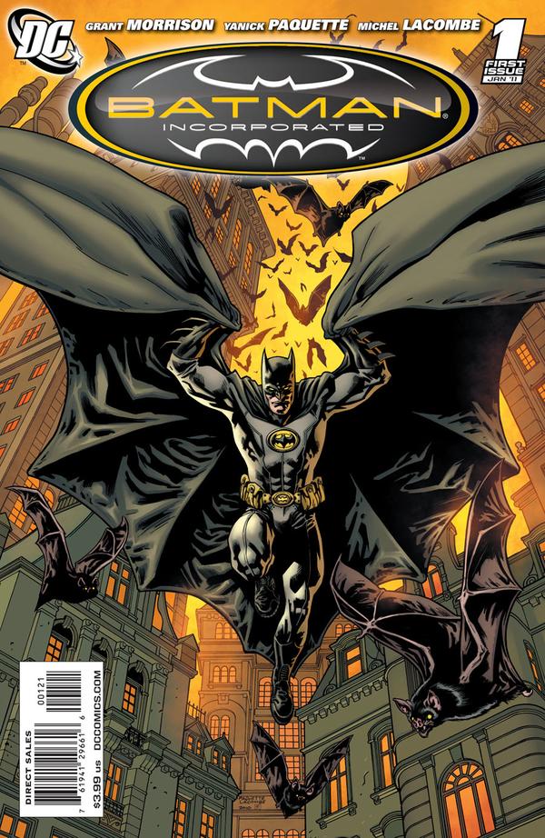
I always felt DC should have stuck with the Batman Inc. design, personally - it really felt like classic Batman, but modernized.
For reference:


-
03-23-2016, 09:26 AM #6Astonishing Member
- Join Date
- May 2014
- Posts
- 3,175
I like it
Yellow/gold highlights on the cape would be good too
-
03-23-2016, 09:34 AM #7BANNED
- Join Date
- Jun 2014
- Location
- Antalya/Turkey
- Posts
- 944
It's ok... cape's inside is purple... this kind of gives Batman a more light hearted look, this is the only part i'm not digging. I hope they don't turn Batman in to something like Batgirl of Burnside. I like Batgirl of Burnside but i don't think that kind of light heartedness is for Batman.
-
03-23-2016, 09:35 AM #8Incredible Member
- Join Date
- Apr 2014
- Posts
- 744
Dislike. It's all the bad parts of the New 52 design with more problems. Whats the point of the yellow trim? It doesn't add anything because the suit is such a light grey. I like that they're going with a black belt but thats about it.
And with every redesign that drifts further from the classic all it does it draw attention to it not being the classic and thus not being permanent.Miller was right.
-
03-23-2016, 09:39 AM #9Fantastic Member
- Join Date
- Apr 2014
- Posts
- 458
I am not sure if the belt is supposed to be black with yellow highlights or dark yellow. If you look at Paquet's interpretation of the suit at the epilogue, it is dark yellow. I think both are fine, but I prefer it to be dark yellow. Originally Posted by CrazyOldHermit

-
03-23-2016, 09:42 AM #10Fantastic Member

- Join Date
- Feb 2015
- Location
- Pennsylvania
- Posts
- 449
I agree. While I prefer the blue with trunks classic, the Batman Inc is the closest they've come to the classic. Originally Posted by L.R Johansson
I really dislike the black belt with highlights of the new costume. I'm still deciding on the bat highlights.
-
03-23-2016, 09:44 AM #11Astonishing Member
- Join Date
- Apr 2014
- Posts
- 2,566
I'm a big fan of Capullo, but this suit was a swing and miss IMHO. I don't think it will last long. Also, the reveal panel is one of what I call Capullo's blank face panels...he has such detailed faces at times (look at the preceding panels of Gordon), but from time to time he does a panel like this where the face looks like a 40's comic strip. Maybe it is a conscious decision to put greater emphasis on the design, but it seems odd to me
-
03-23-2016, 10:08 AM #12D*mned Prince of Gotham
- Join Date
- Apr 2014
- Location
- In the Shadows
- Posts
- 6,190
I feel ambivalent about the suit myself. I do like the yellow outline on the bat symbol, which could be taken as a nod to the yellow oval but I wish the suit itself was black instead of gray. The yellow would stand out more on a black suit and that would make the overall costume look better IMHO. This one just looks bland to me.
Supporting LION FORGE COMICS and other independent publishers.
Check out Lion Forge's Catalyst Prime Universe. Its the best damned superhero verse in comics. Diverse characters and interesting stories set in a universe where anyone can be a hero. And company that prides itself on representation both in the comics themselves and in the people behind them.
Oh my goodness gracious! I've been bamboozled!
When we hit our lowest point, we are open to the greatest change. AVATAR AANG
-
03-23-2016, 10:11 AM #13CBR got me like..
- Join Date
- Apr 2014
- Location
- Long Island, NY
- Posts
- 2,120
I'm reading the issue as I type this and the new suit is awesome. Great job, Capullo!
Yellow trim instead of an unnecessary oval? Check
No more dumb lines by the bat symbol? Check
No more bat knee pads? Check
Love how the cape falls tight around his shoulders when Batman is at rest. Just good stuff right here.
-
03-23-2016, 10:11 AM #14Not a Newbie Member
- Join Date
- Feb 2015
- Location
- Arkham, Mass (lol no)
- Posts
- 9,207
Ok, I've read #50:
1) the suit does look better in action in #50....but has me wondering if only Capullo and really great artists can make it work long term
2) The epilogue by Yanick Paquette to #50 shows a COMPLETELY different all-yellow belt.....which is like..."well, which is it!?"Last edited by JBatmanFan05; 03-23-2016 at 10:16 AM.
Things I love: Batman, Superman, AEW, old films, Lovecraft
Grant Morrison: Adults...struggle desperately with fiction, demanding constantly that it conform to the rules of everyday life. Adults foolishly demand to know how Superman can possibly fly, or how Batman can possibly run a multibillion-dollar business empire during the day and fight crime at night, when the answer is obvious even to the smallest child: because it's not real.
-
03-23-2016, 10:15 AM #15Incredible Member
- Join Date
- Apr 2014
- Posts
- 744
That would basically be a male version of this: Originally Posted by JasonTodd428

And that would be totally awesome.
That era had some great looking costumes. Batman looked pretty damn spiffy:Miller was right.

 Reply With Quote


