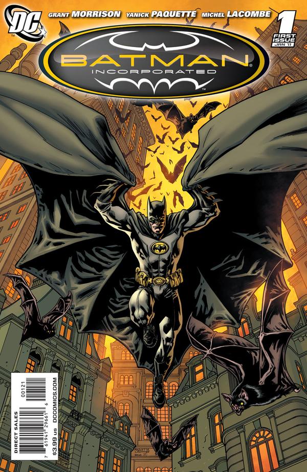
View Poll Results: Do you like the new Batsuit?
- Voters
- 81. You may not vote on this poll
-
Love it
43 53.09% -
Hate it
38 46.91%
Results 16 to 30 of 55
-
03-23-2016, 10:19 AM #16
-
03-23-2016, 10:22 AM #17

Last edited by JBatmanFan05; 03-23-2016 at 10:34 AM.
Things I love: Batman, Superman, AEW, old films, Lovecraft
Grant Morrison: Adults...struggle desperately with fiction, demanding constantly that it conform to the rules of everyday life. Adults foolishly demand to know how Superman can possibly fly, or how Batman can possibly run a multibillion-dollar business empire during the day and fight crime at night, when the answer is obvious even to the smallest child: because it's not real.
-
03-23-2016, 10:30 AM #18

I like it except for the gold outline of the bat symbol and lines on the suit. It's not practical for a character who relies on being in the shadows and blending in at night.
Now faith, hope, and love remain, and the greatest of these is love.--1 Corinthians 13:13
You had a dream; I have a plan--Cyclops
There's no point in being grown up if you can't be childish sometimes.--The Doctor
-
03-23-2016, 10:32 AM #19

It'll take getting used to it, I always liked the yellow emblem though so I'm glad that's there. The purple lining is cool if capullo was drawing it all the time, but it could be weird drawn by others. We'll see.
-
03-23-2016, 10:37 AM #20
 Miller was right.
-
03-23-2016, 12:19 PM #21

They got rid of the seams, mostly, on the character that made sense to have seams. Let's hope the other costumes follow suit, especially Superman.
I voted for "hate it" because the poll is binary, but my reaction is really more meh. Reminds me of the design they're using in the Batman Unlimited kids' toyline.Last edited by Jadeb; 03-23-2016 at 12:28 PM.
-
03-23-2016, 12:53 PM #22

I'm tempted to edit the poll to add a "middle-ground" choice, because I don't love or hate it...
Now that I've actually read Batman #50, I can say that I like it a tiny bit more than I did at first. I like Paquette's version of it more than Cap's. It appears that the belt is actually just yellow, but heavily shaded at times. I like that all the extra lines/seams are gone from the suit, and I like that the inside of the cape appears to be light purple.
I loved the Batman Inc. suit -- I really miss that.
-
03-23-2016, 01:11 PM #23

Not love it or hate it, but a big 'meh'
The changes are too minor imo, it's like some artist different interpretation of standard Batsuit. The new suit does not even have any new function for #50 so I don't see it as necessary
-
03-23-2016, 01:13 PM #24

I like it very much. Sleek, highlight with the yellow outline.
Has a nice, simplistic design to it. Overall only positive for me.
-
03-23-2016, 01:18 PM #25

The more I look at it the less and less I like it. The is one of the worst customs batman has ever worn. The only thing I remotely like about the changes is the yellow trim, even though I prefer it without the trim, I can live with that. Every other change was horrible IMO.
-
03-23-2016, 01:22 PM #26

Don't like it for now, but will wait to see how other artists handle it. Paquette and Cap haven't given me a good enough idea of its long term chances.
Things I love: Batman, Superman, AEW, old films, Lovecraft
Grant Morrison: Adults...struggle desperately with fiction, demanding constantly that it conform to the rules of everyday life. Adults foolishly demand to know how Superman can possibly fly, or how Batman can possibly run a multibillion-dollar business empire during the day and fight crime at night, when the answer is obvious even to the smallest child: because it's not real.
-
03-23-2016, 02:35 PM #27

I'm torn, I like certain aspects but the yellow trim is rather garish.
"So you've come to the end now alive but dead inside."
-
03-23-2016, 02:59 PM #28

Funny thing that. I originally wasn't going to have it because I felt that a neutral option would not add to the poll since a neutral opinion didn't add anything. I then decided that having a neutral opinion was a valid opinion and added it, but I filled out the info wrong on the poll and when I went back to correct it I didn't check to see if it reverted to the binary choices, which it did.
-
03-23-2016, 03:33 PM #29Incredible Member

- Join Date
- May 2014
- Location
- England
- Posts
- 570

Looks good to me, I don't get too picky between designs. Its not pink? Its not a robot? Sounds good to me.
-
03-23-2016, 09:03 PM #30Incredible Member

- Join Date
- Apr 2014
- Posts
- 850

Other than the belt, I like it.


 Reply With Quote


