Page 12 of 12 FirstFirst ... 289101112
Results 166 to 178 of 178
  1. #166
    Titans Together!! byrd156's Avatar
    Join Date
    Apr 2014
    Location
    Kansas City, MO
    Posts
    9,417

    Default

    Quote Originally Posted by L.R Johansson View Post
    Oh yeah - here's my latest variation on the "bullet".

    I think, oddly enough, that version #11 is my new fav'. It's very similar, but slightly simplified and tweaked. Remove a few lines, increase or decrease the thickness of a few others... VOILA!

    What do you think lads and lass's? = )

    Attachment 35819
    8 looks pretty awesome, I like all of those designs.
    "It's too bad she won't live! But then again, who does? - Gaff Blade Runner

    "In a short time, this will be a long time ago." - Werner Slow West

    "One of the biggest problems in the industry is apathy right now." - Dan Didio Co-Publisher of I Wonder Why That Is Comics

  2. #167
    Mighty Member L.R Johansson's Avatar
    Join Date
    May 2014
    Location
    Scandinavia
    Posts
    1,340

    Default

    Quote Originally Posted by LaughingVulcan View Post
    Ah, okay, thanks.
    (Damn, their corporate I.Q. is dropping by the year... )

    Maybe they could use 'bullets' like----> • in lieu of stars?
    You know, that's not a bad idea! I think I saw someone do that in this thread as well - and it works rather well.

    Quote Originally Posted by mr_crisp View Post
    I like the little triangles inside the circle. They remind me of compass points.
    Yeah, now that you mention it - they kind of do... Which variation are you thinking of though? #10? I'm starting to like that one quite a bit, myself.

    Quote Originally Posted by byrd156 View Post
    8 looks pretty awesome, I like all of those designs.
    Cheers mate! = ) 8, huh? Interesting...

    Quote Originally Posted by Clark View Post
    I was thinking along same lines.Attachment 35824
    That does look pretty good! = ) Only thing is, we can't have no stars... :' ( Legalities.

  3. #168
    You guessed it mr_crisp's Avatar
    Join Date
    Aug 2014
    Posts
    1,340

    Default

    Quote Originally Posted by L.R Johansson View Post
    You know, that's not a bad idea! I think I saw someone do that in this thread as well - and it works rather well.


    Yeah, now that you mention it - they kind of do... Which variation are you thinking of though? #10? I'm starting to like that one quite a bit, myself.


    Cheers mate! = ) 8, huh? Interesting...


    That does look pretty good! = ) Only thing is, we can't have no stars... :' ( Legalities.
    10 does look good.
    The Gypsies had no home. The Doors had no bass.

    Does our reality determine our fiction or does our fiction determine our reality?

    Whenever the question comes up about who some mysterious person is or who is behind something the answer will always be Frank Stallone.

    "This isn't a locking the barn doors after the horses ran way situation this is a burn the barn down after the horses ran away situation."

  4. #169
    Mighty Member L.R Johansson's Avatar
    Join Date
    May 2014
    Location
    Scandinavia
    Posts
    1,340

    Default

    The Journey continues!! This time around, I'm trying something new... I'm trying to incorporate the star into the logo, without using a star! A stylized star that is. Versions 14-16 are using a form of semi-realistic version of a star - an actual round ball with spikes of light emitting from it.

    I don't think it's working though, so I actually feel as if #12 is the best one yet! xD Simple and elegant.

    new-dc3.jpg

  5. #170
    Titans Together!! byrd156's Avatar
    Join Date
    Apr 2014
    Location
    Kansas City, MO
    Posts
    9,417

    Default

    Quote Originally Posted by L.R Johansson View Post
    The Journey continues!! This time around, I'm trying something new... I'm trying to incorporate the star into the logo, without using a star! A stylized star that is. Versions 14-16 are using a form of semi-realistic version of a star - an actual round ball with spikes of light emitting from it.

    I don't think it's working though, so I actually feel as if #12 is the best one yet! xD Simple and elegant.

    new-dc3.jpg
    I would go with 15 but make the target lines more bold and a little longer. Still love 8 the most though.
    "It's too bad she won't live! But then again, who does? - Gaff Blade Runner

    "In a short time, this will be a long time ago." - Werner Slow West

    "One of the biggest problems in the industry is apathy right now." - Dan Didio Co-Publisher of I Wonder Why That Is Comics

  6. #171
    Jim gordon with a mohawk Spazz_Al_Ghul's Avatar
    Join Date
    May 2016
    Location
    Connecticut
    Posts
    5

    Default

    I quite like the new logo. It's clean, it's classic, it looks like it belongs on the cover of a comic book. I also really appreciate the subtle bits of flair in the letters. It helps make the logo look somewhat unique, while still looking very simple and standard.

  7. #172
    BANNED
    Join Date
    Apr 2015
    Posts
    6,132

    Default

    Why is it that average people on the Internet are better at everything than the people who actually get hired? It's ridiculous.

  8. #173
    Fantastic Member Potanical Pardon's Avatar
    Join Date
    Apr 2015
    Posts
    462

    Default

    Quote Originally Posted by L.R Johansson View Post
    Ey, you seem very knowledgable tho' - could you maybe give some feedback on my stuff? = ) I'm trying to improve, so a couple of pointers would definitely help.
    I think you have good natural ideas/inclinations. Basic fundamental classes and skills will help. After that learn grid systems and typography.Those are imperative. As far as software - Illustrator or old Freehand (old as in before Adobe bought it). But never underestimate/ignore paper and pencil/marker/pen/whatever.

    As far as specifics, all of the above will fix things but you'll notice on your own that you'll have to imagine and plan for various applications on different media. The pinline strokes in almost all of your logo ideations will disappear when tiny like a favicon or even as a mark on stationary/envelopes. And then the opposite problem exists if you're needing those logos in a trade show or on a 70 ft TV/display. You'll have to plan for B&W, BWGrey, different paper stocks, different color mediums that aren't just paper, motion, business cards - again the pinstripe stroke is problematic here again.

    Essentially you'll learn to create what's called a style guide. They vary in complexities, but they're essentially bibles/guidebooks for a company to utilize to maintain brand consistency company wide internally and to customers/clients. They are very, very detailed. You have to think of every eventuality that things can be used. And it's not just the logos. This includes the exact colors (Pantone) to be used whether web, print, cloth, whatever. How much space between lines (leading) in sentences if on a letter. How much space between lines if it's an email. How much space between lines if it's an instant message. The same with space between letters (kerning). What typeface and fonts...and these are very exact. You can't just go and pick arbitrarily. Letters, emails, brochures, headings, blu-ray cover, poster, calendars, shoes, the annoying label tab on the back of shirts, the annoying label tab on the inside side of shirts, coloring books, cereal boxes, bold, italics, all of it are very specific depending on what and where you're going to use them on, e.g. Bob's business card can't be in Century Gothic Heavy 12pt and Emily's is Century Gothic Bold 11.999999pt. They have to be consistent and exact every time. 3-fold brochures specifications may be entirely different from bi-fold brochures. The style guide informs all kinds of things too - what food/drinks get stocked in a fridge, what color/style furniture in the workplace. The wall color paint/trim colors, textures, flooring, lighting (what lightbulbs/shades), and on and on.

    All of this thoroughness is why logos/brand & identity campaigns take lots of time and can range between $25k-2 or 3million depending on the company. And imagine that EVERYTHING - cereal boxes, stationary, office signs, socks, underwear, night lights, Pez dispensers, all of those materials have to be produced/reproduced over and over by a printer (person not machine) in their humongous awesome printers (machines) repeatedly until proof approval. That's expensive.

    So this isn't just a blue circle with "DC" in it with notches on a whim for those who think it's too plain, simple, empty, flat, retro, "I could have made that/My kid could make that/The average person could...". (I feel like I just did that Devils Wear Prada speech but for graphic design. Hahaha. Sorry.)

    Grid example on current DC logo that should immediately help your ideations:


    The logic and math will translate to beneficial design beyond alignment buttons and eyeballing, centering etc.
    Last edited by Potanical Pardon; 05-19-2016 at 01:06 PM.

  9. #174
    Amazing Member
    Join Date
    Mar 2016
    Location
    New York
    Posts
    52

    Default

    Quote Originally Posted by jcl100 View Post
    I can't say with any degree of certainty, but I wouldn't be at all surprised to learn that the trademark on the bullet logo had been allowed to lapse by the time of the lawsuit. Meaning that when they lost the case to DC Shoes the option to simply revert to the previous logo may not have been on the table.
    If this is TRUE, NO facepalm in the world is big enough to do this justice...

  10. #175
    Amazing Member
    Join Date
    Mar 2016
    Location
    New York
    Posts
    52

    Default

    Quote Originally Posted by L.R Johansson View Post
    The Journey continues!! This time around, I'm trying something new... I'm trying to incorporate the star into the logo, without using a star! A stylized star that is. Versions 14-16 are using a form of semi-realistic version of a star - an actual round ball with spikes of light emitting from it.

    I don't think it's working though, so I actually feel as if #12 is the best one yet! xD Simple and elegant.

    new-dc3.jpg
    12 & 13 are nice. They read to me as representing the 'DC atom'...the core characters of thier Multiverses...Superman (The nucleus), Batman and Wonder Woman are the Electrons (And the next two characters created! )

    Hmm.
    Maybe try 12...with a slightly thicker 'ball track line' (The line JUST out from the white 'nucleus')...and maybe can get rid of the outermost blue hairline.
    If you have a beefy white border, it would stand out on the comics...

    15 & 16 are very cool, too...I would thicken up the 'compass arms', and the 'outer nucleus line' so they'd be more solidly visible.

  11. #176
    Mighty Member L.R Johansson's Avatar
    Join Date
    May 2014
    Location
    Scandinavia
    Posts
    1,340

    Default

    Quote Originally Posted by Potanical Pardon View Post
    I think you have good natural ideas/inclinations. Basic fundamental classes and skills will help. After that learn grid systems and typography.Those are imperative. As far as software - Illustrator or old Freehand (old as in before Adobe bought it). But never underestimate/ignore paper and pencil/marker/pen/whatever.

    As far as specifics, all of the above will fix things but you'll notice on your own that you'll have to imagine and plan for various applications on different media. The pinline strokes in almost all of your logo ideations will disappear when tiny like a favicon or even as a mark on stationary/envelopes. And then the opposite problem exists if you're needing those logos in a trade show or on a 70 ft TV/display. You'll have to plan for B&W, BWGrey, different paper stocks, different color mediums that aren't just paper, motion, business cards - again the pinstripe stroke is problematic here again.

    Essentially you'll learn to create what's called a style guide. They vary in complexities, but they're essentially bibles/guidebooks for a company to utilize to maintain brand consistency company wide internally and to customers/clients. They are very, very detailed. You have to think of every eventuality that things can be used. And it's not just the logos. This includes the exact colors (Pantone) to be used whether web, print, cloth, whatever. How much space between lines (leading) in sentences if on a letter. How much space between lines if it's an email. How much space between lines if it's an instant message. The same with space between letters (kerning). What typeface and fonts...and these are very exact. You can't just go and pick arbitrarily. Letters, emails, brochures, headings, blu-ray cover, poster, calendars, shoes, the annoying label tab on the back of shirts, the annoying label tab on the inside side of shirts, coloring books, cereal boxes, bold, italics, all of it are very specific depending on what and where you're going to use them on, e.g. Bob's business card can't be in Century Gothic Heavy 12pt and Emily's is Century Gothic Bold 11.999999pt. They have to be consistent and exact every time. 3-fold brochures specifications may be entirely different from bi-fold brochures. The style guide informs all kinds of things too - what food/drinks get stocked in a fridge, what color/style furniture in the workplace. The wall color paint/trim colors, textures, flooring, lighting (what lightbulbs/shades), and on and on.

    All of this thoroughness is why logos/brand & identity campaigns take lots of time and can range between $25k-2 or 3million depending on the company. And imagine that EVERYTHING - cereal boxes, stationary, office signs, socks, underwear, night lights, Pez dispensers, all of those materials have to be produced/reproduced over and over by a printer (person not machine) in their humongous awesome printers (machines) repeatedly until proof approval. That's expensive.

    So this isn't just a blue circle with "DC" in it with notches on a whim for those who think it's too plain, simple, empty, flat, retro, "I could have made that/My kid could make that/The average person could...". (I feel like I just did that Devils Wear Prada speech but for graphic design. Hahaha. Sorry.)

    Grid example on current DC logo that should immediately help your ideations:

    https://i.imgur.com/kItnjEB.jpg

    The logic and math will translate to beneficial design beyond alignment buttons and eyeballing, centering etc.
    Wow! That's an awesome reply, dude! = ) Big cheers for the detailed response. I think I have a basic understanding of maybe... 60% of the things you mentioned, but there are certainly new concepts introduced to me in your post. Gonna' try and put them to use immediately!

    Quote Originally Posted by LaughingVulcan View Post
    12 & 13 are nice. They read to me as representing the 'DC atom'...the core characters of thier Multiverses...Superman (The nucleus), Batman and Wonder Woman are the Electrons (And the next two characters created! )

    Hmm.
    Maybe try 12...with a slightly thicker 'ball track line' (The line JUST out from the white 'nucleus')...and maybe can get rid of the outermost blue hairline.
    If you have a beefy white border, it would stand out on the comics...

    15 & 16 are very cool, too...I would thicken up the 'compass arms', and the 'outer nucleus line' so they'd be more solidly visible.
    Yeah, I do think I agree with this - gonna' try and use #12 & 13 as a basis for the next couple of ideations.

    EDIT:

    I think I'm going to call it quits with this one - I came to the conclusion that it's easier to read the text if it's actually at a 90 degree angle instead of 45, so I changed that. I also did some tweaks to the lines, as suggested. Finally, the typography on the "DC" isn't the best, it's only half-done - but the basic idea is to soften out the very angular original text, to move away a bit from that football-team feeling, and into something a bit more modern, a bit sleeker - but mostly the same as always.

    So here ya' go - this is my best shot... at the DC Comics Logo.


    new-dc4.jpg
    Last edited by L.R Johansson; 05-22-2016 at 01:10 PM.

  12. #177
    Spectacular Member
    Join Date
    Apr 2014
    Posts
    142

    Default

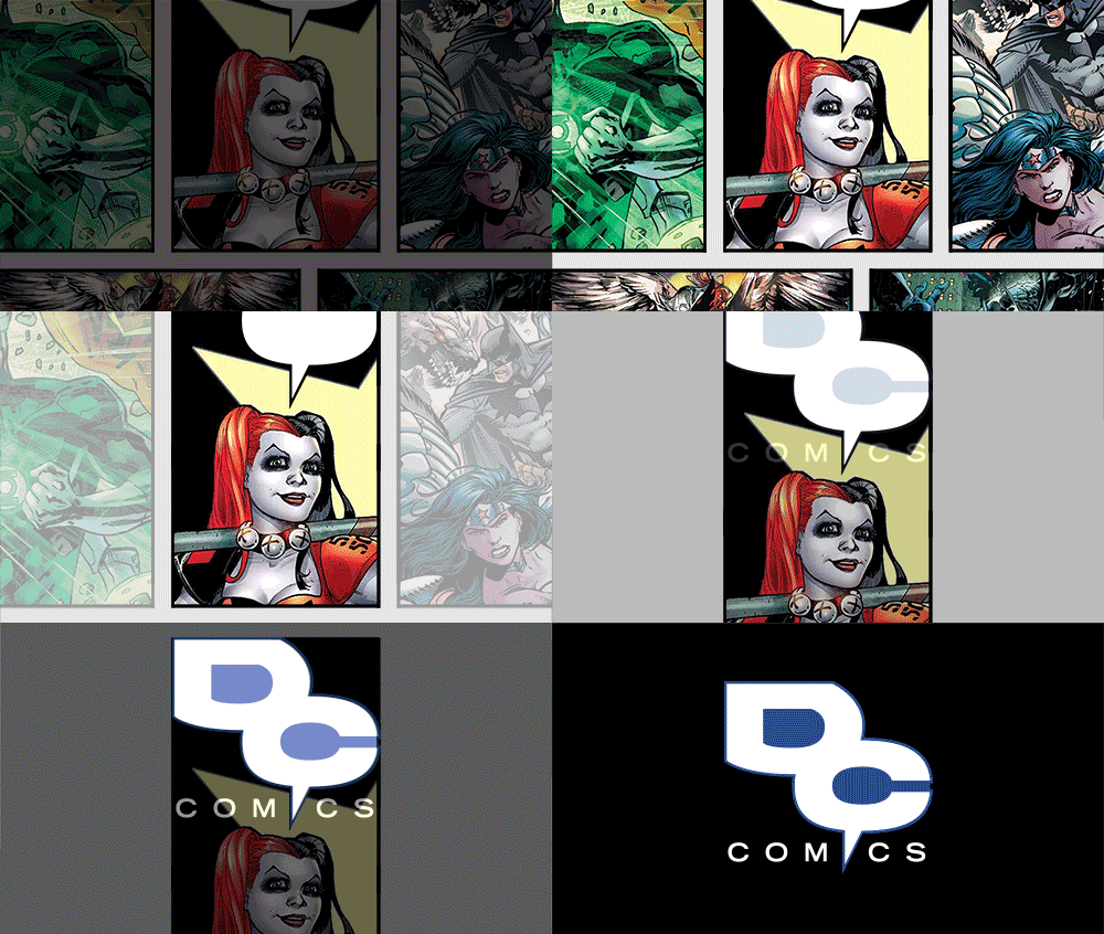
    This one is pretty neat.


  13. #178
    Ultimate Member Lee Stone's Avatar
    Join Date
    May 2014
    Location
    Louisiana
    Posts
    12,302

    Default

    Quote Originally Posted by Sterling View Post
    This one is pretty neat.


    I think the gif gives the illusion it's better because of the fancy transition.
    However, my eye stops at the "C" every time.

    Maybe if the the "D" baloon was omitted and the new Rebirth "DC" logo was put inside the "C" baloon, perhaps as a horizontal oval instead of a circle... that would work.
    And then maybe with the baloon flipped so that the pointer is between the O and M.
    Last edited by Lee Stone; 05-24-2016 at 09:12 AM.
    "There's magic in the sound of analog audio." - CNET.

Posting Permissions

  • You may not post new threads
  • You may not post replies
  • You may not post attachments
  • You may not edit your posts
  •