
Not what I was expecting.
Results 1 to 15 of 34
-
Yesterday, 09:13 AM #1Astonishing Member

- Join Date
- May 2014
- Posts
- 2,424
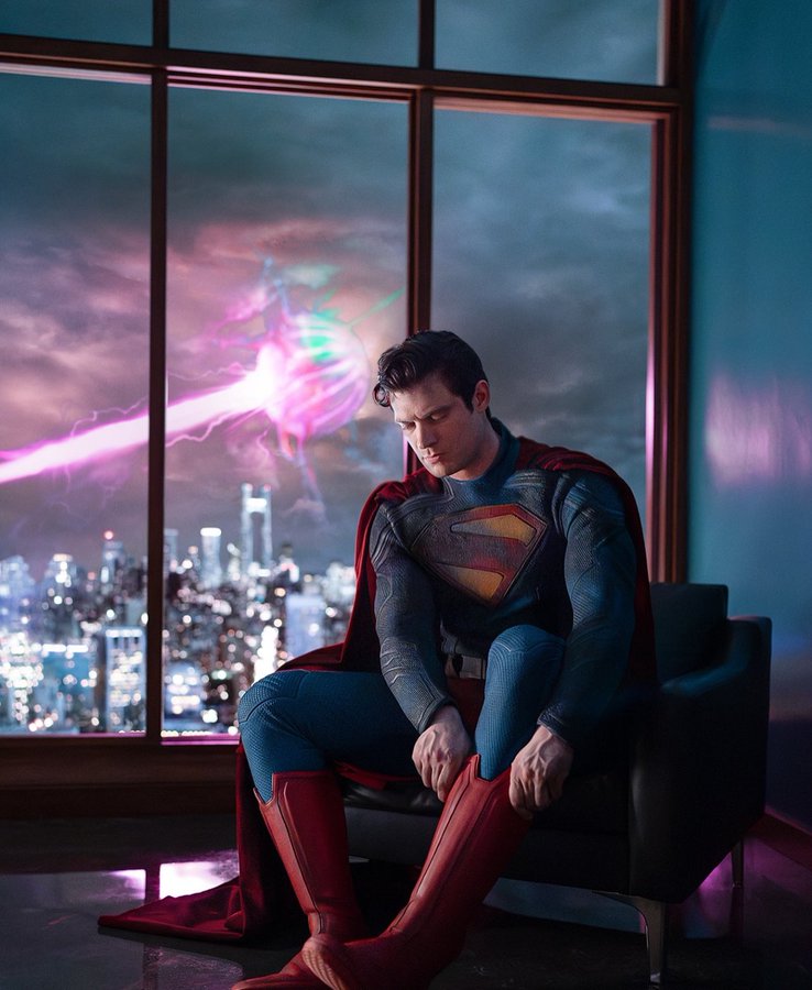
 Superman (2025) suit has just dropped!!!
-
Yesterday, 09:15 AM #2Extraordinary Member


- Join Date
- Oct 2017
- Posts
- 5,850
Unsure how I feel about it
"He's pure power and doesn't even know it. He's the best of us."-Matt Murdock
"I need a reason to take the mask off."-Peter Parker
"My heart half-breaks at how easy it is to lie to him. It breaks all the way when he believes me without question." Felicia Hardy
-
Yesterday, 09:22 AM #3Mighty Member
- Join Date
- Oct 2018
- Posts
- 1,857
Maybe it’s just the angle but looks weirdly cheap looking, idk.
It’s funny though, there was that rumor that it was going to look like the Fortnite suit, new 52 with trunks. Gunn did an eye roll emoji at it and we took it as him debunking it. But yeah I guess it actually is a lot like that
https://www.reddit.com/r/DCU_/s/z0OvbKu8QDLast edited by OpaqueGiraffe17; Yesterday at 01:57 PM.
-
Yesterday, 09:27 AM #4Astonishing Member
- Join Date
- May 2014
- Posts
- 2,424
Torso is busy looking.
Like the colours.
Glad the trunks are back.
Texture reminds me of The Amazing Spider-Man basketball Spidey suit and that's not good.
Lose the collar.Last edited by Batman Begins 2005; Yesterday at 09:37 AM.
-
Yesterday, 09:34 AM #5Astonishing Member
- Join Date
- May 2014
- Posts
- 2,424
James Gunn:
The above photo was taken on set by Jess Miglio and was entirely in-camera.
-
Yesterday, 10:27 AM #6Extraordinary Member

- Join Date
- Mar 2015
- Location
- Metropolis USA
- Posts
- 7,280
Has a very New 52 look to it. It also looks a lot like the suit from the Supergirl show. I don't think this is a very good picture to go off of. I think we need to see it in better lighting. But it looks like a live action version of the MAWS suit.
Assassinate Putin!
-
Yesterday, 11:47 AM #7Astonishing Member
- Join Date
- Nov 2020
- Location
- Otisburg
- Posts
- 2,224
Im in like/not love. But overall I think thats a good place to be right now.

I do like his expression and body language overall. Looks like hes seen a battle or two but still learning the game a bit.Look, you cant put the Superman #77s with the #200s. They havent even discovered Red Kryptonite yet. And you cant put the #98s with the #300s, Lori Lemaris hasnt even been introduced. Sam
Where the hell are you from? Krypton? Edgar Frog
-
Yesterday, 01:16 PM #8All-Star Member.
- Join Date
- Sep 2022
- Posts
- 257
Ugh.
Let's see: New 52 pattern and piping lifted from Jim Lee's New 52 "design" on a suit that isn't skintight, instead appearing more like a suit from the MCU, with the Kingdom Come S shield for "reasons."
Oh, and maybe the trunks are there, though I can't imagine why if the suit isn't skintight.
As for what the image suggests, Gunn's version of the character looks like he's hesitantly suiting up to go and fight what may or may not be Solaris.
So, instead of actual thought and intent put behind the design, we have:
- The New 52 costume, one of the worst superhero uniform designs in comic book history
- A somewhat loose suit that suggests the cheapness of MCU and some DC CW suits
- An iconic alternate version of the S shield that was the result of catastrophic personal losses to Superman, not just a "kewl" look.
When your big-budget movie costume is put to shame by, ironically enough, two costumes from mid-budget TV shows, you have a problem.
HoechlinFleischer.jpg
fbad5934bee1424cd7471fa9f31143dc.jpg
-
Yesterday, 02:49 PM #9Extraordinary Member
- Join Date
- Mar 2015
- Location
- Metropolis USA
- Posts
- 7,280
I think part of my problem with it is that it's too "busy". The reason why these two versions work is they followed the rule of "KISS": Keep It Simple, Stupid. Originally Posted by All Star Superman
 Assassinate Putin!
-
Yesterday, 03:08 PM #10Incredible Member
- Join Date
- Sep 2021
- Location
- Somewhere, in a galaxy far far away...
- Posts
- 631
I think I'm digging it. Gonna have to see it in motion though
-
Yesterday, 03:15 PM #11Incredible Member
- Join Date
- May 2019
- Posts
- 536
I don't like the collar at all. Glad the trunks are back. Don't like the lines all over it.
Still looks too Snyder-y to me. Why can't we go back to like a bright blue cloth suit or something?
I'm a little concerned the tone of this picture means the movie (and him) are going to be too serious and dour again. Gunn didn't exactly say it's going back to lighthearted and humorous but that's really what Superman needs to be to work. Apprehensive.
-
Yesterday, 03:27 PM #12Fantastic Member
- Join Date
- Nov 2023
- Posts
- 355
From what I saw on Twitter, Reddit and here, most people are not liking this suit at all. Not on Instagram but I doubt its any better over there.
Considering the near universal panning this suit has gotten, maybe they will pull off a Sonic and make changes.
-
Yesterday, 03:58 PM #13Extraordinary Member

- Join Date
- Jun 2022
- Posts
- 5,407
Its a physical suit, they don't need to create a whole new model for it. Originally Posted by Laser_Man
Even then it might be better received when different angles start showing up and its seen in motion. Has happened plenty of times with costumes people weren't sure about.
-
Yesterday, 04:27 PM #14Astonishing Member
- Join Date
- Jun 2014
- Posts
- 4,240
He looks to be wearing a blend of the Elseworlds or New Derpy-2 suit with the high collar and thank goodness they have the trunks. This tells me they are not afraid of or embarrassed by Superman's trapping. The only item of consern for me is the emblem but I understand there could be some BTS issues with that. But I remain hopeful as Supes is looking super here.
-
Yesterday, 05:26 PM #15Incredible Member
- Join Date
- May 2014
- Posts
- 502
I was REALLY hoping for a light shade of blue to be used. I don't care much for when they use a darker shade of navy blue for Superman but the suit almost looks like it has a denim jean texture to it so maybe they're going for some kind of "working man" vibe, like boot and jean look, if that's the case I can understand it.
I just feel the light blue has such a more "bright sky" aesthetic that pops when contrasting with the red. That's completely lost when they go with a darker blue. Here is an example of how pleasant, how visually "rich" (or vibrant), I think the light blue take on Superman's costume can be:

I'm also shocked it's a stormy night time view of (I'm assuming) Metropolis that they're going with for the debut image. I remember the story, dark cloud debut picture of Superman in BVS not being well-received and it has seemed like James Gunn has tried to stress a more optimistic, sunny sky approach to his direction for Superman. I'm not saying I think this is going to be some melancholy story or that Superman stories can't have nights or stormy nights featured in them (the comic picture I'm including in this post features a cloudy night backdrop), I'm just really shocked this was the first look.Last edited by Super-Cyke; Yesterday at 05:31 PM.

 Reply With Quote


