Results 61 to 75 of 87
Thread: Doodledudes doodles dude.
-
08-23-2014, 11:20 AM #61BANNED

- Join Date
- Jun 2014
- Posts
- 405

-
08-23-2014, 02:22 PM #62Amazing Member
- Join Date
- Jul 2014
- Posts
- 78
I like the beast. The scribble backgrounds add nothing to the overall work. Originally Posted by doodledude

-
08-25-2014, 09:27 AM #63BANNED
- Join Date
- Jun 2014
- Posts
- 405
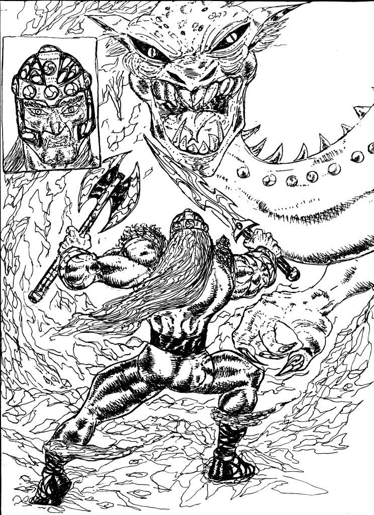
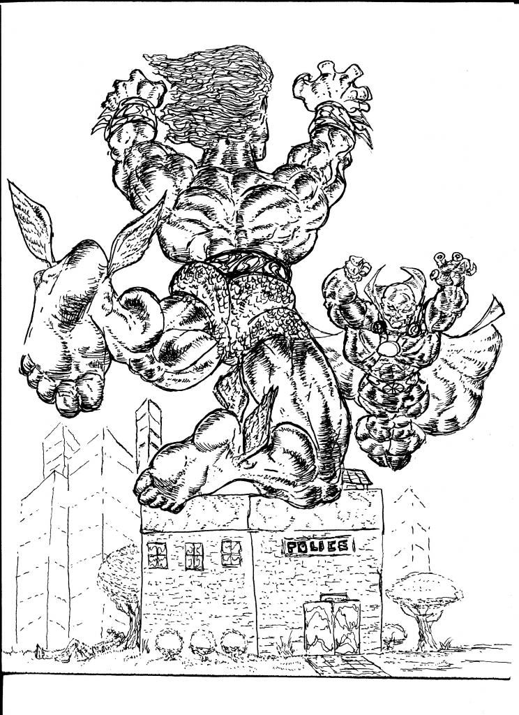
No thoughts on the Namor vs Manhunter? I worked hard on that! Originally Posted by CharlesM
-
08-25-2014, 10:04 AM #64Amazing Member
- Join Date
- Jul 2014
- Posts
- 78
Actually, I must have overlooked it, during my last visit, here. Besides, I thought that you wanted to draw what you wanted to, and didn't want to do more of the challenges. Originally Posted by doodledude
Let me scroll back and check it out.
-
08-25-2014, 10:47 AM #65Amazing Member
- Join Date
- Jul 2014
- Posts
- 78
Your buildings lack energy. They are the equivalent of visual cardboard. Grab a straight-edge, and use it, whenever you are drawing buildings. Your trees look better than your buildings, but even still, they need major work. But, this background is VASTLY BETTER than the majority of your work that you visually burden with scribble lines all over the place. Originally Posted by doodledude
Art requires discipline, Bob. Your work has energy in spades, but it is discipline that enables you - and empowers you - to truly lay the visual smack down upon readers and viewers of your handiwork.
What I like about the background, all of that "boring, normal stuff" that you typically don't bother with attempting to inject into your art is that you end up with less visual distractions, and more of things that make sense. It also nudges you away from pin-ups and begins the transition to true sequentials.
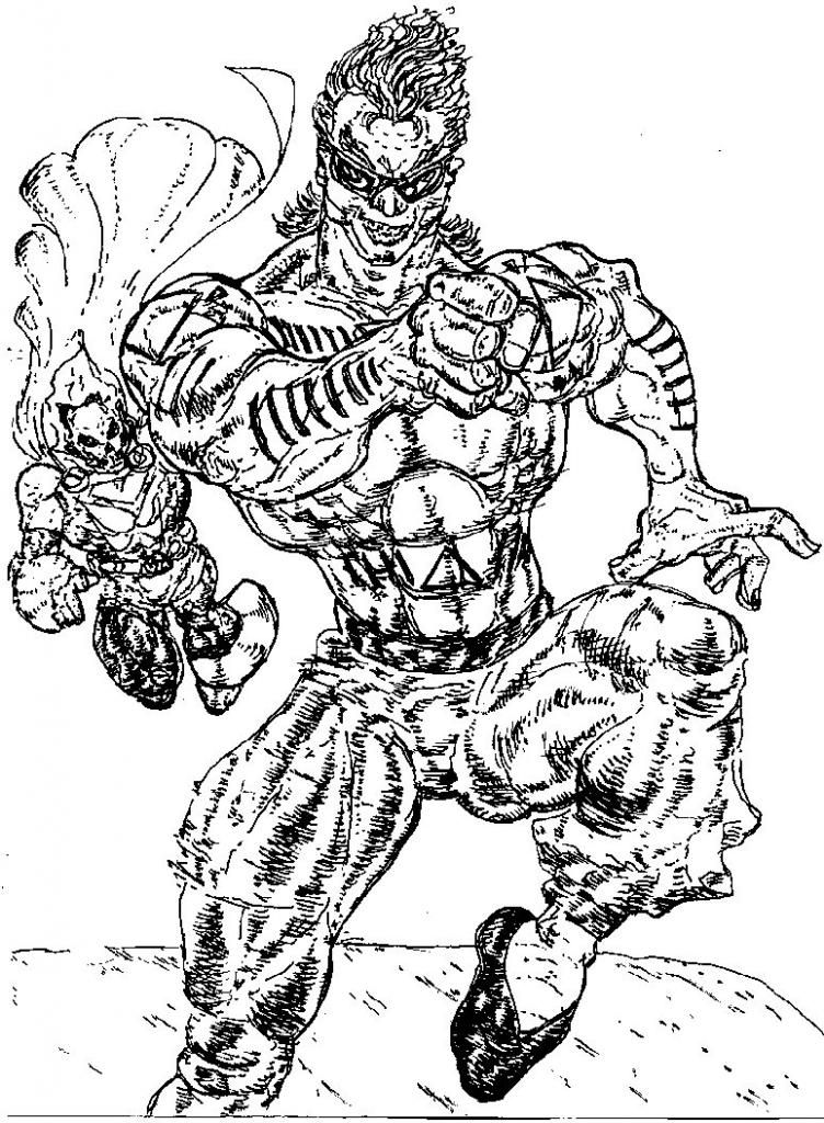
Aside from the wings on his feet, how would I (or anyone else) know that this was Namor, the Sub-Mariner? You and your propensity for tangled masses of hair. Do you know why I picked Namor to challenge you with, Bob? Because, his attitude that he projected in old comic books that I used to read as a kid growing up is perfectly suited for your in-your-face style as an artist.
This piece demonstrates tighter lines than I typically encounter in your work on forums. Of course, you knew that I would nitpick your art. Trust me, Bob, your art needs to be nit picked. You will only become better. Criticism facilitates changes of direction, which in turn facilitates amping up your own output.
Your characters are about to fight. There's no signs of damage anywhere in the environment around them, so no actual clash has taken place. Your heavy application of ink and over-reliance upon lines is killing the visual impact that your characters could be having. You need to transition towards somewhere between bare bone outlines and extreme saturation with lines, the latter being where your art is, right now. You're not getting good mileage out of all of the extra lines, Bob.
But, your depiction of human anatomy is becoming tighter. You still have major issues with it, though. These issues are distracting from your work a a whole.
Because you dispensed with throwing background scribbles all over the page, I can actually make out the characters that you depicted a lot better. There is less visual clutter, this way. When you slap down a scribble, what it ends up being is an aimless line, just wandering all over the place, and wandering all over the reader's eye (which is NOT a good thing, Bob).
Namor's left leg is cramping like Hell. That must be dreadfully painful. The muscle on the back of his leg is contorted. It's just a big bulk of a muscle. It doesn't make him look stronger, though, just mangled.
I do like the respective poses of both characters, though. They are not the same, which increases the visual dynamic. Namor's pose is a launch of himself at the Martian Manhunter. Namor is a straight-up kick your ass kind of a guy, so that makes sense. The Maryian manhunter is far more calculating. Plus, his pose fits him. He's flying in, sizing Namor up as an adversary.
You did put some different size buildings in the background, so that increases the visual interest. The police station has lettering that barely rises above the minimal standards for legibility. That is a sharp area of weakness, Bob. But, you're an artist, not a letterer, right? Excuses won't make you a better artist. You presented it - You own it. Also, the police station got its share of lines, but they do add some texture to the building, but some actual attention to detail on the architecture and building materials would have netted you a big visual plus. You didn't bother with such things, so the end result is visually less impressive - which translates into less feedback on your art. If you want your art to wow people, then you can't do that by skipping past the portions that you consider to be boring or trivial. The environment in which your characters are being portrayed is an opportunity for you to better showcase your characters. Think of the Hulk. An environment gives him objects to smash! People want to see him smash stuff. The same thing holds true for other characters, as well. The real challenge, Bob, lies in you - the artist - figuring out a way to make ordinary things become visually interesting in your presentation of them.
Of the two characters in this one, the Martian Manhunter is the better rendered of the two. Capes are not your strength in trade, when it comes to drawing, Bob. More specifically, your art doesn't capture folds of clothing very well, so understandably, it can't depict large, billowing capes very well.
Look at the Martian Manhunter. Why are his knees so narrow, but then his legs swell up to a huge size before reaching his feet? One thing that you don't do well, as an artist, is transitioning between two points, where the visuals are concerned. A new muscle? You lay it on, and I men as thick as Hell. Encounter a joint? And suddenly, you shrink the body part down. This is resulting in major visual mangling right before the reader's eye, Bob. Ultimately, it all goes back to discipline, as much as it does skill, simply because an artist has to know when to hold back. You don't like to hold back. And, you don't have to - but, you're hurting your own art in the process. You haven't learned the art of subtlety in your drawing, yet, Bob. Give it time, but you also need to actively and consciously practice restraint in your art.
You could have depicted a fight scene in front of a police station any number of different ways. You chose no police cars, no cops, no civilians. This is what I don't understand, Bob. You love to throw down some lines, but you have a bad habit of doing it when you don't need to, and not doing it when it would benefit your art enormously.
Think of it this way, Bob - You want your characters to come to life, so you stuff them with muscles and blast the page with energy. But, the world around them is what brings them to life. It's what makes them larger than life. The more of it that you get in your scenes, the better that your scenes will become, and the more that the characters that you populate your scenes with will come to life to the reader/viewer.
Because you shy away from doing sequentials, you end up giving us characters, rather than a story. Yet, each one of your characters have a story to tell. I suspect that each one of your characters has many stories to tell, Bob. That requires scenes in sequence, not standalone one-shots.
Tell me this, Bob - the windows on that police station. You put windows on that building, but on one of the rest. Why?
Plus, the windows don't even line up with one another. Man, that's truly mediocre, Bob. That aside, the scribbles on the windows, your method of depicting glass, would have come across better in a visual sense, if the building, itself, didn't have so many small lines on it. That one point of detail basically then blends in with all of the other line competing for attention with the viewer's eye.
I like the medallion on the Martian Manhunter's chest, but the straps across his chest, they are hard to make out. Your lines and inking are obliterating your detailing. This needs to stop. You're doing work, in some instances, that people won't be able to see, and by extension, appreciate, simply because the detailing gets run roughshod over by other aspects of your art. Attention to detail and restraint will largely eliminate this negative aspect of your art, Bob. Think of it this way, Bob - when you go to piss, you don't just piss all over the place, right? You either control the stream, you you make a huge mess. If you can pee with discipline, then you can draw with discipline.
I'm not sure if you want to bother with anymore challenges or not. If not, no problem. If so, let me know, and we'll see what you can come up with in answering the call and meeting the challenge.
-
08-25-2014, 11:02 AM #66Amazing Member
- Join Date
- Jul 2014
- Posts
- 78
Bob,
I'm going to go ahead and issue another challenge to you. If you want to decline it, then my feelings won't be hurt. But, if you decide to accept the challenge, don't feel pressured for a deadline to get it done.
Anyway, here's the next challenge for you to ponder whether you are up to the task or not.
Challenge # 3
Mr. Terrific, Moon Knight, and Uncle Sam are locked in a battle inside of Scrooge McDuck's money bin with the Beagle Boys and the Fatal Five. At least one of the good guys must be at the mercy of the Beagle Boys in this scene. Other characters are optional, at your discretion. The camera angle is from the top of the money bin looking down. I want you to depict a battle scene that is not from an up close angle. It will require the use of smaller depictions of characters.
-
08-25-2014, 02:40 PM #67BANNED
- Join Date
- Jun 2014
- Posts
- 405
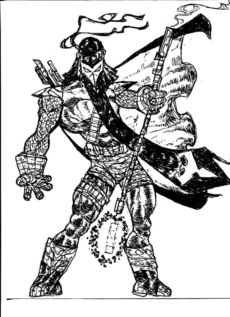
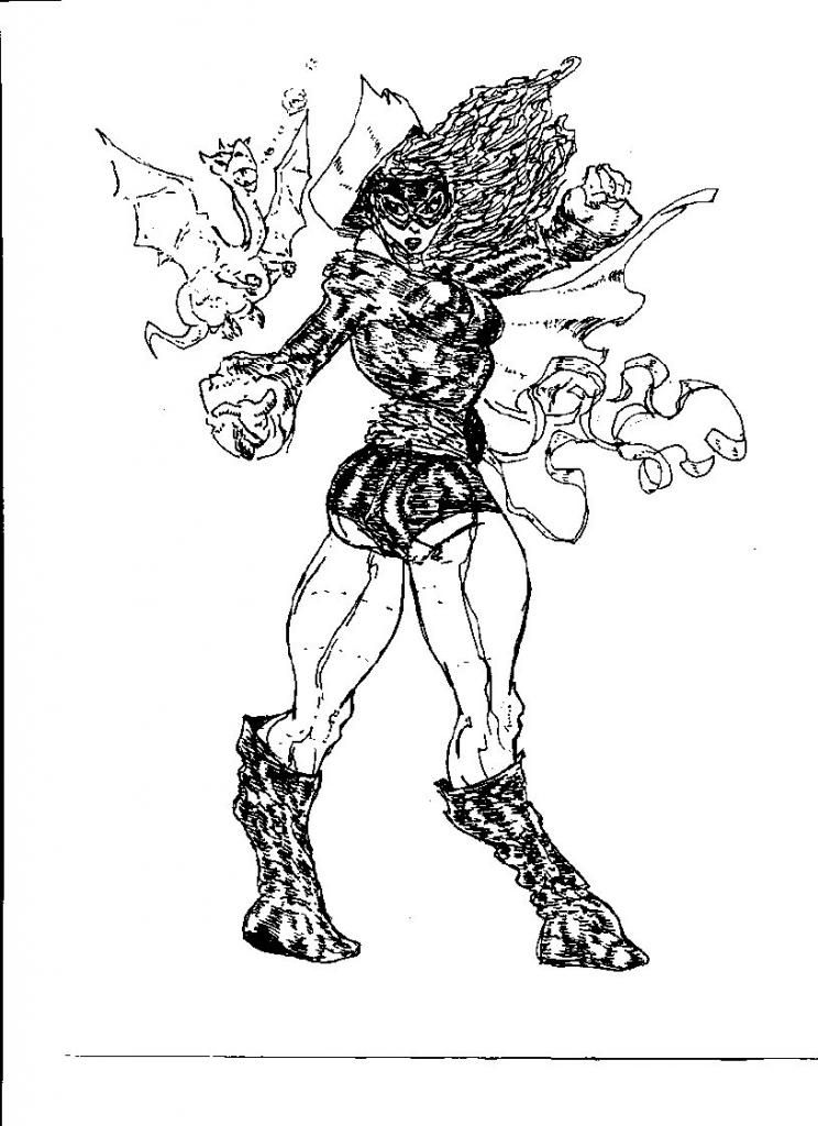
I do like your crits they are nitpicky and longwinded but sometimes you discover things in my art that have helped me become better.I disagree with you about my capes.I love drawing capes and I think I'm one the few artist that are posting on the net that gives them that much love.I don't think your taking into account Namor's pose or the level of craft I put in this pic.Oh well to each his own.I will try the next pic it might take me some time though.Namor had his fish scale pants pointy ears wing feet and his gauntlets.How did you not know that was him?Thank you for your crits they are appreciated.Jimmy Olsen was taking a nap by the tree!What more can you ask for?! Originally Posted by CharlesM
-
08-25-2014, 09:57 PM #68Amazing Member
- Join Date
- Jul 2014
- Posts
- 78
Well, I've never seen Namor rendered quite like that. But, I missed Jimmy Olson. Thanks for pointing him out. Relaxing under a tree. That's a nice touch, Bob. Originally Posted by doodledude
I'm not going to praise the job that you did on Namor's fish scale pants. You populate your art with so many scribbles, it drowns out your details, in instances. As far as Namor's ears go, only one ear is visible, and barely, at that. Not sufficient to really see it and toss any points your way for it.
What kind of critique would you prefer, Bob? No nitpicks? Brief? I try to give feedback that is useful. My critiques may be long to you, but to me, they aren't particularly long. Even the one that I just did for you is written in an off-the cuff manner. And the gauntlets? Slapping gauntlets on a character doesn't make them Namor. You presented Namor's back to me, which was fine for the challenge, but I can't really tell that's Namor looking at the back of his head. It just doesn't look like Namor, as I have seen him. If I don't recognize the character, then that's not a good sign.
I like the energy in your art. It's always what has attracted me to it. We'll have to disagree on the capes, though.
The challenges are intended to draw you out of your comfort zone, Bob. Subjecting your work to critique will compel you to nitpick your own work more. I'm sure that it is fun to draw what you want to draw. But, it can be quite useful to draw things that you wouldn't ordinarily draw. I could tell you that a given piece looks good, or that it sucks - but, that doesn't really say much. Drawing is time-consuming. So is trying to write a critique of someone else's work. I look at all sorts of art by all sorts of artists. How much of that art do you think that I had any say in what was drawn? So, I do sympathize on drawing what someone else's picks for you to draw. I can relate to it, in my own way.
-
08-30-2014, 04:32 PM #69BANNED
- Join Date
- Jun 2014
- Posts
- 405
-
08-30-2014, 11:39 PM #70Amazing Member
- Join Date
- Jul 2014
- Posts
- 78
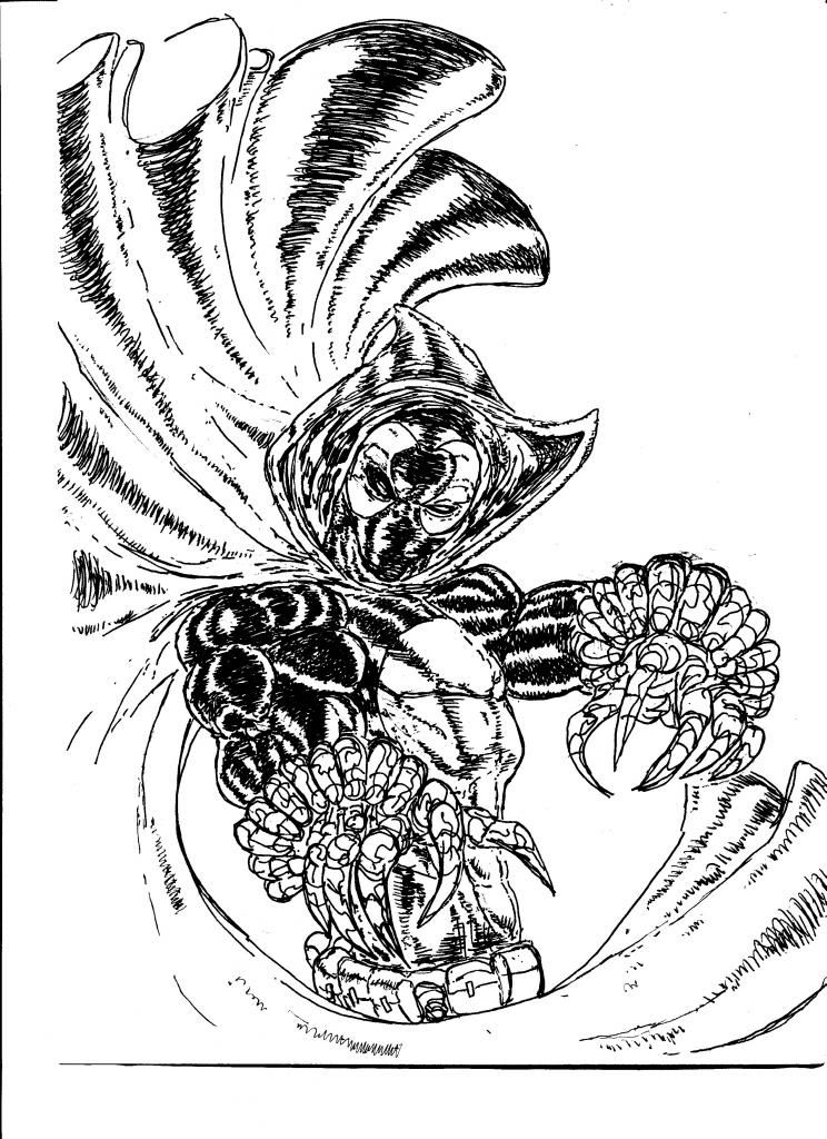
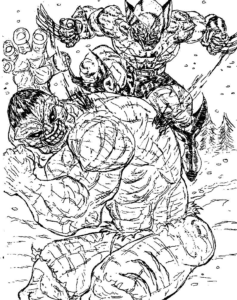
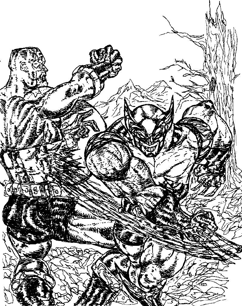
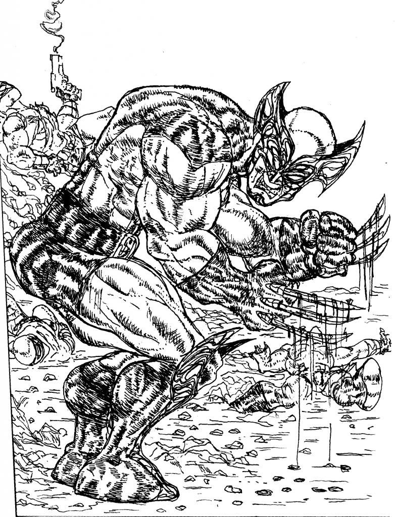
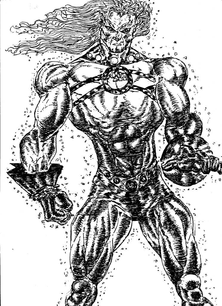
You should do more similar to the one on the left, Bob. Originally Posted by doodledude
-
08-30-2014, 11:45 PM #71Amazing Member
- Join Date
- Jul 2014
- Posts
- 78
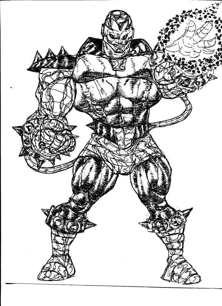
You've managed to get the arms down to a more realistic level, Bob. Significant progress, there. The legs? Not so much so. The knee areas, especially, this guy's legs look painful. Originally Posted by doodledude
The long banner thing, the way that it hangs from the face, that looks really odd. What purpose does that thing serve to the character, aside form getting in his way?
The special effects are very weak, visual blah. You really need to focus on that area, Bob. A lot of your characters tend to be either not wielding any super power, at all, or when they do, it is some watered down visual mediocrity. Your characters tend to be stylish individuals, even if some of them are way out there, visually speaking.
This guy's boots, they don't have the wide flare, like some do, but overall, they look pretty tacky.
The multiple accessories look OK, but nothing visually awe-inspiring in that department, either.
You like doing those kinds of shorts, don't you, Bob?
-
09-03-2014, 09:50 AM #72BANNED
- Join Date
- Jun 2014
- Posts
- 405
It Is what it is man.Some seem to like it.Its not my creation it's a character from the x-universe. Originally Posted by CharlesM
-
09-14-2014, 02:40 AM #73BANNED
- Join Date
- Jun 2014
- Posts
- 405
Last edited by doodledude; 09-14-2014 at 02:50 AM.
-
09-14-2014, 02:45 AM #74BANNED
- Join Date
- Jun 2014
- Posts
- 405
Last edited by doodledude; 09-17-2014 at 06:36 PM.
-
09-17-2014, 06:29 PM #75BANNED
- Join Date
- Jun 2014
- Posts
- 405
Last edited by doodledude; 09-17-2014 at 06:33 PM.

 Reply With Quote