

Yeah, I don't know if anyone recalls this, but originally, All-Star Superman was supposed to have a redesigned version of the S - and this version was actually seen!
In the earliest preview of #1, as I recall it, you could see Superman wearing this variation of the shield, but only there - once later previews came out, and the actual comic, the redesigned shield had been replaced.
As I understand it, both Morrison and editorial changed their mind on it, but I think Quitely was still for it - and apparently the S-shield at the end of All-Star, the backwards one on the big vault-door, is it?
Doe ANYONE have pictures of this? Especially some before and after -shots from the previews and the published page? Would be awesome to see.
Results 1 to 13 of 13
-
06-17-2016, 01:17 AM #1Mighty Member

- Join Date
- May 2014
- Location
- Scandinavia
- Posts
- 1,340
 All-Star Superman's original, redesigned S-shield?
-
06-17-2016, 02:12 AM #2BANNED
- Join Date
- Apr 2014
- Location
- Belgium
- Posts
- 18,566
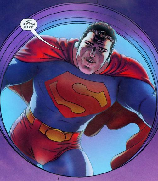
Far superior to what we ended up with in the final version if you as me.
They switched it sometime between the previews and the printing of the actual book.Last edited by Carabas; 06-17-2016 at 02:14 AM.
-
06-17-2016, 06:25 AM #3Mighty Member
- Join Date
- May 2014
- Posts
- 1,146
I had no idea they were going to do a little adjusting to the "S". I really like the version in the picture in Carabas post. It's a shame they didn't go with it.
-
06-17-2016, 08:58 AM #4Extraordinary Member
- Join Date
- May 2014
- Posts
- 7,626
Eh, it doesn't really look all that different enough so as to be something to "miss" to me.
-
06-17-2016, 09:57 AM #5Mighty Member
- Join Date
- May 2014
- Location
- Scandinavia
- Posts
- 1,340
Ey, big cheers for posting that! = ) Originally Posted by Carabas

It's an interesting design, I must say - a more discreet tweak of the shield then I remember. The soft design definitely fits the Superman that Morrison wrote in the series.
I wouldn't say it's necessarily superior though. : \ For the story that he wrote, I think they did the right move in using a more classic version, since it was meant to be as iconic a Superman as possible.
(the shield they used wasn't THE classic shield though! It was actually the slightly tweaked Byrne-version - the one that turned bigger and more SHARP, much sharper edges than in the Bronze Age Pre-Crisis one, who still had a bit of that police-badge rounding in it)
Oh, you'd be surprised... there's actually quite a few differences when you see them next to each other. Originally Posted by thwhtGuardian

-
06-17-2016, 12:21 PM #6Extraordinary Member
- Join Date
- May 2014
- Posts
- 7,626
I did just that myself, and while yes there are very definite differences they don't look major enough to warrant missing it or it being a shame. That isn't to say it isn't a nice play on the classic look, I'm just saying it's not so ground breaking that it's something to be missed. Originally Posted by L.R Johansson
-
06-17-2016, 12:34 PM #7Not a Newbie Member
- Join Date
- Feb 2015
- Location
- Arkham, Mass (lol no)
- Posts
- 9,207
The original design there was cool...comes off as costumey and old timey simple and kinda childlike. But no regrets for me, the regular symbol they went with was just fine and I think helped All-Star feel like what some Superman fans like me want from the main continuity books.
Things I love: Batman, Superman, AEW, old films, Lovecraft
Grant Morrison: Adults...struggle desperately with fiction, demanding constantly that it conform to the rules of everyday life. Adults foolishly demand to know how Superman can possibly fly, or how Batman can possibly run a multibillion-dollar business empire during the day and fight crime at night, when the answer is obvious even to the smallest child: because it's not real.
-
06-17-2016, 01:00 PM #8Incredible Member
- Join Date
- Apr 2015
- Posts
- 853
I talked to Grant about emblems at Comic-Con back in 2004 or so. He did a sketch for me of this emblem (which I may have lost in a move; I might have a scan backed up somewhere).
He designed this logo for his Superman 2000 pitch with Peyer, Waid, and Millar. I believe they had both Kubert brothers lined up for art.
Its use in All-Star was a recycling DC shot down for whatever reason.
-
06-17-2016, 01:09 PM #9Incredible Member
- Join Date
- Apr 2015
- Posts
- 853
Wel, Grant's idea was that the yellow parts are the symbol of the House of El (which means "Hope" or "Star"; same word in Kryptonian) and the red part is irrelevant (and New 52 kind of hinted at this again, as did Most Awesome Superbat's costume from Final Crisis). Originally Posted by thwhtGuardian
So that's where it takes on SOME relevance.
And, honestly, as a kid, I always thought Superman's symbol was a bunch of yellow shapes and the red crest element was just a background for them. So I think it does sort of attempt to take the Donner concept of the symbol as a family crest (done to appease Marlon Brando, who wanted to wear the S) and use that to engage the reader with a kind of pre-literate thinking.
I always thought Superman Returns and Man of Steel missed the boat by having the red S be raised, particularly while insisting it's not an S. The yellow bits should be raised and I think we need to see them out of sequence in at least one scene so it registers that the symbol is a bunch of geometric shapes and curves and that their arrangement isn't what's important.
If I were handling an origin, I would probably have the yellow shapes arranged differently as the House of El symbol (maybe with some extra shapes) and then have Ma Kent arrange the pieces into an S when putting together the costume.
-
06-17-2016, 02:05 PM #10Father Son Kamehameha <
- Join Date
- May 2014
- Posts
- 8,755
I'm grateful for the Marlon Brando bit about wearing the S.
As for this... well, I don't really think much one way or another about the style, but I just think it looks ugly being so big and stretched. I never did like it to be the whole top half of his shirt, essentially.
-
06-17-2016, 03:10 PM #11Amazing Member
- Join Date
- Jun 2016
- Posts
- 78
The "S" on the left was fine to me.
-
06-17-2016, 05:34 PM #12Mighty Member
- Join Date
- May 2014
- Location
- Scandinavia
- Posts
- 1,340
Which one? I take it you mean the Superman 2000 variation? Please take in mind that the whole big thing and taking up most of his shirt, was something that was standardized by Byrne and pretty much became a staple of the Post-Crisis Superman. Originally Posted by Kuwagaton
This get me thinking back to how a lot of people felt that the version of the shield that Brandon Routh wore in Superman Returns was too small...
-
06-17-2016, 05:37 PM #13Father Son Kamehameha <
- Join Date
- May 2014
- Posts
- 8,755
Reeve had it too big, but then in the comics Byrne made it too big. Originally Posted by L.R Johansson

 Reply With Quote


