
It's interesting. Not the photo, my reaction to the photo. I like Cavill a lot. I think with good material, for instance where the good material popped into Man of Steel (character material, specifically - I liked a good chunk of the hard sci-fi elements) he really shines as a really good Superman choice, and I like his more modern, natural feeling Clark, too, heavy-handed philosophical thesis statement or not. I actually like that bit of silver - although I can't see why they didn't just make it an actual belt rather than something belt-esque that serves the same design function.
So really, the subject matter is not a problem, it's rather how it's presented.
The "stylistic" flourish - and I say stylistic in sarcasm quotes because frankly, it's not very effing stylish is like straight outta Injustice: Gods Among Us or other modern RAD, BAD and totally generic video-games. So you know ... Zack Snyder-esque, which to be honest I thought the promo material for Man of Steel actually avoided with its fairly clean presentation.
What does it convey, setting him against that dismal, Gotham-esque (but not good Gotham ... video-game Arkham City Gotham) kind of vibe? Obviously that the social ramifications of Superman will be at the forefront of this film and that Batman will be used as the character to, ironically shine light (or shine darkness ... darklight?) onto the function and ideals of Superman. He'll be our skeptic (while Luthor will be the outright cynic). Superman will no doubt win Batman over by the end. Probably with a bit of help from Lois Lane and Alfred.
So you can understand exactly why that atmosphere was selected for this image.
It's just ugly. The colors don't pop. The somber tones strip the chic and avant-garde style right out of it, which defeats the point of having Superman in the image. Frankly I've always felt that aesthetic strips the chic and the mystique out of Batman as well (I prefer the high contrast noir to the desaturated faux).
I don't expect that aesthetic to carry into the film. Snyder & WETA's Krypton was colorful. Kansas was green/tawny, steel and cinders, and sunkissed. The arctic didn't have too much of that "teal/blue" color correction to make it seem "cold" - it's snow, man. It already feels cold. Man of Steel, probably thanks to the Nolan influence, was right to put these extraordinary beings into a nearly totally "realistic setting".
But if this is where they're going with the posters, I'm going to have words for the presumably one-time art students in their COM-D department.
Results 16 to 26 of 26
-
07-06-2014, 09:16 AM #16Astonishing Member

- Join Date
- Apr 2014
- Location
- New York
- Posts
- 4,117
 Retro315 no more. Anonymity is so 2005.
retrowarbird.blogspot.com
-
07-06-2014, 09:21 AM #17Astonishing Member
- Join Date
- Jul 2014
- Location
- WGBS
- Posts
- 2,537
I can't recall the exact pose, it might be from Kingdom Come, but the photo has a strong Alex Ross vibe too it. I really hope that they are planning on a Kingdom Come somewhere down the line. Visually it should be amazing.
-
07-06-2014, 09:23 AM #18Mighty Member
- Join Date
- May 2014
- Location
- NY
- Posts
- 1,040
He looks great. He looks like Superman. He looked great in the first movie too though. Now just a little more mature.
-
07-06-2014, 02:04 PM #19Ultimate Member
- Join Date
- Apr 2014
- Posts
- 18,725
http://s645.photobucket.com/user/THE...ROSS2.png.html Originally Posted by Johnny Thunders!

I bet you're thinking of this one. And I feel you.
-
07-06-2014, 03:46 PM #20Spectacular Member

- Join Date
- May 2014
- Posts
- 116
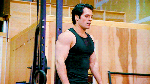
I am not fonf of that metallic color palette.
The photo is right, but I don´t like that Henry has developed such muscled body. Superman is not about muscles, he is not Hulk, nor Captain America, nor Batman, his strength doesn´t come from there.Last edited by Charlus; 07-06-2014 at 06:09 PM.
-
07-06-2014, 04:01 PM #21BANNED
- Join Date
- Apr 2014
- Posts
- 4,852
Like the costume more. Well Yes Charlus, but he should still be well muscled maybe more Olympic Swimmer style the bodybuilder though.
-
07-06-2014, 04:38 PM #22THE MARK OF MY DIGNITY
- Join Date
- Apr 2014
- Posts
- 10,105
Hmm the Superman build has always been an interesting topic to me, because on one hand Charlus is right in saying that's not where his strength comes from. BUT you still have to keep in mind the very macho nature behind the character. Even though his physical muscle size is not 100% power behind him, it's still a visual signification of dominating/world changing strength that Superman is known for. in my experience people usually expect Superman to be the biggest guy in the room most of the time. Originally Posted by JaggedFel
In actuality I can see validation in both sides of the argument. Cavil vs Reeve's build. Both convey Superman correctly as far as their respective builds go. If you ask me I've always been of the mind that she should be quite stocky but not really ripped in the meticulous manner that Batman would be (whom btw I think should almost always be less stocky and shorter than Superman). He should look "corn fed" like a football player from Kansas.
But again I don't disagree with the lurch-like swimmer build that C Reeve's and Routh had in the suit.
-
07-06-2014, 04:40 PM #23Ultimate Member
- Join Date
- Apr 2014
- Posts
- 18,725
All I care about is if he can appropriately not stand out when he's Clark Kent. When the size can no longer be masked by the clothes, then that's too big. And judging from that recent set pic of Cavill in a suit, this doesn't look like it'll be a problem at all.
Last edited by Sacred Knight; 07-06-2014 at 04:44 PM.
-
07-06-2014, 06:04 PM #24Spectacular Member
- Join Date
- May 2014
- Posts
- 116
Yes, I agree that would be the ideal body form for Superman. Not this juggernaut muscled body Henry has right now. Originally Posted by JaggedFel
Last edited by Charlus; 07-06-2014 at 06:21 PM.
-
07-06-2014, 06:20 PM #25Greetings, Chicken!!!
- Join Date
- Apr 2014
- Location
- Seattle
- Posts
- 1,381
In one word; "YUMMY"

-
07-06-2014, 06:21 PM #26Spectacular Member
- Join Date
- May 2014
- Posts
- 116
I still think this is too much, and very hard to hide under civilian clothes. Originally Posted by Sacred Knight

Yes, I see your point, and I think you are right about what some people might expect when Superman is in a room surrounded by other heros. But that´s just inmature: "The biggest the most powerful". Originally Posted by Superlad93
From my point of view, it would´t feel right if Superman had more muscles than Batman, cause that would suggest that, indeed, Superman is stronger than him because of that.

 Reply With Quote


