

..........
Results 751 to 765 of 1289
Thread: Comic Book Binding
-
02-11-2018, 10:41 PM #751Incredible Member

- Join Date
- Jan 2018
- Posts
- 696

Last edited by JoeGuy; 10-22-2019 at 04:09 PM.
-
02-12-2018, 01:45 AM #752Moderator
- Join Date
- Apr 2014
- Location
- Dundee, Scotland
- Posts
- 6,005
ok so I'm not a graphic designer but here are my 2cents: Originally Posted by JoeGuy

on the front cover all the creator names should be the same size. Also Sale and Lee's name seems squashed, I think the distance between the letters should be increased.
The top image on the spine need some contrast so the black will blend in with the spine's black. Not sure if it's just the resolution of this image you posted but the edges of the letters don't look that sharp. Don't know if there is any such option in gimp but in photoshop you can set the letters to "crisp" which will make them look sharper.
I think there is too much text to fit on the back cover and it looks crowded and squashed, hard to read. Also I would change the blue text to red (same red and yellow as on the frontcover).
Here is something I'm not sure about: you have one type of font on the front but a different on the spine and the back. Maybe it should be the same all over or the same on the spine and the front at least?
I'm interested what others say, I only dabble in graphic design a bit I',m more of an illustrator but it's a skillset I wish I learned.
BTW I like the direction of this cover.
-
02-12-2018, 03:06 AM #753Incredible Member
- Join Date
- Jan 2018
- Posts
- 696
..........
Last edited by JoeGuy; 10-22-2019 at 04:10 PM.
-
02-12-2018, 03:27 AM #754Amazing Member

- Join Date
- Jan 2015
- Location
- Mother Russia
- Posts
- 94
I'm having a little problem with "Eisner-award winning creators" cause it cuts off Jim Lee)
-
02-12-2018, 03:31 AM #755Incredible Member
- Join Date
- Jan 2018
- Posts
- 696
..........
Last edited by JoeGuy; 10-22-2019 at 04:10 PM.
-
02-12-2018, 03:36 AM #756Incredible Member
- Join Date
- Apr 2014
- Location
- Yokohama, Japan
- Posts
- 582
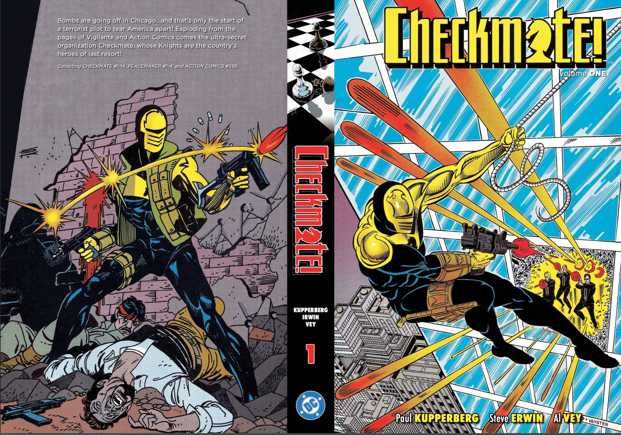
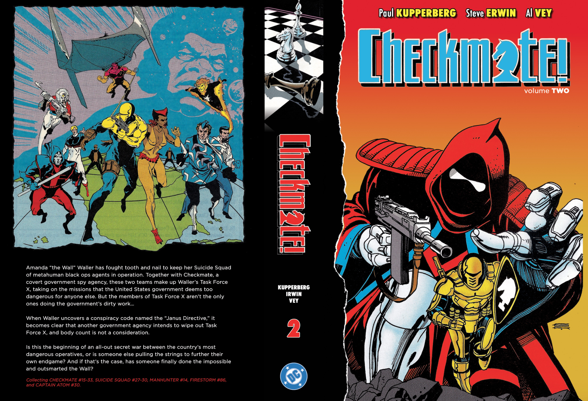
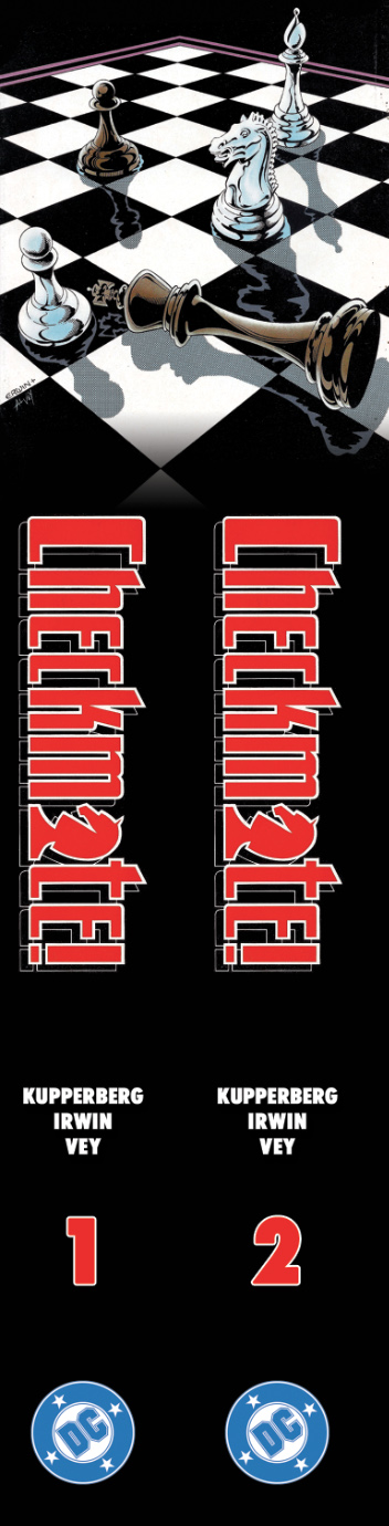
It's been awhile, so I thought I'd post some of the recent/semi-recent binds I've designed. I'm settled here in Japan, so have time to take on a few design jobs from time to time, so feel free to message me if you need any covers or contents pages designed.
First up, the classic Checkmate series in two volumes:
-
02-12-2018, 03:36 AM #757Incredible Member
- Join Date
- Apr 2014
- Location
- Yokohama, Japan
- Posts
- 582
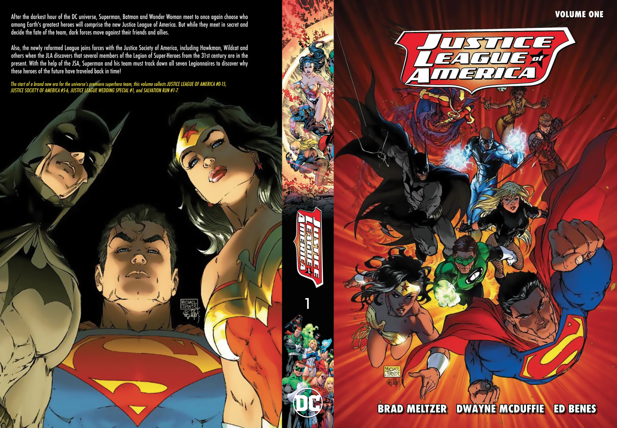
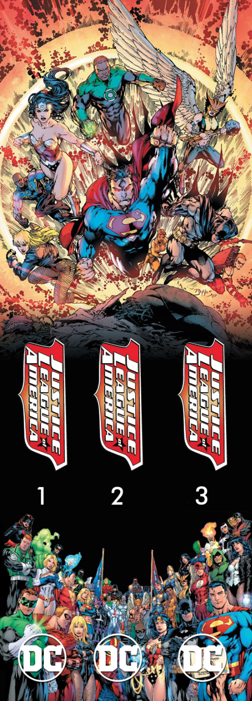
Here's the cover to one volume of a three volume Justice League set, as well as the spines:
-
02-12-2018, 03:37 AM #758Incredible Member
- Join Date
- Apr 2014
- Location
- Yokohama, Japan
- Posts
- 582
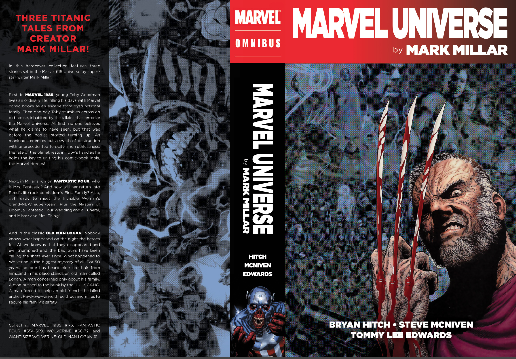
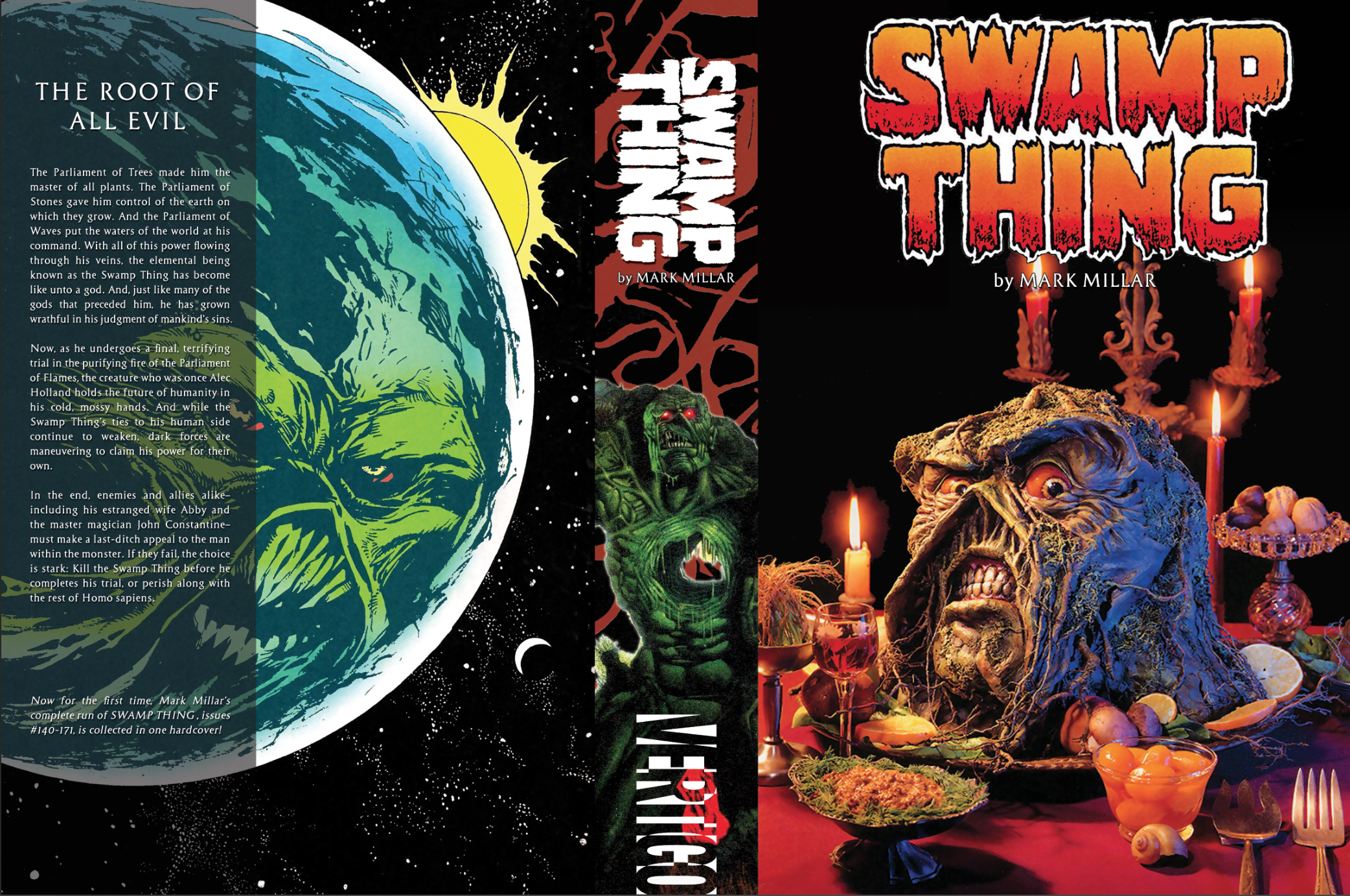
And here's a couple Mark Millar-related volumes. One collecting some of his Marvel work, another of his Swamp Thing run:
-
02-12-2018, 03:48 AM #759Amazing Member
- Join Date
- Jan 2015
- Location
- Mother Russia
- Posts
- 94
nothing comes to mind, sorry.Always prefeared as much textless as possible. Originally Posted by JoeGuy
-
02-12-2018, 07:29 AM #760Astonishing Member
- Join Date
- May 2014
- Posts
- 3,445
Hey that swamp thing one looks familiar Originally Posted by Dick Grayson

-
02-12-2018, 08:17 AM #761Incredible Member

- Join Date
- Jul 2014
- Location
- Kansas City, MO
- Posts
- 737
Be careful with that text you have running along the edge of the front cover...make sure you're not too close to the edge/bleed area. Originally Posted by JoeGuy
I like the direction of the cover. I think the red font color in the creator names doesn't stand out from the background enough...maybe put a stroke around it to make pop a bit? I'd make the creator names all the same size, as well...keep it nice and uniform. On the spine - not a fan of the comma between creator names....(little things like that can make a difference). I'd just put maybe a little dot or something between each name and just say Batman and then below that have Loeb * Sale * Lee (or use first names if you want, still).
Another way to go is pull the names down below...so have Batman Omnibus running vertically, then below that have the names run horizontal and stack them like:
Jeph Loeb
Tim Sale
Jim Lee
(center them, probably)
These are totally just things you COULD change...I am digging the look...but I have another buddy who designs some stuff and he and I bounce ideas back and forth like this all the time, and it really helps get the creative juices going sometimes.
-
02-12-2018, 08:19 AM #762Incredible Member
- Join Date
- Jul 2014
- Location
- Kansas City, MO
- Posts
- 737
Nice...digging these a lot! Good to see you're back to designing some stuff. Originally Posted by Dick Grayson
-
02-12-2018, 10:00 AM #763Thrashing Like a Maniac!
- Join Date
- Jul 2015
- Location
- Gotham City, Earth 666
- Posts
- 562
Dick Grayson! It's been too long! It hasn't been the same without you! Great use of the bullet logo man! And a classic series in general! Welcome back! Originally Posted by Dick Grayson
And then there were none...
Custom Binding Thread: http://community.comicbookresources....0645aadbab2369
The All Purpose Metal Thread : http://community.comicbookresources....5299bbaefeffe8
-
02-12-2018, 10:13 AM #764Incredible Member
- Join Date
- Jan 2018
- Posts
- 696
..........
Last edited by JoeGuy; 10-22-2019 at 04:10 PM.
-
02-12-2018, 10:17 AM #765Incredible Member
- Join Date
- Jan 2018
- Posts
- 696
..........
Last edited by JoeGuy; 10-22-2019 at 04:08 PM.

 Reply With Quote


