Page 693 of 1487 FirstFirst ... 1935936436836896906916926936946956966977037437931193 ... LastLast
Results 10,381 to 10,395 of 22298
  1. #10381
    Fantastic Member
    Join Date
    May 2014
    Location
    California
    Posts
    444

    Default

    Quote Originally Posted by ChronoRogue View Post
    Yes games do have the benefit of being a light source itself but few people would read a comic in poor light conditions, that kinda of defeats the purpose and strains your eyesight unnecessarily. The more limited colors that a game protrays is not relevant to how a person can perceive darker colors, how would a more open palette matter if artists are able to make do with more limitations?

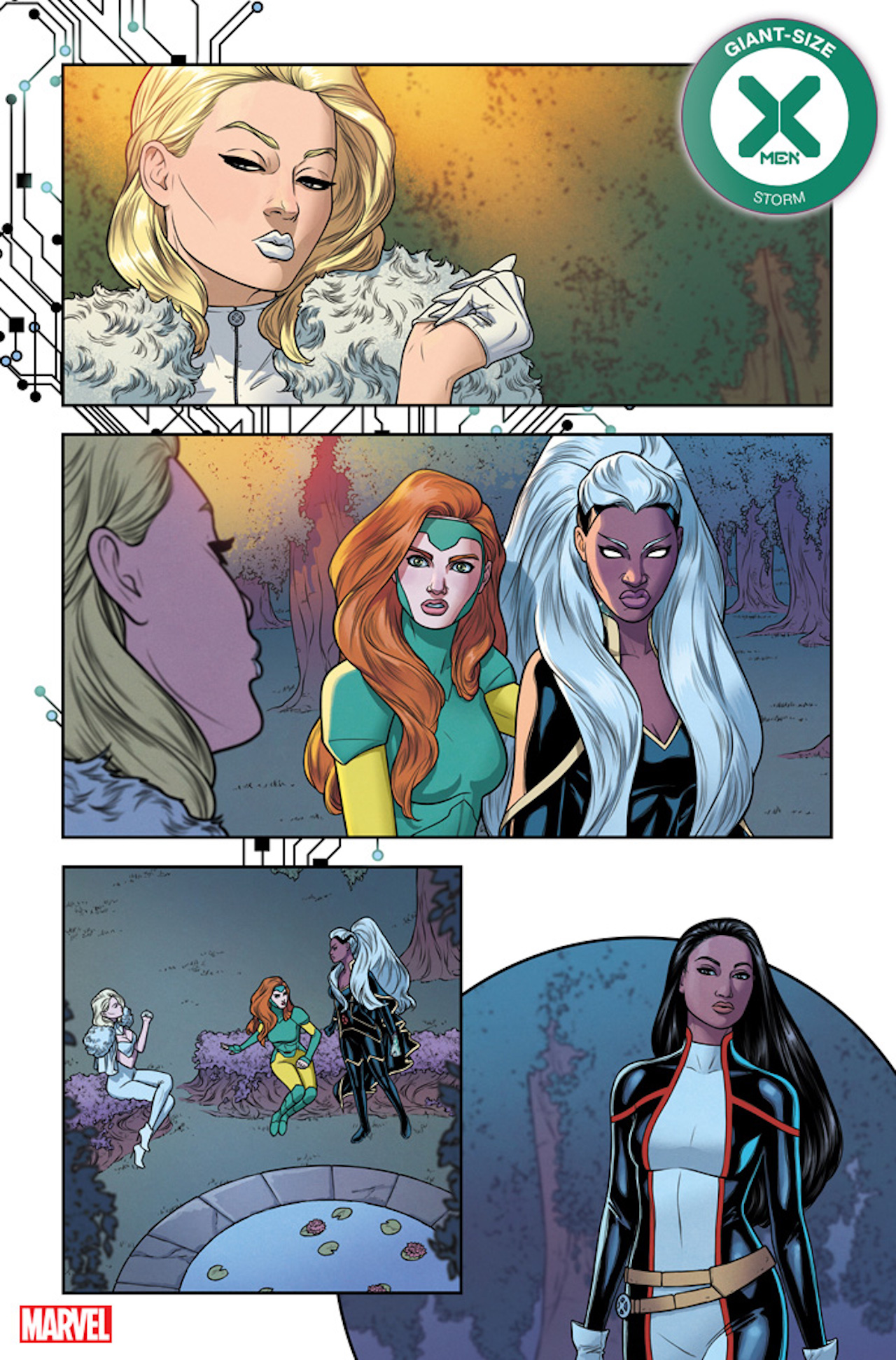
    Havok83s image is not as dark as skin tones go so it printing darker should not be an issue. I don't really understand what you mean about too much yellow or why it would not look "correct" as Monet's skin tone there looks more similiar to the regular skin tone that she was often portrayed in Gen X (even in darker settings).
    but what you're not understanding is the light source from screens comes from behind the image, like how a screen projector illuminates transparent film and lights it differently than what you would see on a solid white printed page. (paper also degrades in time, turning yellow and inks fade, which changes colors drastically as well.

    again, tihs chart reminds us that colors on a screen will always output brighter than on a printed medium:

    Why-Printing-Uses-CMYK-Image-3.jpg

    also video games are animated - which means characters and objects move and light sources shift - which means colors in a game get different opportunities to stand out and separate because the animated motion allows your eye the opportunity to psychologically process and visually separate colors easier. colors in a comic panel have 1 shot to get all the visual information to stand out and convey properly, because nothing moves and light does not change within one panel of still art. and I think you're misconstruing the fact that lighting a printed page with a lamp, or overhead lighting, happens in front of the image - so the image itself isn't being lit, and shining an exterior light source -- although makes things easier to see--- does nothing to brighten the image quality itself. and depending on if your bulb's light is blue or yellow, or close in proximity to you sitting on a desk or mounted up high on a ceiling, it changes the temperature of the colors you see on the page completely. how much light you shine on your comic book will affect HOW WELL you SEE colors within the visual information, the light does not make the colors themselves brighter, if that makes sense, since they've already been set in print. games ARE the light source, but comics pages are NOT the light source and NEED a light source, and that makes a big difference in the visual experience. For example an incandescent bulb, emits warm light and emits more wavelengths of red light. this causes the object viewed under this light source to have a reddish appearance, etc. and since colorists for print can't predict the lighting conditions readers will use to experience their colors, they have to find colors that can work universally and sometimes that's not achievable.


    https://www.packagingimpressions.com...tion-of-color/
    Last edited by Tunasammiches; 08-30-2020 at 09:33 AM.

  2. #10382
    Fantastic Member
    Join Date
    May 2014
    Location
    California
    Posts
    444

    Default

    what I mean by the yellow tones on havoc's sample looking incorrect is due to the environmental lighting setting and how it works with the overall color setting and panel as a whole and has the potential to print too dark (especially that large shadow detail on her cheek). the figure does not stand in the panel alone by herself. she is surrounded by an environment that contains light and other colors. it looks like the environment around monet and storm is early evening, or night time, or twilight or something with light from a pale moon, etc - where the sun is down and all the warm tones you see during a daytime setting is gone. so in consideration of the color tones of the environment setting being dark blues, purples, desaturated greens and cool blue tones, the warm yellow tone on her skin does not fit the scene and the figure doesn't look integrated with it's surroundings as well as it could. now if it was high noon, and the sun was directly above her, and you have daylight tones of yellows and bright blues, then i could see havok's color tones being correct, but since it's a nighttime setting, his adjustment stands out too much and she looks like her colors aren't integrated into the rest of the scene's colors and the color plan looks inconsistent and haphazard.

    I understand and agree on your point on white washing and colorism, i just don't think its being applied fairly to these particular panels.
    Last edited by Tunasammiches; 08-30-2020 at 09:47 AM.

  3. #10383
    Astonishing Member danielsan52's Avatar
    Join Date
    Sep 2014
    Posts
    4,377

    Default

    Quote Originally Posted by Dante Milton View Post
    Monet: Oh look, an army of demons, exactly how I wanted to spend my Saturday night.
    Beast: Holy ****, what are they doing to Unus?!?!
    Demon: Yes, String him up and cut out his entrails. Then use those entrails to restrain that big gray one over there while also shoving hot coals into his various orifices.
    [A]: Well, F**k.
    Beast: Yikes!
    First time we see Unus in years and people be like *blink blink*
    TO KNOW HER IS TO FEAR HER: JESSICA DREW THE SPIDER-WOMAN
    BE SURE TO CHECK OUT THE NEW 2024 SPIDER-WOMAN SERIES by STEVE FOXE!!!

    MISSING:
    Synch's Aura
    Northstar and Aurora's shiny hair
    Spider-Woman’s cowl costume

  4. #10384
    Sarveśām Svastir Bhavatu Devaishwarya's Avatar
    Join Date
    May 2018
    Posts
    14,064

    Default

    Conspirational knee-jerk theories will always trump logic and understanding. Neverthelsss, I greatly appreciate your efforts, Tunasammy.
    That said...
    I'm not impressed by that latest XoS Larraz piece. It's way too jumbled and not visually clear. (Partly for reasons given by TunaS with regards to colouring...not the first time I've thought this...and not Larraz's fault, I'm sure)
    I love Larraz's art but this is one of his weaker pieces.
    Last edited by Devaishwarya; 08-30-2020 at 06:49 AM.
    Lord Ewing *Praise His name! Uplift Him in song!* Your divine works will be remembered and glorified in worship for all eternity. Amen!

  5. #10385
    Extraordinary Member Uncanny X-Man's Avatar
    Join Date
    May 2014
    Location
    Krakoa
    Posts
    6,073

    Default

    I'm totally in LOVE with Pepe Larraz's art. I think they should let him really make his mark on the X-Men universe by letting him redesign a few characters and also have a nice long run on an ongoing book... a handful of issues a year doesn't quite cut it for me. We lost Silva to FF so I hope Larraz will stick around for a good long while yet.

  6. #10386
    Extraordinary Member Purplevit's Avatar
    Join Date
    May 2014
    Posts
    9,296

    Default

    Quote Originally Posted by psylurker View Post
    I'm totally in LOVE with Pepe Larraz's art. I think they should let him really make his mark on the X-Men universe by letting him redesign a few characters and also have a nice long run on an ongoing book... a handful of issues a year doesn't quite cut it for me. We lost Silva to FF so I hope Larraz will stick around for a good long while yet.
    Larraz is doing all Main X issues so far. He is doing events, crossovers and all huge staff. Simple ongoing book won't be as big. Even HiX-Men.

  7. #10387
    Amazing Member gealach's Avatar
    Join Date
    May 2014
    Posts
    30

    Default

    EgqPenvWkAApEt7.jpg
    EgqPePkXkAMUMyv.jpg

    Lineart from David Baldeon on Twitter.
    I seek words of such surpassing beauty that they might melt the hardest heart of stone. - Jacqueline Carey

  8. #10388
    Sarveśām Svastir Bhavatu Devaishwarya's Avatar
    Join Date
    May 2018
    Posts
    14,064

    Default

    You mean...all this time he could draw faces with features that looks normal?
    Lord Ewing *Praise His name! Uplift Him in song!* Your divine works will be remembered and glorified in worship for all eternity. Amen!

  9. #10389
    Invincible Member Havok83's Avatar
    Join Date
    May 2014
    Posts
    28,021

    Default

    Quote Originally Posted by Tunasammiches View Post
    Us designers have one rule: whatever you see on a screen will always print out darker in print. I understand the sensitivity to racial colorism issues, but just noting from a colorist's standpoint considering darker color values for a print format, CMYK print production tends to make colors darker and might not be the best in providing visual contrast and might become unclear for some viewers, since everybody sees colors differently - which means that people with poorer eye sight, visual impairment or color blindness will have a more difficult time separating the colors if they are all tones that are too dark and create a muddy color palette and they won't be able to enjoy the colors as much as someone with better vision quality. it's best to create color contrasts to ensure legibility for the reading experience. it's tricky to balance, ensuring respect for representing a person's skin color accurately while also trying to make it work visually with other color combinations on a ink-printed page. so if storm or Monet is wearing something dark, the colorist will need to tweak the skin tone to separate it visually from the costume, or surrounding lighting, they might have to tweak her skin tone to be slightly lighter or add more red to give more visual vibrancy but they will need to be careful about how it interacts with the red tones chosen for their lips. whereas if they were wearing something white, like the middle part of Monet's costume, it creates enough contrast to allow for darker skin pigment colors to be distinguished without worrying about the colors blending too much in the print process and totally muddying up their faces and facial expressions for the viewer. in the retouch of Monet in the last panel sample- her skin tone is too dark and although it looks ok on a bright screen with light coming through it, it might print too dark in a physical book copy and since her face is surrounded by black colored hair and her dark black/blue colored costume, in a dim night time setting of blues in the environment, her facial features will look muddied and illegible - the color of her lips blends too much with the color of her skin and now makes the lips less visible and hard to read, especially depending on the printing process and inks used. I'm not saying colorism is right in real life, but in consideration of the printing process, it might actually complement the characters and the art if the skin is tweaked to be lighter during darker colored scenes and color palettes. like I said, I get the knee jerk reaction to racial colorism, but there needs to be some technical awareness to proper applications to color for the best visual outcome for a printing process that allows for clear visual legibility. there is a way to get a good color balance that doesn't completely white wash a character but people need to understand the nuance that sometimes during print production, color tweaks are necessary for optimal visual communication.
    Thats a lame excuse. It might work if its someone's first time coloring a professional comic but when one has done it for years, then its on you to make better decisions before anything goes to print, knowing that the colors will come out darker. I dont get how some artist can get it right with Monet while others completely miss the ball. There is no excuse for them

  10. #10390
    Astonishing Member Su_Whisterfield's Avatar
    Join Date
    Aug 2019
    Location
    UK
    Posts
    2,349

    Default

    Quote Originally Posted by Havok83 View Post
    Thats a lame excuse. It might work if its someone's first time coloring a professional comic but when one has done it for years, then its on you to make better decisions before anything goes to print, knowing that the colors will come out darker. I dont get how some artist can get it right with Monet while others completely miss the ball. There is no excuse for them
    I put it down to a lack of care in editorial. There should be a bible for each character and every writer, artist and colourist should have access to it. A private, in-house wiki.
    If colourists can get The Incredible Hulk or Mystique right all the time, no matter the lighting, they should get Ororo or Monet, Roberto or Bishop correct too.

  11. #10391
    Extraordinary Member Master of Sound's Avatar
    Join Date
    Aug 2014
    Posts
    9,544

    Default

    Quote Originally Posted by gealach View Post
    EgqPenvWkAApEt7.jpg
    EgqPePkXkAMUMyv.jpg

    Lineart from David Baldeon on Twitter.
    Daken really looks more Asian in X-Factor. Less sexy though.
    Last edited by Master of Sound; 08-30-2020 at 01:42 PM.
    "COURAGE, DON'T YOU DARE LET ME DOWN"
    ==================================================
    ==================================================

  12. #10392
    Moderator Nyssane's Avatar
    Join Date
    Apr 2014
    Posts
    4,740

    Default

    Quote Originally Posted by Master of Sound View Post
    Every time I go this thread to check out Upcoming X-books art teases, all i see is a lot of bla bla bla. Can we keep on topic, please. I believe other topics have enough threads to be discussed elsewhere.
    This.

    Please don't make me start deleting posts because I think a lot of what's being said is very constructive. But this thread is primarily for art teases, not jibber jabber.

  13. #10393
    Astonishing Member
    Join Date
    May 2014
    Posts
    2,573

    Default

    Quote Originally Posted by Su_Whisterfield View Post
    I put it down to a lack of care in editorial. There should be a bible for each character and every writer, artist and colourist should have access to it. A private, in-house wiki.
    If colourists can get The Incredible Hulk or Mystique right all the time, no matter the lighting, they should get Ororo or Monet, Roberto or Bishop correct too.
    A character sheet/guide would be grand. But mystique has been colored several different shades of blue over the years, it’s just blue, so no one really noticed or cared. Ironically, hulk was one big coloring mistake (he was supposed to be gray, the printer ended up making green, marvel decided to roll with it. )

    Anyways, from the artwork, I’m still not sure what’s going on with x of swords. But I’m guessing it’s supposed to be that way?

  14. #10394

    Default

    Quote Originally Posted by gealach View Post
    EgqPenvWkAApEt7.jpg
    EgqPePkXkAMUMyv.jpg

    Lineart from David Baldeon on Twitter.
    Nice! Daken looks very cool, calm, and relaxed. Makes me wonder what (or who) he just did.
    Join me on the official website for X-men Supreme, home of Marvel Universe 1015. Want a fresh take on X-men? Click below to enter the official home of Marvel at it's most Supreme!


    Or if you want, check out my YouTube channel, Jack's World.

  15. #10395
    Ultimate Member Wiccan's Avatar
    Join Date
    Aug 2015
    Posts
    12,927

    Default

    They darkened Storm and Monet's skin.
    https://www.gamesradar.com/giant-siz...ext-big-story/

Posting Permissions

  • You may not post new threads
  • You may not post replies
  • You may not post attachments
  • You may not edit your posts
  •