

If he's not careful, his shoulder gears will knock him out.Originally Posted by Snoop Dogg

Results 2,161 to 2,175 of 2505
-
10-18-2019, 03:09 PM #2161The Professional

- Join Date
- Apr 2014
- Location
- The Corner Of Your Eye
- Posts
- 16,560

-
10-18-2019, 03:10 PM #2162Moderator

- Join Date
- Nov 2014
- Posts
- 116,294
I'm surprised how bulky the armor looks.
-
10-18-2019, 03:12 PM #2163The Professional
- Join Date
- Apr 2014
- Location
- The Corner Of Your Eye
- Posts
- 16,560
Those hip plates are absolutely killer. Literally. Originally Posted by Frontier
-
10-18-2019, 04:13 PM #2164Extraordinary Member
- Join Date
- Apr 2014
- Posts
- 6,008
For a 2020 armor, it looks awfully 90's.
-
10-18-2019, 04:28 PM #2165The Spirits of Vengeance

- Join Date
- Aug 2017
- Location
- Chicago, Illinois
- Posts
- 12,979
Agreed. The 2020 armor from 1986 was a lot more cutting edge: Originally Posted by MichaelC
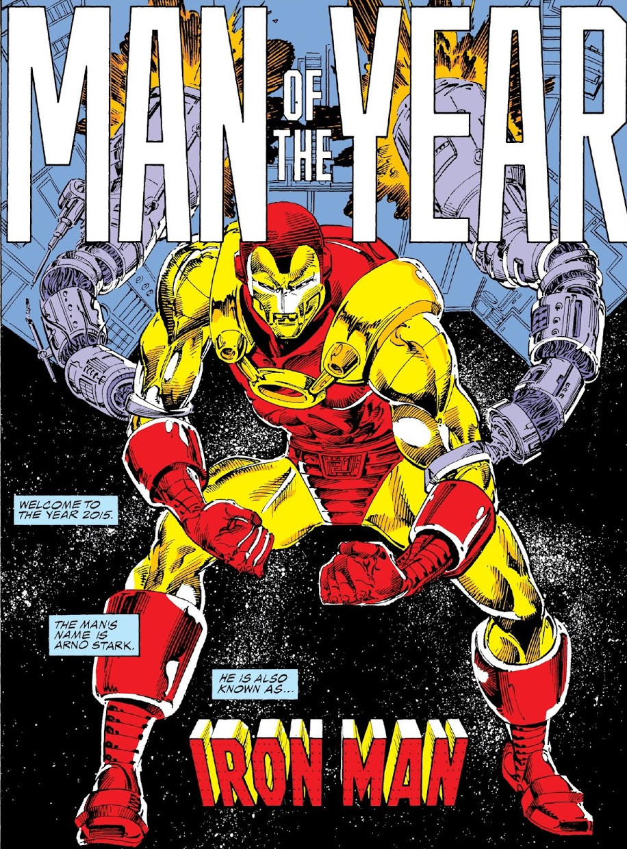
Last edited by K7P5V; 10-21-2019 at 01:05 PM. Reason: Corrected grammatical errors.
-
10-18-2019, 04:40 PM #2166IRON MAN
- Join Date
- May 2014
- Location
- Hellfire Club
- Posts
- 7,934
My thoughts as well. Originally Posted by MichaelC
"We live in a world of cowards. We live in a world full of small minds who are afraid. We are ruled by those who refuse to risk anything of their own. Who guard their over bloated paucities of power with money. With false reasoning. With measured hesitance. With prideful, recalcitrant inaction. With hateful invective. With weapons. F@#K these selfish fools and their prevailing world order." Tony Stark
-
10-18-2019, 05:40 PM #2167Uncanny Member
- Join Date
- Jul 2016
- Posts
- 36,753
Well, Force Works was originally a rebranded West Coast Avengers, so maybe she'll end up there? Alongside Vision, Wonder Man, and War Machine. She will of course still be in Agents of Wakanda as well. Originally Posted by Captain M
I guess this means that Iron Man relaunches in July? With a new writer?Appreciation Thread Indexes
Marvel | Spider-Man | X-Men | NEW!! DC Comics | Batman | Superman | Wonder Woman
-
10-18-2019, 06:18 PM #2168iMan 42s
- Join Date
- Aug 2014
- Location
- Maryland
- Posts
- 3,654
My issue with the costume is pretty much the same, it's too damn bulky, however I'd argue it's also too detailed. For something such as this it should be slimmer like the 1980's costume. It didn't matter how much it looked like then or past armors because in hindsight it was the perfect design. Technology naturally got more compact and slimmer. Technology these days is sleeker as a byproduct of how small it's gotten on-top of how things have gotten significantly easier to produce. In terms of the comics as well the armor also followed this trend.
The armor ends up looking a decade older than it is as a result. Kind of like it's trying to use the style of the MCU except the MCU is 10 years old and Iron man has long since moved past this.
The gears should also be subdued. Significantly. I get that Arno had gears and I'm not saying he shouldn't have them, but it worked in Gillen's run because it was a big suit. It was either aesthetic flair or it was part of the suit's mechanisms. In either case it didn't matter because it didn't look like it hampered the design. This looks so big it looks like it came out of someone's art portfolio in the 90's. It looks more like he'd injure himself nor does it look comfortable to wear. He'd be walking around in that suit like a toy who can't put his arms at the hip. Curving it up the chest (to avoid limiting arm movement) and or blending it with the chest would work better. Or alternatively it could be changed to act as ports for other bits of gear, so at a glance it's a gear near the top but it's more like Warmachine's weapon mounts. We didn't know what exactly the original was used for so now is the time to do it.-----------------------------------
For anyone that needs to know why OMD is awful please search the internet for Linkara' s video's specifically his One more day review or his One more day Analysis.
-
10-18-2019, 07:18 PM #2169Extraordinary Member
- Join Date
- Apr 2014
- Posts
- 6,008
I think part of this may be that, like Batman being replaced by Azrael after the Bane story, Marvel WANTS us to dislike this design, so we will root for Tony to kick his ass. So it is deliberately designed to make you throw up in your mouth a little.
-
10-18-2019, 07:45 PM #2170iMan 42s
- Join Date
- Aug 2014
- Location
- Maryland
- Posts
- 3,654
Yeah but the Knightfall armor does look good. Azrael's armor works since it becomes so far removed from Bruce's it loses it's immediate distinction it's Batman among it's stylistic removal from the detective genre. Azrael is built for combat whereas Bruce was and is more known to use his brain. The difference in costume should not only be meant to look good but also reflect something about the that incarnation in the legacy even if it is just aesthetics. As well, Azrael eventually attained the look he did, he didn't start with it. The costume over time progressively changed to show more and more how different Jean Paul Valley was to Bruce Wayne even if some of that was mocking the style of the times. You could chart an arc with Azrael that you can't if you go all in on a bad idea like what happened with Scarlet Spider. You can't just start in a bad spot. Originally Posted by MichaelC
And if that is the case, for a book that has been hemorrhaging readers since it started in an environment where we do judge a book by it's cover, I'm not 100% that's a good idea.-----------------------------------
For anyone that needs to know why OMD is awful please search the internet for Linkara' s video's specifically his One more day review or his One more day Analysis.
-
10-18-2019, 07:55 PM #2171Kinky Lil' Canine
- Join Date
- Nov 2018
- Posts
- 10,097
It looks like a monstrous version of Iron Man, which the old 2020 designs were kinda going for but didn't commit much to so they looked more like regular suits but edgier.
I don't blind date I make the direct market vibrate
-
10-18-2019, 07:57 PM #2172Benefactor / Malefactor
- Join Date
- Feb 2015
- Posts
- 3,510
I generally like it, though the bulkiness of the gear shoulders is a bit much.
I'll be real, nothing about that says "cutting edge" to me. Originally Posted by K7P5V
-
10-18-2019, 09:14 PM #2173BANNED
- Join Date
- Sep 2019
- Posts
- 761
Guess Tony bringing back Rhodey hasn't done any favours for anybody as his trauma is leading to him opting to escalate the situation instead of rendering them inoperative through non lethal means. In fact it seems like it is the twilight of both Rhodey and Tony before a new dawn in which they may or may not feature prominently just like CW II was a end of the line storyline for both.
-
10-19-2019, 02:04 AM #2174The Spirits of Vengeance
- Join Date
- Aug 2017
- Location
- Chicago, Illinois
- Posts
- 12,979
Just trying to lighten the mood with some "dry humor". Sorry, didn't mean to offend anyone. Originally Posted by H-E-D

Last edited by K7P5V; 10-19-2019 at 03:35 AM. Reason: Added a few words.
-
10-19-2019, 05:16 AM #2175BANNED
- Join Date
- Apr 2014
- Posts
- 7,499
Yeah, this is looking cool as hell. Glad Marvel is making this into a big deal Iron Event. Can't wait! Originally Posted by Snoop Dogg


